What's in Store for the Stadium Series?

New event merchandise could be full of clues

I rarely get the opportunity for a good headline pun. Tonight we're taking a look at some new NHL Stadium Series T-shirts that are now showing up in stores. The designs could be offering some insight into what the forthcoming jerseys will look like.

We'll dive in with the New York Rangers first.

Photos from ebay (o_sports_gear)

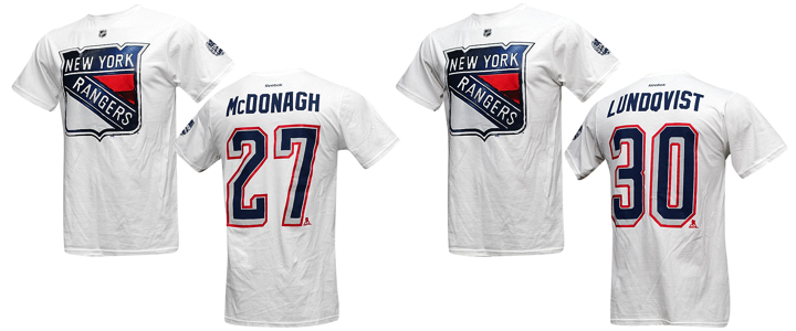
A few things to note. First, the shirt is white. We'll see that's not the case with all of them and there's reason to believe they may suggest the colors of each team's Stadium Series jersey. For one thing, a source tells me the Rangers' jersey is, in fact, white.

It makes sense as the Rangers will be the designated "road team" for both of their Yankee Stadium games against the Islanders and Devils. Speaking of the Devils... (On a roll with these awful puns!)

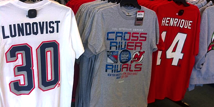
Photo by @TheJerseyNYRFan (via Twitter)

A photo posted to Twitter by @TheJerseyNYRFan on Monday shows the back of the New Jersey Devils shirt. It's red with white numbers.

The tweeter also pointed out the coloring of the Devils' chrome Stadium Series logo on the "Cross River Rivals" tee seen in the middle. There's no green in sight. But it's likely that has more to do with the production costs associated with the number of colors used in the screen printing process.

Back to the Rangers for a moment.  The number treatment seen on these shirts is unlike anything the team has used before. The grey/silver evokes the design used on the Lady Liberty jerseys from back in the late '90s. But those numbers used red for the shadow rather than a thin outline.

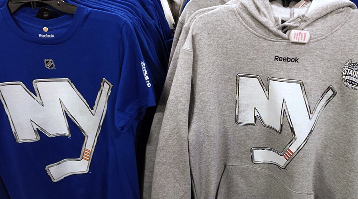
Photo by Jessica D'Agata (@ayojess via Twitter)

This blue New York Islanders tee seems to confirm the idea that the shirts match the jersey colors. But look closely and you'll see this chrome Isles logo doesn't quite match the one released last week. The one on the shirt has rounded corners and an angled corner at the top of the Y.

To sum up, these are the colors and logos that will be representing these teams in January.

As far as jersey crests, I think it's accurate only for the Devils and Islanders. It sounds like the Rangers will, as usual, go with a wordmark across their chests and the shield will be used on the shoulders. Whether the crests will make use of this chrome-treated effect is anyone's guess. But I hope not.

Let's switch gears now to the Soldier Field game in Chicago.

Photos from ebay (o_sports_gear)

The Chicago Blackhawks have red Stadium Series T-shirts. As the home team, this makes sense. But the noteworthy element of these photos is the elongated number design. It's the standard Blackhawks font, but it's stretched out.

If you look back at the Rangers' shirts you'll notice the same thing. It's just more pronounced here.

The elongated design is very noticeable on the Pittsburgh Penguins shirts. Their jersey numbers are usually rather wide. Definitely not the case here. So could these number redesigns be an element of the "futuristic" jerseys we've heard about?

Based on the colors and crests, it doesn't appear things will look too different for Chicago's Stadium Series game. Here are the colors and crests based on what we've seen so far.

That leaves us with the California game at Dodger Stadium.

Just today, a new T-shirt showed up for the Los Angeles Kings with another new logo.

Photo from TEAM LA Store

The TEAM LA Store started selling this, described as a "ligature logo T-shirt." A ligature is basically a couple of letters joined together to create a unique letterform. It's the letters from the Kings' primary logo — which is also featured on the tee. However, it is not the same as the chrome logo unveiled last week. So that's nice and confusing.

What will be on the front of the Kings' Stadium Series sweater? Your guess is as good as mine, but I doubt it's this ligature. This shirt is different from the previous ones seen in this post. The others have the NHL shield in place of the Reebok logo near the neck — and apart from that and the chrome logo, there's nothing else on the front of them.

In other words, this shirt doesn't seem to be part of the same series as the others.

As for the Anaheim Ducks, I haven't seen a shirt yet. All I know is the jersey will be orange. That's according to a tweet by Ducks PR guy Adam Brady. This means the L.A.-based outdoor game may feature orange versus black. We already know the 2014 Winter Classic will see red versus blue. Nice to see the league branching out.

We don't have enough information to be certain yet, so this graphic is a bit of an educated guess on my part. Like I said, the Kings could end up wearing white. (I'm just hoping they don't.)

As we piece together the looks for the upcoming Stadium Series, what are you hoping to see or not see?

Sens to Unveil Heritage Classic Jersey

Ottawa's new sweater to launch on Nov. 28

While America celebrates Thanksgiving, Canada will celebrate the arrival of a new NHL sweater. The Ottawa Senators announced Sunday they will unveil their 2014 Heritage Classic jersey on Thurs., Nov. 28. The outdoor game will be hosted by the Vancouver Canucks at B.C. Place on March 2.

As we've come to expect, the next 11 days will be filled with photo and video teasers through the Sens' social media avenues. In case you want to follow them, here are their Facebook, Twitter and Instagram accounts. But you can always count on seeing them here as well.

Also included in the press release was this insight into the big game.

The Heritage Classic game is a tribute to the 1915 Stanley Cup match where the Vancouver Millionaires (PCHA) faced the Ottawa Senators (NHA). This would be the first time that the champions from both professional leagues would face off for the Stanley Cup.

Does this mean the Canucks will reprise those Vancouver Millionaires sweaters from last season?

File photo from Vancouver Canucks (2012)

It sure sounds that way. Those jerseys were too nice not to get a second go-around. But if that is the case, it would be the first time any Winter Classic jersey had been used prior to its outdoor appearance. (Yes, they've mostly been throwbacks, but you know what I'm saying.)

If the Canucks sport maroon, the Sens would have to go with something lighter. Many readers have expressed a desire to see a "vintage white" version of the Senators' black third jersey — also known as the Heritage Jersey. At this point that's almost a shoo-in. It could make for a great-looking game!

I'm certainly looking forward to seeing it. (In person!)

Chrome Logos for Stadium Series

Effected logos to represent seven participating teams

Today, in a bizarre move, the NHL unveiled a collection of what it calls "chrome-treated" logos for the seven teams participating in the 2014 NHL Stadium Series. In essence, it was the result of someone goofing around with Photoshop — a fact eluding exactly no one. But there were some interesting revelations to discuss.

First, a new version of the New York Islanders primary logo was added to the mix — without the map of Long Island, the wordmark or the classic blue circle. The team has never used the NY on its own before. But check out the graphic posted on the front page of the Isles' website today.

It shows us that the new logo — un-chromed — was designed to sit on a blue background. So it appears we should be anticipating a blue jersey for the Isles' Stadium Series appearance.

By the way, said jersey is now on sale to Islanders' season ticket holders — sight unseen, no less. I'm not sure I could bring myself to part with that much money to buy something I've never seen.

The chrome logo for the New Jersey Devils re-introduces an old color palette. Green is back! But does this mean the Devils will simply break out the throwback jerseys they've been wearing in recent years for St. Patrick's Day? Based on what I've been hearing, I'm not so sure. Read on, I'll explain.

The Isles and Devils will both face the New York Rangers at Yankee Stadium in late January. And while this chrome-ified shield would indicate a Blueshirts throwback to the 1970s, I understand this logo will be little more than a shoulder patch.

The Rangers are known for the diagonal text across the front of their uniforms, and it may well be "NEW YORK" on the chest rather than the club's nickname — not unlike their Heritage Jersey, which debuted in 2011. Something to keep an eye on as we wait for the unveiling.

Speaking of which, the Rangers' own press release tells us the league will reveal all of the Stadium Series jerseys together "in the coming weeks." When that is exactly is anyone's guess.

The Los Angeles Kings are going back to the crown for their Stadium Series logo. But note the conspicuous lack of purple. Perhaps a sign the Kings could sport a Gretzky-era look? Maybe, but again I'm not so sure. Stay with me here.

The Kings' Dodger Stadium foe will be the Anaheim Ducks. But didn't we hear recently that Mighty Ducks might be making another appearance this season? Not if we assume this logo is the crest of the team's new sweater. On the other hand, I do still expect it to be orange. This would allow the Kings to wear black or white.

The Chicago Blackhawks and Pittsburgh Penguins will wrap up the Stadium Series on March 1 at Soldier Field. But their fancy chrome logos give us nothing. They're exactly the same as their existing primary marks — you know except for all that fancy chrome stuff.

I swear I did a logo treatment like this for Icethetics several years back. I'll have to try to track that stuff down. It didn't last long because you guys told me it looked terrible. And it did. Guess no one told them.

Stadium Series aesthetics will not be inspired by tradition

Since 2008, we've become accustomed to outdoor NHL games requiring a certain historical aesthetic. It's right there in the name. The Winter Classic. The Heritage Classic (double there!). Teams wear throwback jerseys and the whole event is designed to evoke feelings of the game's origin out there on the frozen pond in a world that could barely imagine our immense 20,000-seat arenas.

But there's a reason they didn't call this the Stadium Classic Series. (And it's not just the extra syllables.) The word "classic" conjures old-time hockey thanks to the Winter and Heritage Classics. It's my understanding the NHL is going in the opposite direction for these events. In a way, the goofy chrome logo treatment is to get fans out of that retro mindset.

It's right there in the Rangers' press release, actually.

The NHL also unveiled today the NHL Chrome Collection, chrome-treated team logos specifically designed for use in connection with the 2014 Coors Light NHL Stadium Series™. The Chrome logo designs are unique to the NHL Stadium Series and inspired from the chrome details on the NHL shield, bringing a dynamic and modern perspective to conventional team identities.

We might be wise to read a little more into that last line. Bringing a "modern perspective to conventional team identities." Likely a frightening thought to the traditionalists among us, but probably an important idea to consider.

In fact, someone with knowledge of the Stadium Series jersey designs recently described them to me as "futuristic." Later, another source told me the NHL and Reebok took the lead designing them. The teams were merely "consulted" as opposed to being directly involved.

Think about that as we wait for the league to finally unveil the jerseys. What sort of futuristic ideas could you imagine Reebok incorporating into these new uniforms?

Review: Flames Alternate Jersey

The wait has been long enough. This review now needs to be epic. It won't be, but at least it's here.

The Calgary Flames unveiled their new third jersey on Oct. 27. The new look made its on-ice debut on Nov.1 — so by now, we've had plenty of time to fully appreciate it.

Photo from Calgary Flames

My expectations for sweaters designs from Canadian teams are typically high. I feel like the nation that birthed the sport should have the best-looking teams. That's not necessarily sound logic, just a feeling. I tend to hold the Canadian teams on a higher pedestal in this regard.

However, when we learned the Flames had a new third jersey in the works this year, my expectations were a little different. In 2009, the Flames introduced a retro third jersey — modeled after their original uniforms from the 1980s. Most people — myself included — felt like that was the pinnacle of Calgary third jersey options. (The home and road could still have used some work, on the other hand.)

How could the Flames improve upon their first black-free jersey since 1994? Simply put, they couldn't. Even a lateral move was off the table. They could only hope to do something different. And that they achieved.

Photo from Calgary Flames

In typical fashion, the jersey was red. But for the first time in team history, a wordmark adorned the chest of a Flames sweater. The team wanted to declare pride in its city. But on first glance, it seemed like a knock-off the Buffalo Sabres' third jersey from 2010 — the retro-style script with the classic primary mark underneath.

In the last two weeks, my opinion of the crest hasn't changed much. I'm not from Calgary, so perhaps that's why it's difficult for me to appreciate the sentiment. But I am from Tampa and care little for the "TAMPA BAY" scrawled across the Lightning's road jersey. I'd prefer seeing a simple symbol represent our city. I don't think there's any better symbol for Calgary than the flaming C.

But since that's already on a couple of jerseys, this is what I would've rather seen on the chest. I will admit that roundel logos have been overdone in the NHL and the style of this one is slightly reminscent of the Flames' provincial rival in Edmonton. But with a bit of simplification, it could've made a brilliant crest.

Needless to say, I think it makes an excellent shoulder patch for this jersey. The logo represents the many natural facets of Calgary's surrounding region from wheat fields to mountain ranges in front of the setting sun. It's clever imagery and a slick design.

However, the two logos featured on this jersey do not feel like they belong on the same sweater. The styles are worlds apart. I get the sense the two logos were perhaps part of separate proposals and mashed together by a decision-maker without an eye for design. But I could be wrong.

In the last few years, Reebok has appeared limited in its template variety. A handful of basic jersey designs seem to permeate all of the hockey world at this point. But the Flames' new third shows the manufacturer is willing to try new things.

Not only is this a completely new template, it's custom for a specific look the Flames were going for. Check out the shoulder yoke. That unusual design was inspired by the classic western shirt — a staple of any cowboy's closet. This is the sort of thing I absolutely love about third jerseys. Every team should try something a little outside the box now and then.

Speaking of unusual, the graphic suggests the designers were trying to take an overused feature like the lace-up collar and make it their own. Apparently, this one was designed with the intent to string it upside down. But looking through pictures of the Nov. 1 game, none of the players were interested in wearing it that way.

Photos from Calgary Flames

Good effort anyhow. By the way, you'll notice the alternate captains' "A" in the form of the Atlanta Flames logo is carried over from the primary jerseys. Nice way to keep Atlanta alive in the NHL even if it can't have a team of its own.

Photo from Calgary Flames (via Twitter)

What I love most about this jersey is the attention to detail. Hardly any jersey introduced in the last couple of years has been able to avoid Reebok's trendy "hanger effect" — the design on the inside of the collar. Here we see elements of the shoulder patch reprised.

It's a great feature for jersey buyers. Owning it is really the only way to appreciate it. And I'm certain that was Reebok's goal. They are a business after all.

Photo from Calgary Flames

On the other hand, I don't love every detail. The 5 — along with the full number set — was designed to be distinctive. But I'm afraid the it missed the mark a bit. It's distinctive, but not for the better. It just looks like a flipped two. Our brains are not accustomed to quick recognition of a shape like this. Until we get used to it, it's going to feel like an error — like someone stitched a digit upside down.

I can't help but wonder if it ends up being a situation similar to what the Lightning had back when they introduced the italicized electric numbers in 1995. The 1 always looked like a 7 and the 8 barely looked like an 8. Adjustments were made quickly to help with legibility.

Apart from the 5, I do like the rest of the numbers. In particular, I like that they're white. The black on red isn't unreadable, but it's not as easy on the eyes. And the thin yellow stripes on the jersey help to tone down any similarities to the New Jersey Devils' look.

Let's wrap this up with some thoughts about what might have been. The Flames released a video on their website after the unveiling talking about the new look. It included a shot of a wall covered in unused concepts. In some of them, it's clear why they were cut. In others, less so.

I love the simplified flaming C at the top of this photo. What a great way to move that classic mark into the 21st century. But I certainly think the existing version will stand the test of time. I wouldn't be surprised to see the exact same logo still in use when the team celebrates its 50th anniversary in 2030. 

If nothing else, maybe some of our concept artists can have a little fun with some of these designs. I look forward to seeing what you guys come up with.

Summary

This is always the hard part, so I'll try to make it easier with a pros/cons list.

PROS

  • Attention to detail, namely the shoulder yoke and collar
  • The shoulder patch and "hanger effect"
  • White numbers
  • New striping pattern

CONS

  • Had to be red to be a crowd-pleaser, but I think a third jersey should be a third color
  • The wordmark crest is disappointing
  • 5

What are your pros and cons?

And don't forget to check out the updated Jersey Galleries!

Minor Jersey Mayhem

This is a big weekend for specialty jerseys around the minor leagues. Let's start in the AHL!

Game photo from Rockford IceHogs (via Flickr)

Rockford celebrates Los IceHogs Dos!

How can we not start here? The Rockford IceHogs donned these numbers for Los IceHogs Dos this weekend. If you missed "Uno," check out this post from last year. They are really something.

I talked with IceHogs' communications director Mike Peck who said the team partnered with the Latino Leadership Coalition in Rockford for the event. In fact, they inspired the jersey design.

"They really wanted to highlight the strong musical aspect of the Hispanic/Latino culture," said Peck.

The IceHogs wore this uniform on Friday night and auctioned them off afterward with "proceeds being donated to La Voz Latina, an organization dedicated to serving the Rockford region’s Hispanic community through education, workshops and youth programming," according to the press release.

The great thing about these specialty jersey nights around the minors is that these teams are always raising money for charity. So no matter how silly the team may look on the ice, at least it's for a good cause.

Photo from Worcester Sharks (via Facebook)

Worcester raises autism awareness

The Worcester Sharks wore these jerseys on Friday and Saturday to benefit The Autism Resource Center of Central Massachusetts. The puzzle piece pattern is the standard symbol of autism awareness.

Photos from Texas Stars

Texas dons player-designed stars and stripes

This Veterans Day weekend was marked by a number of patriotic or military-themed jerseys. The Texas Stars called it Stars & Stripes Military Appreciation Weekend and wore these jerseys on Friday and Saturday. The subsequent jersey auction is benefiting the Texas Stars Foundation.

The cool part of this uniform is who designed it. Remember Taylor Vause? He played for the Swift Current Broncos a couple seasons and ago and was responsible for designing some fo the team's specialty jerseys. He's continued that hobby since graduating to the pros.

Vause spent most of last season with the Stars but is currently with the club's ECHL affiliate, the Idaho Steelheads. So unfortunately, while he designed this jersey, he didn't get to wear it this weekend.

Images from Springfield Falcons and Hershey Bears

Falcons and Bears go patriotic for Veterans Day

The Springfield Falcons and Hershey Bears honored military veterans in different ways this weekend. The Falcons wore the Hometown Heroes Night jerseys above while being shut out 3-0 on Friday. (This is the only photo I've been able to find of the jersey so far.)

The Bears, on the other hand, are going the camouflage route with tonight's set. I have yet to see any photos of the actual jersey, but the rendering above was posted to their Facebook page on Thursday.

Bakersfield can't stop making odd jerseys

And finally, we wrap up in the ECHL where this is happening tonight.

Image from Bakersfield Condors (via Facebook)

Had to make it huge so you could truly appreciate it. The Bakersfield Condors are always trying to go outside by the box with specialty jerseys. And I really don't know what to say about this one. Perhaps I could address the irony of the sponsor being Dignity Health. Because that's just what the players won't have after they wear these for three hours.

If you can't get enough, the Condors have a photo gallery on Pinterest.

I know there are some I've missed so I'll have a follow-up to this post likely later this evening. In the meantime, what do you think of these? Any favorites in the bunch?