Stadium Series: What's Left?
/
Rangers to unveil Stadium jersey Friday afternoon
The time has come to catch up on the three remaining NHL Stadium Series jerseys that have yet to be released. I'm now able to share with you some details about what's to come.
To begin, the New York Rangers announced this afternoon that they will unveil their outdoor jersey on Friday afternoon. It's been rumored it would come this week. Now it's official. Word is, the release will happen online around 3 PM ET via their website. I assume we'll get some photos and a nice video — like the other teams have done.
Fan snaps sneak peek of jersey ahead of unveiling
But you don't have to wait until tomorrow to get your fill of pre-release details.
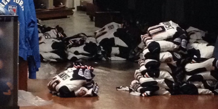 Photo by Reddit user SMIRTLE
For one thing, a photo of the jersey was leaked tonight by Reddit user "SMIRTLE," who wrote: "At MSG for a basketball game and happened to pass by a gift store where the unreleased winter classic [sic] jerseys are lying on the floor!"
He obviously meant Stadium Series, not Winter Classic. But the point is, you can see parts of the jersey from his cell phone shot. A nice little sneak peek.
New sweater includes mix of past jersey features
As it happens, I was able to get a look at the full front and back of the Rangers' Stadium Series jersey today. So I'd like to give the diehards an idea of what to expect tomorrow.
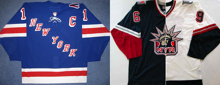 Photo (left) by @CJ_Matthews
The jersey features elements of each of the above uniforms previously worn by the Rangers. I'll explain with some bullet points.
- It's white. (That's obvious from the leaked photo.)
- The Rangers' tradition of diagonal text running down the chest continues. But instead of "RANGERS," it says "NEW YORK." (That design was used back in the early '80s as well as for a 9/11 tribute sweater.)
- In this case, "NEW YORK" will be blue, outlined in silver and red. It's been chrome-ified.
- The color scheme harkens back to the Lady Liberty third jersey from the 2000s. That is, the navy blue and silver are back. No royal blue on the jersey.
- Also, the sleeve striping is based on that NYR sweater. In this case, a thin red stripe lies between two thick navy blue ones with some white space between them. (That's also visible in the leaked photo.)
- The template most closely resembles the Ducks' jersey. Navy blue on the shoulders and down the sides with one solid blue stripe at the base. The new lace-up collar style.
- The Rangers' shield logo is featured on the left shoulder. The Stadium Series patch on the right.
- The name and number style matches what we saw on T-shirts last month. (And on the white version of the Lady Liberty jersey above.)
- The back numbers are elongated and the sleeve numbers are angled.
One more note. You may recall the Rangers — despite playing on their "home field" at Yankee Stadium — are designated as the "visiting team" for both outdoor games. Their opponents, the Islanders and Devils will count these as "home" games. And as is standard, the road team wears white while the home team dons their dark uniforms.
I can't imagine I've left any stone unturned here, but if you have any questions, feel free to ask. Or, you know, just wait until tomorrow afternoon.

Devils fight back against Stadium Series modernization
Speaking of the New Jersey Devils, they are the one team I don't have solid information on. But in this case, I trust the rumors. And you probably will too once I lay it all out.
Knowing as we do Lou Lamoriello's stance on jerseys — that is, the Devils wear red, white or, begrudgingly, a throwback and NOTHING else — it's no surprise to hear that New Jersey will apparently be sporting their red and green retros this winter.
They've been used on or around St. Patrick's Day in recent seasons since 2010.
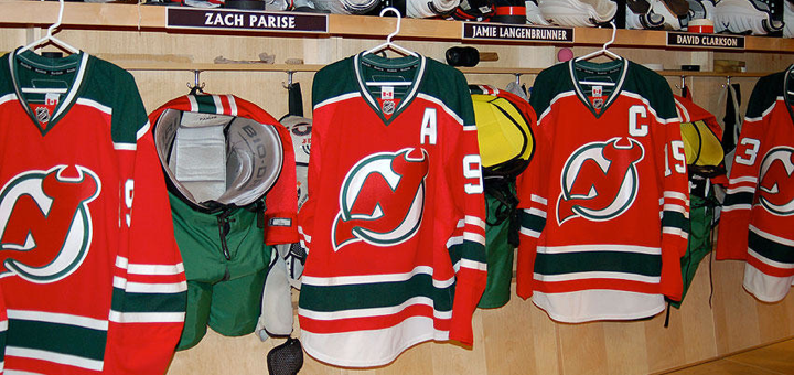 Photo from New Jersey Devils (2010)
This goes against the decidedly modernized jersey designs being implemented for the Stadium Series. And it's speaks to Lamoriello's sweater conservatism in a big way. Was he able to fight back against the powers at Reebok and the NHL?
But there's a twist. Even if the colors and striping survive, it sounds like we're still getting that chrome crest. There are some battles you just can't win, I suppose. I'm eager to see how it all comes together. The Devils have not announced a public unveiling date yet.
Neither have the Blackhawks.
UPDATE 12/20 (10:34 AM): The Blackhawks tweeted this morning that they're "gearing up for a special unveiling this afternoon!" So it looks like we'll get the Rangers' and Hawks' jerseys around the same time — today.

Hawks bringing back black for Stadium Series
Here's one we should've seen coming. Instead of a red Stadium Series jersey for the Chicago Blackhawks, they'll actually be wearing black. (That's going to be one dull-looking game at Soldier Field, I'm afraid to say.)
As far as the design itself, there's good news and bad news. I'll start with the bad. The template lives on and it does some unpleasant things to one of the game's most universally loved sweaters. The good news — it's still kind of a throwback and it's one of the best-looking Stadium jerseys!
Remember the Hawks' black third jersey? It debuted in 1996 (like the Burger King and Wild Wing monstrosities, in fact) and lasted until the Age of Reebok in 2007. It was brought back the following year in the Edge cut before being replaced by the 2009 Winter Classic jersey.

It's back! Imagine this jersey on the new Stadium Series template. It doesn't totally ruin it, but it does make it less awesome. The stripes don't wrap completely around the sleeve and there's no black space at the very bottom of the jersey. Then there's the chrome thing. And the angled and elongated numbers.
The classic yellow "C" patch is emblazoned on the left shoulder — although I believe it was spared the chrome treatment. Of course, the Stadium Series patch is on the other shoulder. The new modern collar laces are also in play here. They're white.
This one will easily be the least-hated jersey among traditionalists who dislike the new-fangled template. And I'd say it was the best thing the Blackhawks could've hoped for given the parameters of it.
Which of the three jerseys are you looking forward to most?