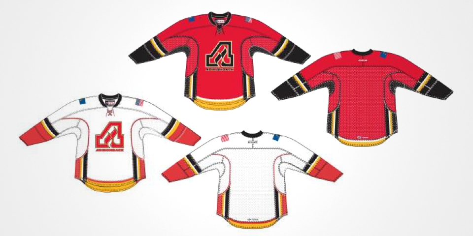
Arizona Coyotes to wear throwback jersey in March

The Arizona Coyotes have announced their theme nights for upcoming 2014-15 season — including the date for the highly anticipated Throwback Night, which will be Thurs., March 5.

From the announcement:

Thursday, Mar. 5 vs Vancouver Canucks (Throwback Night): Celebrate the Coyotes history in the Valley of the Sun and watch the team play in one of the franchise’s original uniforms. The first 5,000 fans in attendance will receive a throwback Jeremy Roenick Bobble Head courtesy of Gila River Casinos.

The Coyotes haven't yet said which of the jerseys will be worn for that game. Dark jerseys are worn at home these days, but when the Coyotes arrived in 1996, teams wore white at home.

That brings us to the Canucks. Might they wear a throwback jersey as well? This theme night is about the Coyotes, so it's unlikely. But you never know. Keep the spaghetti skate in mind next March!

Phoenix Coyotes uniforms, 1996—2003

ECHL selects winning fan-designed All-Star jersey

I recently came upon a story that's been out there a very long time — that I apparently never followed up on. Last December, the ECHL announced the winner of its 2015 All-Star Classic jersey design contest.

The contest began in early December and the winner was named the day before Christmas Eve. It turns out Jordan Roberts was the creator of the winning look.

One of the finalists was frequent Icethetics and IceHL concept contributor Matt McElroy. He created Option C in the graphic above.

The 2015 ECHL All-Star Classic, hosted by the Orlando Solar Bears, will take place at the Amway Center in Orlando, Fla. on Jan. 21, 2015.

The game will feature a showdown between the host team and the ECHL All-Stars. The Solar Bears' All-Star Classic jersey has not yet been released.

What do you think of the winning design? And what do you think the Solar Bears will do?

Penguins' new third jersey is up for pre-order

The Pittsburgh Penguins are now taking pre-orders on their new third jersey, sight unseen. But based on a tweet from the team today, we have an unveiling date of Fri., Sept. 19.

No images of the sweater have been made available yet. However, I have been told by a source that it will be similar to the yellow jersey the Pens wore for home games during the 1983-84 season.

Pittsburgh Penguins home jersey, 1983-84

Who's excited?!

Major shake-up coming to minor league hockey?

Rumors have been flying this summer about a major shake-up to minor league hockey in North America.

Most noteworthy is the potential merger of the ECHL (formerly known as the East Coast Hockey League) and the CHL (Central Hockey League) possibly next summer — in time for the 2015-16 season.

A handful of west coast NHL teams would love to have their player development systems a little closer to home — geographically, anyway.

The top tier minor league is the AHL (American Hockey League). The teams are heavily concentrated in the northeastern United States — six of 30 are in New York state alone — and none are farther west than San Antonio, Texas.

The Kings, Coyotes, Sharks and Ducks are reportedly among the NHL teams looking for a big shift in the minors.

If you're interested in a long discussion about the what-ifs, I couldn't possibly improve upon the piece Travis Hughes put together on SB Nation. Give it a read if this sort of thing interests you.

All I know is it could be a huge topic of conversation here next summer and there will surely be plenty of opinions and ideas to go around.

Now let's get back to the present with a look at some of what's new heading into the 2014-15 season.

INFOGRAPHIC: Affiliations between NHL/AHL/ECHL/CHL teams in 2014-15

Click here to download full size.


Adirondack Flames jersey designs revealed

Given that the AHL's Adirondack Flames are owned by the NHL's Calgary Flames, it's no surprise to see the sweater synergy here.

I'm not aware of any "official unveiling" of these sweaters nor would I expect it. (The Heat wore the same thing, only with the yellow swapped for grey.) The above images were found on the A-Flames official online store.

Still, there are noteworthy attributes to discuss. First, the team will evidently wear "Adirondack" on its sweater beneath the flaming "A" on the crest. Seems unnecessary, but then this logo was originally used in Atlanta in the NHL in the 1970s.

Second, the Flames wear national and provincial flags on the shoulders of their uniform. But Canadian and Albertan colors would be well out of place in upstate New York.

Instead, we can see the A-Flames will use the United States flag on their left shoulder and the New York state flag on the right.

If you're unfamiliar with the New York flag, click through the mini-gallery above.

And if you want to weigh in on the design, vote in the poll to the right.


Binghamton Senators update sweaters

Never ones to be satisfied with a uniform design, the AHL's Binghamton Senators will have a new look when they hit the ice for the 2014-15 season.

The overhauled jerseys were unveiled last Thursday, Aug. 30. Both are based on the Reebok template first employed by their parent club, the Ottawa Senators, for that 2008 third jersey.

The B-Sens' alternate logo continues to take center stage on the uniforms while the primary logo that's been in use since 2002 is nowhere to be found.

Also of interest is Ottawa's secondary "O" logo seen on the right shoulder.

By the way, you may notice the CCM logo has replaced Reebok just below the collar on the back. We'll be seeing a lot more of this throughout the minors and juniors. But don't expect to see CCM in the NHL anytime soon.

We've known for a while that Adidas wants to get its Reebok brand out of hockey to focus on runners. But they still need permission from the NHL. When they get it, they'll want to use the Adidas logo.

That could happen as early as the 2015-16 season. Reebok's contract with the NHL ends in 2017.


Indy Fuel show off jerseys, mascot

On Aug. 1, the ECHL expansion franchise Indy Fuel gave us our first look at their uniforms and mascot.

The Fuel are picking up where the Cyclones left off, with a color scheme and jersey design that look awfully familiar. Guess it's a good thing Cincy went in a new creative direction this year.

The sweaters are pretty standard, but do have some unique qualities. The striping is far from earth-shattering, but the collar is one of a kind. And it sure looks to me like they're trying to mimic Nike's hockey jersey styling with those shoulders.

If you're curious about the number and letter styles, see the tweet on the right in which comedian Jim Gaffigan is presented with his own Fuel sweater.

Perhaps best of all, though, is Nitro. The "hockey-loving dragon" will serve as the Fuel's mascot. They really did refer to him that way in the press release. Have to love minor league hockey!


The Chill third that might have been

You guys remember the St. Charles Chill of the Central Hockey League? Two years ago they held a big logo design contest, won by Alex Flick. Then a year ago, they began their first season. Which also turned out to be their last season.

The Chill folded in May. Alex won season tickets for life when his logo design was chosen by the club. He probably didn't expect it to end this quickly. 

Alex had been working on a third jersey concept that was going to be used by the team this season. It's obviously not happening now, but I thought it might be worth sharing with the community.

By the way, it's been a bad offseason for the CHL. After losing the Chill, the Denver Cutthroats and Arizona Sundogs shut down in quick succession, leaving the league with just seven teams competing in 2014-15.

The news wasn't as bad in the ECHL, though. The San Francisco Bulls, as we know, folded midseason, and the Las Vegas Wranglers recently announced they were suspending operations for 2014-15 while they try to secure a new building.

Coincidentally, perhaps, that was not long before the rumors of the NHL expanding to Las Vegas. I'll let you draw your own conclusions.


Look for full season previews for all the leagues coming later this month.

ECHL's Cincinnati Cyclones unveil new logos, uniforms

The "winds of change" are blowing in Ohio. On Friday, the ECHL's Cincinnati Cyclones unveiled a sweeping rebrand with new logos and uniforms.

Cincinnati-based agency LPK developed the new look. They kept the black and red color scheme, but yellow is out and grey takes on a bigger role.

This revision signals a major shift in the team's identity, from the goofy, kid-friendly cartoon character to a simpler, more professional lettermark.

Twister, the hockey stick-wielding toothless tornado, has been part of the franchise's iconography since 1996, when it was a member of the old International Hockey League. He remains their mascot, however.

Unsurprisingly, longtime fans haven't responded positively to the redesign. Below the article announcing the new look, one fan commented:

Way to take a fun, unique logo that has great brand recognition in the city and turn it into this generic, minimalist shit that could be the logo for ANY team in ANY city.
—Brandon Noble

To his point, when I first saw the logo, I thought it could've passed for a solid Carolina Hurricanes concept. Then again, as much as I may dislike the cartoony marks found around the minors, they do tend to resonate with fans.

So there are two sides to this. Longtime fans love the old design for its fun distinctiveness. But those with a more sophisticated sense of design and lack of attachment to the team might prefer the new look.

Which side are you on? And what do you think of the new look of the Cyclones?

I don't know about you, but for me, there's something about that grey third jersey.