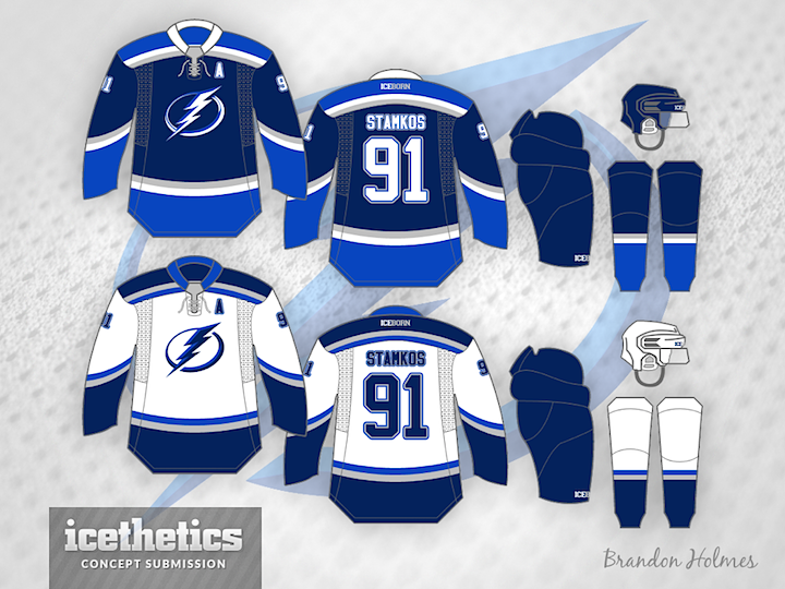
Ice Bowl XLIX

Our Super Bowl tradition continues with a trio of concepts converting the opponents in today's big game to hockey teams. First up is this sharp set from Justin Nahhas.

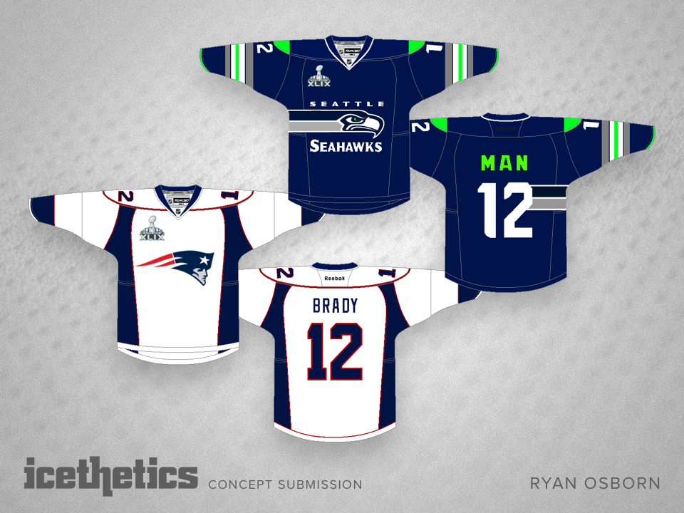
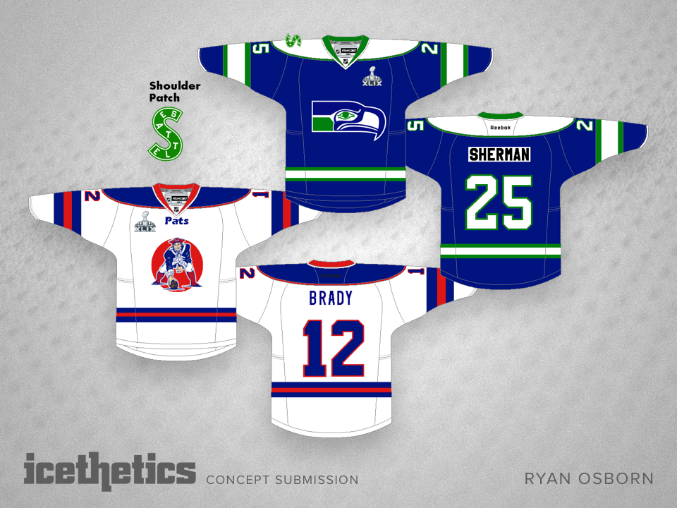
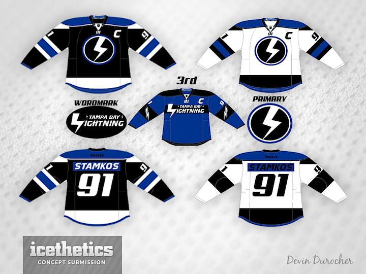
Ryan Osborn couldn't decide between modern or throwback jerseys — so he sent both.

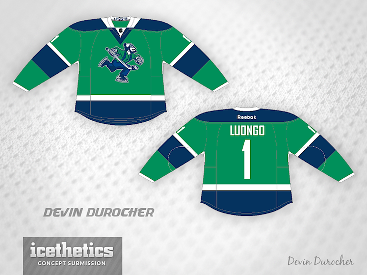
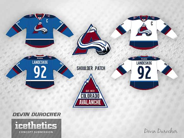
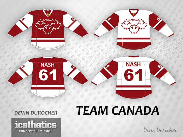
And Devin Durocher went full on retro with his entry. Which one is your favorite?

Now that you're in the football spirit, take a look back at our previous Super Bowl concepts in 2014 and 2013. And then there's my favorite NFL hockey concept of all time.

0685: Johnny Canuck

As Tampa/Vancouver Week winds down, we continue to explore the Canucks' ongoing identity crisis. On Tuesday, the stick-in-the-rink logo was featured. Today, the star is Johnny Canuck. John Elbertson created this set with a home, road and retro-inspired alternate jersey.


Now how about in green?

Ben Macdonald's contribution would actually fit in quite nicely with John's home and road set. And that Johnny Canuck logo really stands out well on green.

Devin Durocher also went with green but I thought his overall feel was different enough from Ben's to warrant posting them together. Do you have a preference? Would you like to see Johnny Canuck on the chest of a Vancouver player someday?

By the way, is there a reason why everyone who designed a Johnny Canuck jersey put a goalie's name and number on the back? Weird, right?

0684: New Year, New Bolts

Happy New Year! Hey, believe it or not there's more than one NHL game on the schedule today. The Lightning are in Vancouver today — and so am I. And that's the reason for Tampa/Vancouver Week. Brandon Holmes gets 2014 started with a sharp two-tone blue set for the Bolts.

And as a bonus, here's a rare one. A completely original uniform and logo design from Devin Durocher. I like his simplified logo. Not sure about the third jersey. Thoughts?

We'll go back to the Canucks to finish out the week!

0594: Dual Blue Avs

Devin Durocher made a handful of tweaks to the Avalanche's uniforms — and even the logo. But while I like the two-tone blue color scheme to an extent, the logo without the oval leaves it looking a little off-balanced. What do you think? Good idea for the Avs?

0567: Team Canada in Sochi

Skipping our Winter Classic Saturday series today for something more timely. On Thursday night, the world got a sneak peek of what may be Team Canada's 2014 Olympic jersey. With that in mind, a few concept artists have toyed with the idea. Francis Matte has a revised version of the red sweater along with a white one to match.

Adam Ravenhill decided to stick with the Nike design for the red jersey and also add a white version. Any chance the maple leaf in the middle of that one could be white? Or is that sacrilege in the Great White North?

And now for something completely different. Devin Durocher submitted this one last week, prior to Thursday's leak. He writes: "It's very simple with a few accents. There is a gold 8 in the V of the collar for the 8 golds Canada has won at the Olympics. Also inside the collar at the back of the neck it says TRUE NORTH."

Thoughts on these designs? Are you worried about the official unveiling of Canada's sweaters?