Bay Area Freak Out

0228-brianbrideau-sjs.png

We wrap up February with a Freak Out Friday from Brian Brideau. He was inspired by a logo designed by Ross Taylor almost two years ago. It was meant to be a merging of the California Golden Seals and San Jose Sharks identities. This might be a neat idea for a potential Stadium Series or Winter Classic game featuring the Sharks.

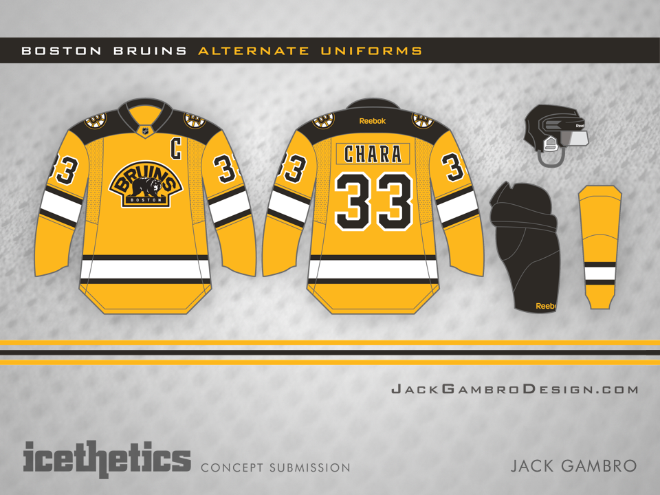
Boston Gold

0227-jackgambro-bos.png

I've long thought the Bruins could use a gold third jersey — not unlike their Winter Classic sweater from 2010. Jack Gambro seems to have had the same idea. I like almost everything about it. Only the crest feels out of place to me — being mostly gold itself.

Modern Retro Inspired in Calgary

0226-dylanwonka-cgy.png

The Calgary Flames' new third jersey has inspired a lot of concept artists to rethink the team's look. A lot them. Expect to see a lot more in the coming weeks. For now, Dylan Wonka has given the new sweater a retro feel by removing the black and replacing the crest.

The Grey Kings

0225-bastianschmulling-lak.png

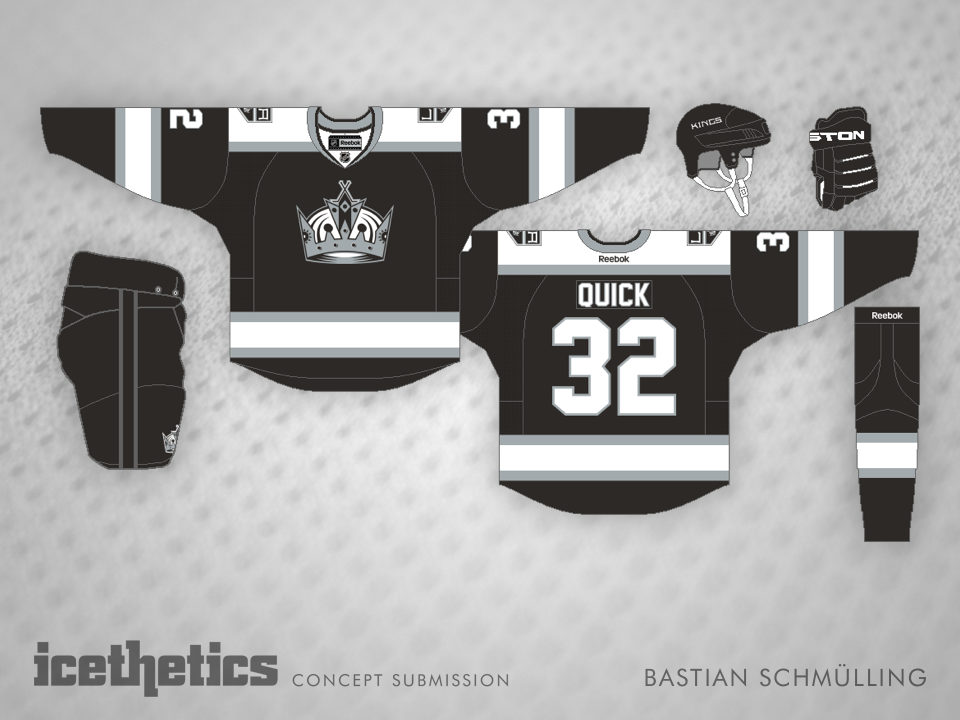
Bastian Schmülling never ceases to impress me with always eye-pleasing concepts. This one for the Kings is no exception. Grey doesn't stand out as a particularly good jersey color. But as we saw in the Stadium Series, it could make for a very nice alternate jersey if you do it right. In this case, I think it's definitely been done right.


Update

0225-bastianschmulling-lak-rev.png

With his revised design, Bastian writes: "Inspired by Kris' comment about my silver Kings-jersey, I've created a matching black version. While he suggested use silver yokes/stripes and white accents, I prefer white as the secondary-color."

Imaginary Throwback

0224-colinmay-tor.png

Colin May has been working on a series of alternate jerseys for NHL teams. Today he attempts one for the Toronto Maple Leafs. It's more of a fauxback than anything from the team's own history. But it's a cool look and definitely something I could imagine coming from the turn of the last century.