Bolt Out Friday

Freak Out Friday is taking a hiatus this week as I catch a plane to attend the unveiling of the Tampa Bay Lightning's new third jersey. Let's call it Bolt Out Friday!

Since the new sweater will be black, I have a trio of black concept jerseys to share today. First up is the above design by Kris Lutes. A lot of folks are talking about something that keeps the "BOLTS" crest but with an overall retro feel. This pretty much nails that.

Then there's this one by Caleb Fuller which has some cool arcing bolts of electricity near the collar. The team's sneak peek photos sort of discount this idea, unfortunately.

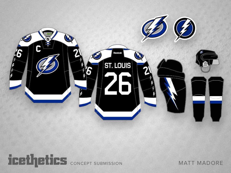
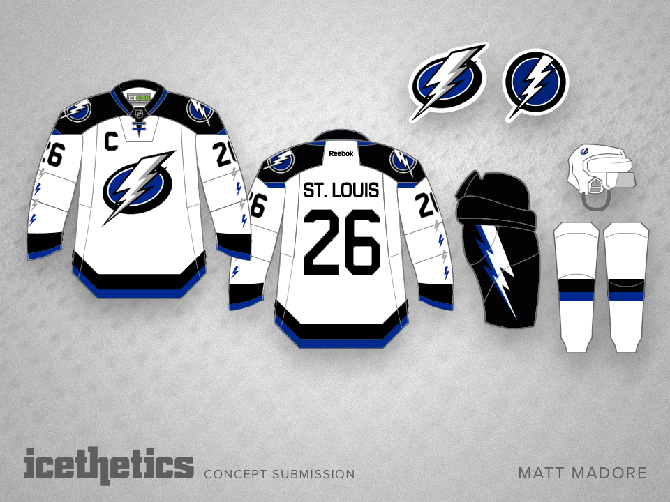
And finally, Matt Madore presents more a home/road set here that combines old and new.

Be sure to keep an eye on the blog and Twitter for updates on tomorrow's unveiling!

Redoing the Blues

There's a rumor out there that has the St. Louis Blues changing their uniforms — and possibly logo — next season. With that in mind, here's a sharp look from Kris Lutes, including both home and road alternate jerseys. Do you have a preference? Would you like to see all of them? None of them?

0627: Fixing the Jackets' Third

Not everyone is a fan of the vintage white-infused Columbus Blue Jackets' third jersey. So Kris Lutes created a different option with more red. How do you like the use of the Ohio state flag striping?

0438: Eggplant and Orange

When the Anaheim Ducks rebranded back in 2006, they lost their unique color scheme in favor of black and orange — already owned by the Flyers. Sure, there's a bit of gold in there, but it's underused. Kris Lutes put together a concept that sort of merges the new and old looks of the team by adding orange their old eggplant and jade palette. I think it would look fantastic on the ice!

Also, as you may have noticed, I'm debuting a new concept template today. It features a jersey material background texture now, replacing the old ice. Think it fits better with what we do here on a daily basis.

0298: D.C.'s Mix of Old and New

We've seen a number of concepts that have tried to mix the Caps' current look with its original one from the 1970s. But Kris Lutes is just going for it. Same jersey. New logos. Something you'd want to see on the ice one of these days?