0299: Chill Logo Contest Leftovers

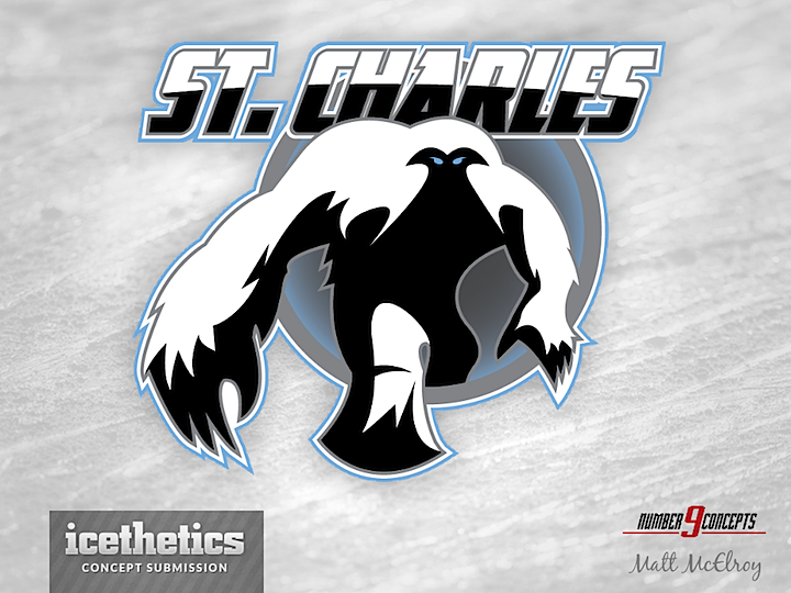
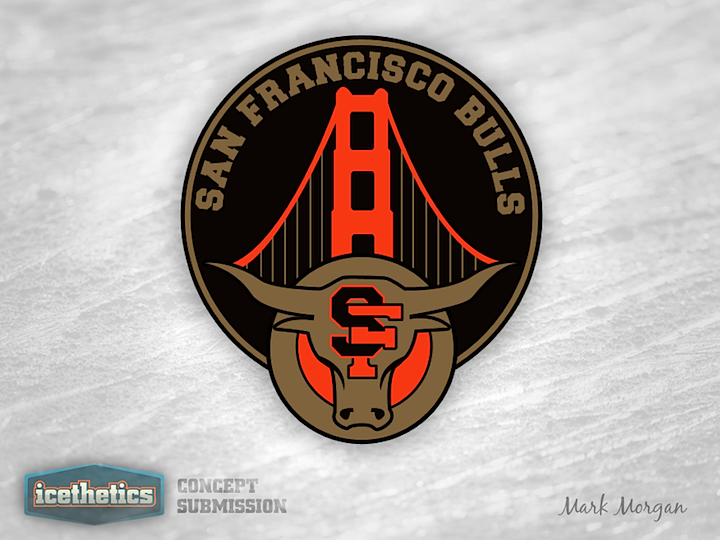
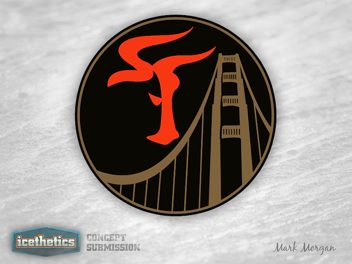
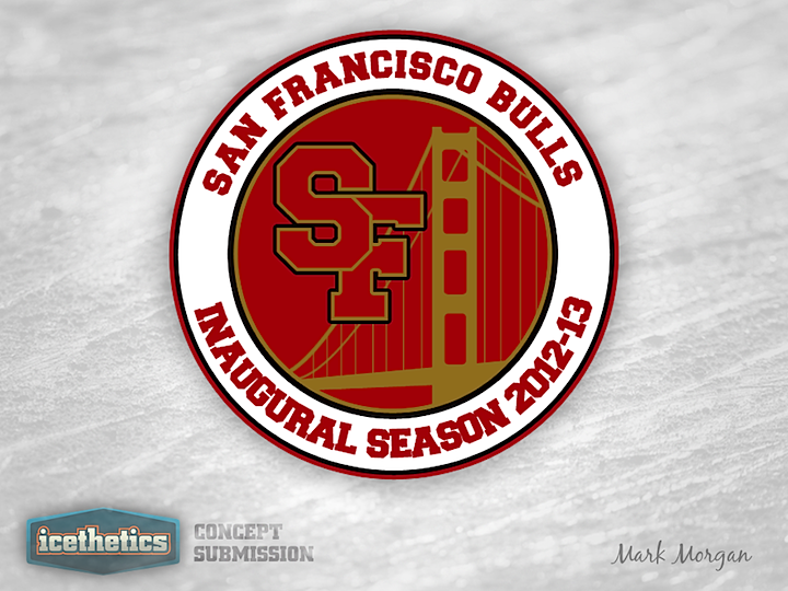
Over the summer, the St. Charles Chill — a new Central Hockey League team — held a fan logo design contest. The winner was announced two weeks ago but I did promise to share any entries that were sent my way. Matt McElroy and Mark Morgan sent in their work. And while neither won the contest, it's worth taking a look.

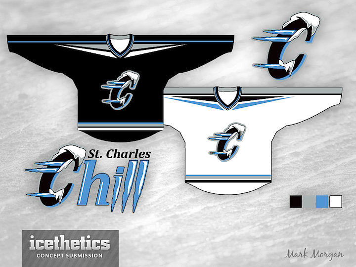
What do you think of these two options? Is either one better than the winning design?

0183: San Francisco Sunday, Part 3

Mark Morgan was the most prolific designer to take a swing at designing a secondary logo for the ECHL's new San Francisco Bulls. So I'm giving him this San Francisco Sunday all to himself. The first design features a pretty straightforward look. It incorporates the primary logo, the intertwined SF and the Golden Gate Bridge.

This next one is my personal favorite. At first glance, it looks like a weirdly-shaped SF. But look again. It's the head of a bull in profile! I didn't even know that was possible!

The last one doesn't quite use the right colors but it's still a solid and simple patch design. So which of Mark's three is your favorite?