ECHL's Cincinnati Cyclones unveil new logos, uniforms

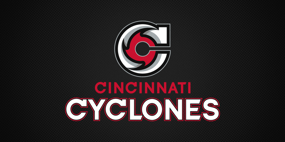
The "winds of change" are blowing in Ohio. On Friday, the ECHL's Cincinnati Cyclones unveiled a sweeping rebrand with new logos and uniforms.

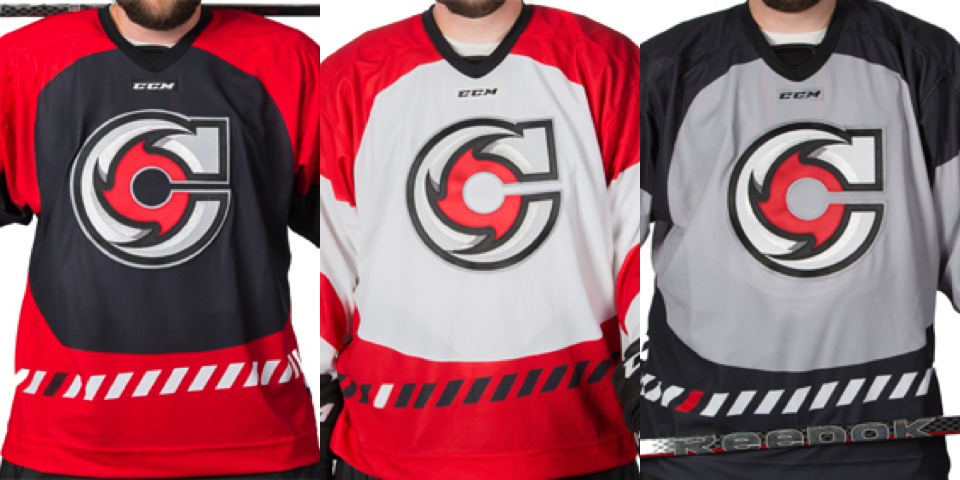
Cincinnati-based agency LPK developed the new look. They kept the black and red color scheme, but yellow is out and grey takes on a bigger role.

This revision signals a major shift in the team's identity, from the goofy, kid-friendly cartoon character to a simpler, more professional lettermark.

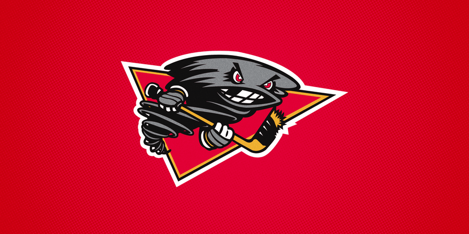
Twister, the hockey stick-wielding toothless tornado, has been part of the franchise's iconography since 1996, when it was a member of the old International Hockey League. He remains their mascot, however.

Unsurprisingly, longtime fans haven't responded positively to the redesign. Below the article announcing the new look, one fan commented:

Way to take a fun, unique logo that has great brand recognition in the city and turn it into this generic, minimalist shit that could be the logo for ANY team in ANY city.
—Brandon Noble

To his point, when I first saw the logo, I thought it could've passed for a solid Carolina Hurricanes concept. Then again, as much as I may dislike the cartoony marks found around the minors, they do tend to resonate with fans.

So there are two sides to this. Longtime fans love the old design for its fun distinctiveness. But those with a more sophisticated sense of design and lack of attachment to the team might prefer the new look.

Which side are you on? And what do you think of the new look of the Cyclones?

I don't know about you, but for me, there's something about that grey third jersey.

Are the Flyers reviving their 2012 Winter Classic jersey?

Photos by Dave Isaac/Courier-Post Staff

Photos by Dave Isaac/Courier-Post Staff

A recent offseason skate featuring members of the Philadelphia Flyers has led to speculation about its upcoming new third jersey. Specifically, it's been suggested that the 2012 Winter Classic uniform might make a comeback.

Dave Isaac, Courier-Post, wrote:

Among them was Zac Rinaldo, wearing black pants with an orange stripe down the side and many players donned black helmets, which had cream-colored numbers and an orange outline. Usually, the Flyers wear solid black pants and the black helmets have solid white numbers on them.
In the locker room, the striped pants hung in most players' stalls with the cream-numbered helmets above. In all likelihood, this is part of the Flyers' new alternate kits this season. The team will debut, at some point, a third jersey. It sounds like it's not coming soon and two players said they haven't seen the new threads yet.
The helmet and pants look exactly like what the Flyers wore in the 2012 Winter Classic against the New York Rangers. While the jersey aspect of the kit remains a mystery, expect for it to come out around training camp, if not before. Perhaps the jersey won't be new at all and that, too, will be identical to what the Flyers wore in the game at Citizens Bank Park.

I'm not sure I would say "in all likelihood." It's entirely possible the guys are just using leftover equipment they can't use in a game anymore. They wouldn't just throw it away, would they?

Then again, if the gear wasn't seen at all last year — which Isaac doesn't specify — it could be something new. But I would be surprised if the Flyers were issuing players new alternate uniform gear during the offseason. Of course, that's just me.

What do you think? Should the Flyers revive their Winter Classic look? Or go with something completely new?

FURTHER READING: Flyers confirm third jersey


UPDATE · Aug 27 · For those interested, further confirmation of Isaac's report of the Winter Classic style pants being seen in the locker room can be found on the Flyers' website.

Image from Philadelphia Flyers

Image from Philadelphia Flyers

There are a number of video interviews shot in the locker room where the orange-striped pants are visible in the background.

Flyers 2012 Winter Classic uniform

St. Louis Blues unveil new home and road uniforms for 2014-15

Our long wait ended as the St. Louis Blues officially unveiled new home and road uniforms Monday night at the Blues Ice Breaker event. The updated look will hit the ice for the first time this fall.

For those following the proceedings on Twitter, some of the thunder was taken out of the big reveal when photos of the jerseys were leaked an hour before the start of the event.

The Blues' new look follows a trend in recent years across the NHL — and hockey in general — to return to traditional style uniform design.

Some would argue the Blues were among the teams hit hardest by Reebok's push to modernize sweater designs in 2007. Here, the team reverts back a jersey not unlike what they wore prior that.

Gone is the unsightly apron-string piping. Back are the horizontal waist and sleeve stripes. And remaining unchanged is the classic Blue Note.

If you haven't yet guessed, I'm a huge fan of the new sweaters. Just as I was back in July when I got my first glimpse and shared the details with you.

From the team's press release:

Constructed from all the latest advanced materials of the Reebok Edge 2.0 system, the jersey's diagonal color striping on the sleeves has been straightened for a simplified, cleaner aesthetic. The same effect has been achieved with the return of stripes along the waistline.

It's definitely cleaner.

By the way, in case you missed the live stream of the Blues Ice Breaker, I wanted to point out some items from Brett Hull's appearance.

In preparation for the jersey reveal, the team chose to lower expectations by reminding us of a time when the Blues wore red. In other words, the new look can't be any worse than this, right?

Luckily, there was no need for low expectations and it served as a fun trip down memory lane nonetheless. I thought it was funny that T.J. Oshie told Brett Hull the Gretzky-era jerseys were his favorite. I know very few Icethetics readers would agree with him there.

Now it's your turn to chime in. What do you think of the Blues' new uniforms? Do they work for you?

New Blues jerseys leak on Twitter before unveiling

As I write this blog entry, the St. Louis Blues are minutes from the Ice Breaker event where they will officially unveil their new home and road uniforms. But just hours ago, photos of the new threads showed up on Twitter.

Photos via Twitter

These photos were were later removed from Twitter, but I grabbed copies.

This confirms the design details I first shared back in July.  In addition, the photos gave us our first look at the white road jersey and confirmation that the number and letter styles will remain the same — as seen on the home sweater.

Check back to Icethetics tonight for full coverage of today's big unveiling!

See the new chrome NHL All-Star crest on a jersey

Today we get a sneak peek at what's coming to the 2015 NHL All-Star Game. Specifically that flashy chrome crest.

A source wishing to remain anonymous provided Icethetics this photo (right) showing a Reebok practice jersey emblazoned with the new logo we first saw last month in a Reebok catalog. The design was included on a handful of All-Star Game related products.

Perhaps this is the practice jersey the players will wear prior to the game being held in Columbus this January.

The one thing that stands out to me from the photo is that the crest appears to be unusually large. It could be the angle, but it still looks big.

What do you think?

Possible 2015 NHL All-Star practice jersey?