Islanders resurrect the fisherman for final season in Nassau

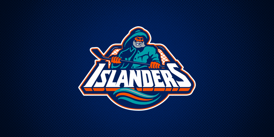
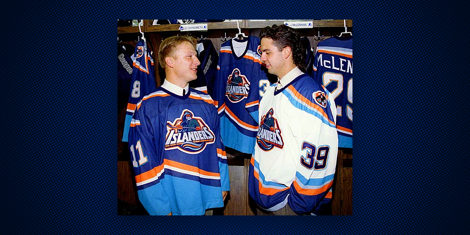
As part of their final season before moving to Brooklyn, the New York Islanders will resurrect a widely reviled symbol from their past.

Neil Best, Newsday, reported the following information on Monday night:

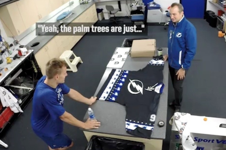
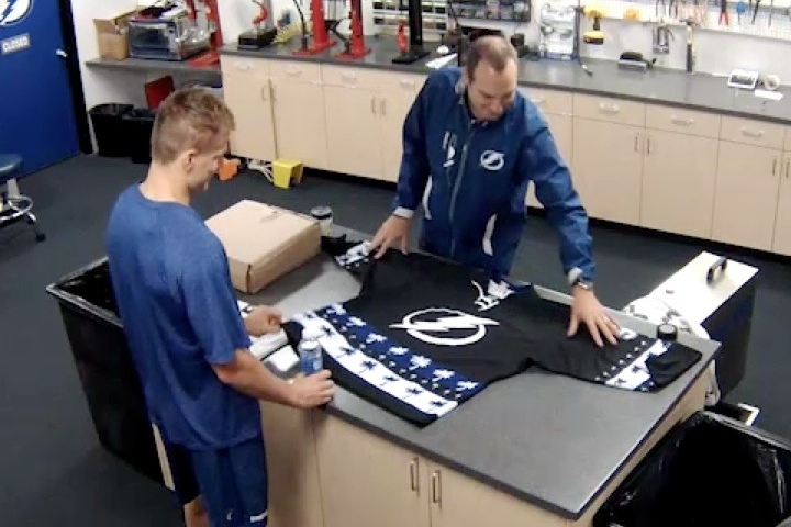
Ahead this winter: a night in which, during warm-ups, players will wear a modernized version of the notorious "fisherman" logo that debuted in 1995, after which the jerseys will be auctioned off for charity.
Those jerseys already are available for purchase by fans.
Um, shouldn't the Islanders be trying to forget that logo?
"It's part of our history," [senior marketing manager Eileen] Mathews said. "I saw probably five to 10 people in Brooklyn wearing that jersey. I think it's gotten a cult following."
She said younger fans particularly seem to like it. That presumably is because they don't remember the first time around.

Five to 10 people is a reason to bring it back? Not that I'm complaining. I was 11 when the "fish sticks" jersey came out and therefore loved it — finding the old jersey to be stale and boring.

I've developed better taste over the years, of course, but that doesn't mean I'm not excited to see this happen — and at least it won't be used in a game.

The pre-game warm-up is a good time to showcase a stunt jersey like this. Wearing it in an actual games makes it a much bigger deal than it should be.

I'm also curious about the "modernized version" of the logo Best mentioned. How exactly will it be modernized? It's only 20 years old. And why not just go with the original logo unedited?

Another thing. He says the jersey is already available for purchase. Does that mean it's available now in the team store? Can any Long Island residents out there confirm that for us?

While we wait for more details, I'm eager to see how the Islanders market this event. Should be an interesting year on the island.

By the way, the story of how the original logo was returned to the jersey is readily available on the Isles' website. I highly recommend reading it.

So what do you think of this news? Excited? Scared?


UPDATE · Oct 7 · Check this out.


UPDATE · Oct 8 · If you're still wondering about the "already available for purchase" comment, I have some news to share from Brian Erni. He writes:

Weird little wrinkle to the Isles fisherman story. Neil Best's article said the "jersey was already available for purchase by fans" but I emailed the NVMC Team Store. Here's their response below.
"We are not selling the fisherman jersey.  The team is just wearing the jersey during warm-ups for selected game(s)."
Maybe just an error on Newsday's part, but who knows. Also, I find "selected game(s)" interesting. Could be more than one.

Something to keep an eye on. I'd be surprised if a warm-up jersey were put on sale to the general public. If you want one, you'll probably have to bid in the auction.


One of the world's greatest photos.

Nameplate-gate: Red Wings fans' annual panic attack

This comes up every preseason.

And while the 2014 preseason is now over, I'm writing this post for posterity — so I can use it as a quick link reference during preseasons to come.

Every September, Detroit Red Wings fans and non-fans freak out. They tweet and email me about the "fact" that the Wings have changed the nameplate on their uniforms.

They haven't.

There's a very simple explanation. During the regular season, the Red Wings equipment staff creates custom arched name bars for each player. When you create that custom arch, the first T in "TATAR" cannot be swapped with the second T because arch skews them differently.

In the preseason, 50 to 60 rookies and prospects suit up for one or two games before being cut. It's therefore a waste of time and effort to make those individual custom nameplates for guys who won't be around very long.

To simplify the process — during the preseason only — the equipment staff employs a generic serif block font for the name bars where the letters can be quickly stitched together.

When the regular season opens, everything will be back to normal.

Breathe regular.

Review: Lightning third jersey could be improved

A week has passed since the Tampa Bay Lightning revealed their new black third jersey for the 2014-15 season. I attended the unveiling in person on Sept. 27, but I've held off on writing this review because I didn't want it to be a gut reaction.

It's no secret around here that I'm a serious Lightning fan. Have been since the beginning, way back in 1992. I've there for every high moment and every low moment. From perennial last-place finishes to a Stanley Cup-clinching Game 7 victory.

A few Lightning jerseys from my collection.

A few Lightning jerseys from my collection.

So when the Lightning introduce a new uniform, it's a bit more personal than when another team does it. In this article, I'll walk you through my take on it. What I like, what I don't, what surprised me, and what I hoped for. (With lots of photos to break up all the words.)

Thunderstorms were landing in Tampa just as I was.

Thunderstorms were landing in Tampa just as I was.

The weekend began poetically enough. As the plane descended into Tampa on Friday afternoon, thunderstorms had already done so. We don't get thunderstorms in Seattle and it had been a long time since I'd been back home to experience Florida's — lightning and all. The moment the plane touched the tarmac, a bright flash struck in the distance. See? Poetic.

It was a dark and stormy night...

My brother picked me up at the airport and we went straight to the newly rechristened Amalie Arena for the preseason game between the Lightning and Dallas Stars. Regular readers will recall the last jersey unveiling I attended was in Dallas last summer as the Stars revealed their new branding to the world. More poetry.

Pictures don't do it justice. It dwarfs Godzilla.

During the first period, the in-game host came out wearing a black Lightning jersey covered in rows of blue and white palm trees. He joked that we were getting a sneak peek of the new third jersey being unveiled tomorrow.

He then directed our attention to that massive scoreboard for a video in which Lightning public relations director Brian Breseman got feedback from Lightning players on the design.

For more on the prank, check out this blog post.

The Bolts were dominant in the 6-3 win and it was just fun to watch them. I hadn't been to a game in that building since January 2012. The new scoreboard is truly enormous, by the way.

Now let's fast-forward to the next morning, back at Amalie Arena.

This is after the event. The crowd was actually huge for a Fan Fest.

There was a lot going on throughout the day, but the main event for me and many others was, of course, the unveiling the new third jersey. When the time finally came, they dimmed the lights and pointed us toward that giant video screen for this...

The teaser photos from the previous two weeks had me pretty well prepared for the overall feel of the jersey. Thick white stripes running the length of the sleeves and the standard secondary logo on the shoulders. What I was dying to see was the crest.

Would it be the standard primary logo on the front or would they do something completely new? The diagonal BOLTS wordmark was in the back of my mind, but I figured the team would want something different this time around.

Yep, it says BOLTS again.

Though I do love having a black jersey again, when I saw it, my immediate reaction was slight disappointment. To be honest, I wanted to see them do away with the BOLTS crest.

This team has always been black and white with a bit of blue trim. In all those great photos of Lightning players lifting the Stanley Cup in 2004, they're wearing black. So I was definitely excited to have a black jersey again. But that was no surprise.

Of course if you asked me seven or eight years ago, I was begging for a blue jersey — which we finally got in 2008 with the first iteration of the BOLTS sweater. But even then, I wasn't wild about what we ended up with. Bolts. It's weird front and center.

Tampa Bay Lightning third jersey, 2008—2014

If you live outside of Tampa, you may not know that we've used "Bolts" as a nickname almost since the beginning. It probably started with the media as shorthand and was helpful when describing a member of the team. You can be a Ranger, a Penguin, a Shark — but a Lightning? Doesn't work. You can be a Bolt, though.

So I don't mind seeing "BOLTS" spelled out on the uniform, but does it need to be right in the middle like that? How about borrowing an idea from the Bruins' original third jersey?

Boston Bruins third jersey, 1996—2007

Boston Bruins third jersey, 1996—2007

Say what you will about the very '90s design of that jersey, but the "BRUINS" wordmark on the shoulder actually worked. If I was suggesting revisions to the Lightning's latest sweater, BOLTS on the shoulders would be one.

As for the crest, I think the secondary logo could look great, as demonstrated in this concept by Kevin Dion. And while we're at it, Kevin's blue sleeves could work as well.

In 2011, black was dropped entirely in the rebrand — then quickly brought back as a trim color on the numbers when fans complained. For the past three years, the Lightning have had not one but two blue jerseys. But the lack of black seemed to be ignoring the team's origins.

So. Much. Black.

So. Much. Black.

Of course this jersey just feels like we're overcompensating for the last three years.

The most common complaint I've read from fans here on the blog and on Twitter — it feels like they just merged the jerseys of the 2014 Stanley Cup Final opponents. You get your black jersey and sleeve piping from the Kings and your diagonal wordmark crest from the Rangers.

It's hard to argue with that. It doesn't seem like this jersey was well thought out with regard to how it fits into the franchise's history and identity. Or at the very least, it feels like those in charge of the design didn't have the same appreciation for the history as longtime fans do.

So I wanted to know more. During Fan Fest last Saturday, I got to spend a few minutes talking with Lightning president Steve Griggs — who did, in fact, confirm that the club's tradition was a key piece of the puzzle. Just not in the same way I was thinking.

Interviewing Tampa Bay Lightning president Steve Griggs

Interviewing Tampa Bay Lightning president Steve Griggs

The interview was brief and I hadn't fully formed my opinion of the new design yet, but the conversation provides a bit of insight behind the direction they chose.

CS: What brought about the new third jersey?
SG: I think the concept came about in the sense that we got a new home and away four years ago. Launched it four years ago and introduced it three years ago. 
What we were looking to do is bring black back into the color palette of the Lightning. And you know the other two jerseys were blue and white with a little touch of black. We went to a full black jersey in replacing our blue third jersey.
CS: I see you guys used the same crest as you did on the old third jersey. Were there any thoughts of doing a different logo on the front?
SG: Yeah we had different concepts of doing the logo on the front. Whether it was the patch or Lightning, but we kept going back to the sense that for 20 years this team's been called the Bolts.
The Bolts jersey's been extremely popular. And for a young team still, Bolts is part of the tradition and part of the organization over the last 20 years.
CS: How long was this jersey in development?
SG: It takes about a year to develop a jersey. From start to finish. 
Steve Yzerman's involved. Our owner's involved. Tod Leiweke's involved. Reebok is involved as well as the NHL. So there's a lot of people involved in it.
You know it's not just from a branding perspective, but from a performance perspective. Even Steven Stamkos saw the early renderings of it. We got some feedback from him as well as our equipment team. They have ideas too that have to be integrated into it.
CS: Did you talk to fans about the new design?
SG: Yeah, obviously got feedback from the fans. They like Bolts. They like black. One of the things we found in the feedback when we did the new home and away was the importance of the bolt on the pants, that it was synonymous with the Lightning and Bolts.
I think we've got that tradition with the new black jersey as well.

CS: Anything else to add?

SG: We're excited about it. We'll wear it [for] the first game [in the] middle of November. People can pre-order their jerseys now at TampaBaySports.com. Ships in the first week of November. In time for the holidays.
We're excited to have it. It'll be great. 
CS: Last question. What did you think of the palm tree jersey?
SG: I thought it was funny. Might use it for a Winter Classic!

If you can have an outdoor game in California, why not Florida? I like his thinking!

Despite how it may be coming across to this point in the review, I don't think the new look is all bad. I love how the blue is used outside the jersey. The sock stripes are cool — though I have to wonder why that same striping wasn't replicated on the waist and sleeves of the sweater.

By far, my favorite part of the whole set is the blue bolt on the pants. The bolt has always been white — which makes sense — but there's just something about seeing it in blue. And the the silver notches in the numbers are a neat yet subtle addition.

Note the new notches.

Note the new notches.

THE VERDICT

The truth is, there's more about this uniform to like than dislike. Yes, I'd change the crest and add more blue to the jersey itself, but other details of the design, such as the socks and blue bolt on the pants, give us something fresh to help make up for the shortcomings.

But perhaps the best way of evaluating this new sweater is by answering one question: Would I buy one? I have four Lightning jerseys hanging in my closet — the 1997 storm third, the 2007 black primary, the 2008 blue third, and the 2011 blue primary.

The answer is no. I will not be adding a fifth this season.

In the end, while I may enjoy seeing it on the ice, it's not one I'm dying to wear.

So there's my take. What's yours? Has your opinion changed since you first saw the jersey last weekend? Do you think it might change after seeing the full uniform in a game?

Lightning return to black with new third jersey reveal

The Tampa Bay Lightning officially revealed their new third jersey today, and the theme song was "Back in Black" — literally.

Fans have been itching to have black back in the team's palette and the team has listened. The color was initially lost in the 2011 rebrand — despite the fact that the Lightning were the NHL's first and only black and blue team from the beginning. 

But now a wrong is being righted to an extent.

The new sweater is almost completely black. It deviates only with minimal white trim and a blue collar and shoulder patches. The BOLTS crest, however, is the one element carried over from the previous third.

If you're wondering how I feel about the jersey as a longtime Lightning fan, it's late at night and I need time to collect my thoughts. I'm going to go into more depth in a separate blog post which will include my interview with Lightning president Steve Griggs.

For now I'll admit that on first glance, my reaction wasn't too far from many of the comments I read on Twitter and Instagram throughout the day. I was underwhelmed and somewhat disappointed.

That isn't to say this is a bad jersey. But we all have our expectations and they can't all be met.

Meantime, flip through the photos and feel free to share your take below. I'd love to get a better sense of what you guys think.

Bolts prank players with fake palm tree third jersey

The Tampa Bay Lightning pulled an awesome practical joke on a handful of players regarding their third jersey. And the video evidence is priceless.

As I may have mentioned, I'm in Tampa this weekend for the unveiling of the Bolts' new third jersey on Saturday. So I decided to catch Friday's preseason game against the Dallas Stars — which was excellent, by the way. I'll take a 6-3 win any day, exhibition or otherwise.

During the first period, the in-game host came out wearing a black jersey with the Lightning bolt on the front and stripes formed by rows of palm trees. To anyone reading this blog, it would've been obvious it wasn't an actual game jersey.

But it seems Lightning players are a bit easier to fool.

The hidden camera footage reveals player reaction to being told this is the team's new third jersey. Highlights include Radko Gudas saying, "That's sick! We have palm trees on the jerseys? That's amazing!"

Really, Radko?

Another guy called it a "Christmas sweater with palm trees on it." When asked how to fix the design, another said "maybe one row" of palm trees.

Yeah, that'll do the trick.

In all, a good joke, well-executed. If anything, it tempers expectations for tomorrow. No way to be disappointed when we can say, at least it doesn't have three rows of palm trees on it.

Be sure to keep an eye on the home page with my Twitter and Instagram updates all day tomorrow. I probably won't get around to putting together a blog post until later Saturday night.

Hope you enjoy the coverage!