0355: Sabres or Swords?

This one is sort of a mix of old and new. Matt Marczel says he "was inspired by the old Cinncinati Swords of the AHL during the '70s" for this concept. Their classic look would still work today. But then so would Buffalo's original jerseys from the 1970s. If only they could lose all the extraneous silver piping and fix the blue.

For reference, here's a look at the old Swords jersey.

0340: Deleting Black From Dallas

I know the Dallas Stars are working on a new logo for next season, but if they weren't, I could live with the way Matt Marczel has altered it. To me, these jerseys are fantastic!

0115: The Stars of America's Capital

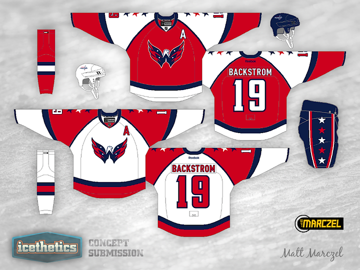
Another double feature on this Tuesday! Stars Week wouldn't be complete without a stop in America's capital city. In his Washington Capitals concept, Matt Marczel hasn't just added stars to the jerseys, he's added them to the logo as well. Look at these and tell me that "Weagle" logo doesn't belong on the front of a uniform. Granted, the stars may be a bit much.

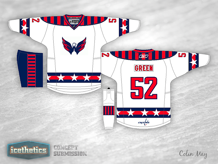
We have another prolific artist in Colin May who thinks the Caps jerseys need more stars. I find myself oddly enjoying the shoulder yoke on this one. You wouldn't think I'd like it that much in this context, but somehow it works. Got a favorite between these two?

0087: Fixing the Islanders Third

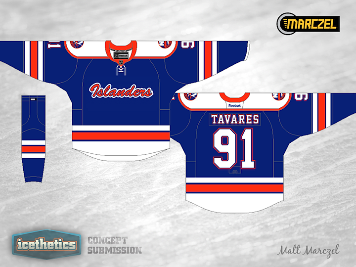
There was some confusion in last week's NHL JerseyWatch update as to whether the Islanders would be altering or even dropping their new black third jersey. They put the rumors to bed with a tweet from their official Twitter account, but that doesn't mean we can't improve the jersey on the Concepts page. Matt Marczel has this to offer.

0063: Feelin' Retro in Philly

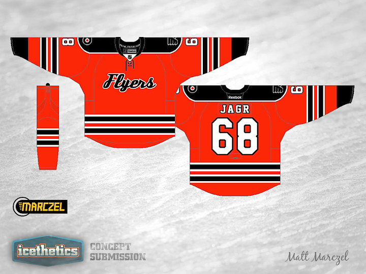
It's another Winter Classic Weekend. Matt Marczel has put together a nice retro-inspired sweater for the Philadelphia Flyers. If you ask me, the only drawback is the Jets-style striping.