Out of Springfield

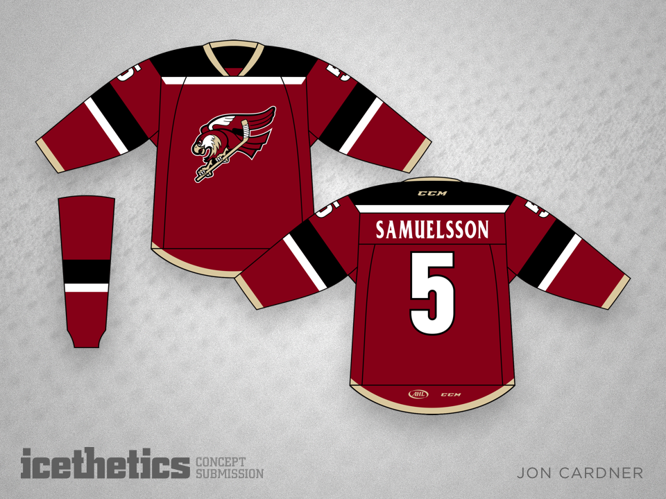
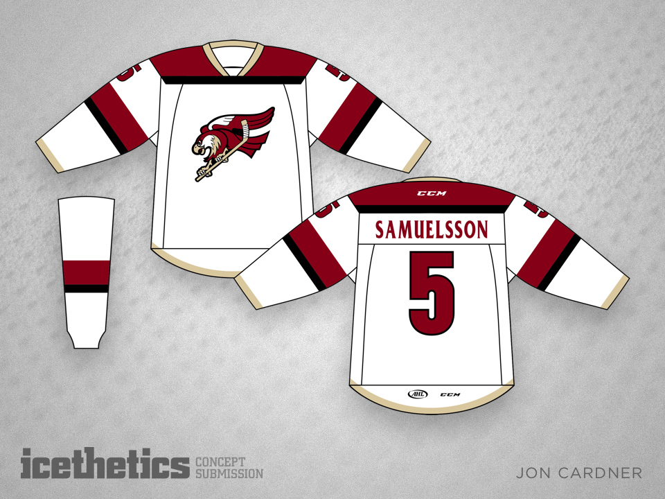
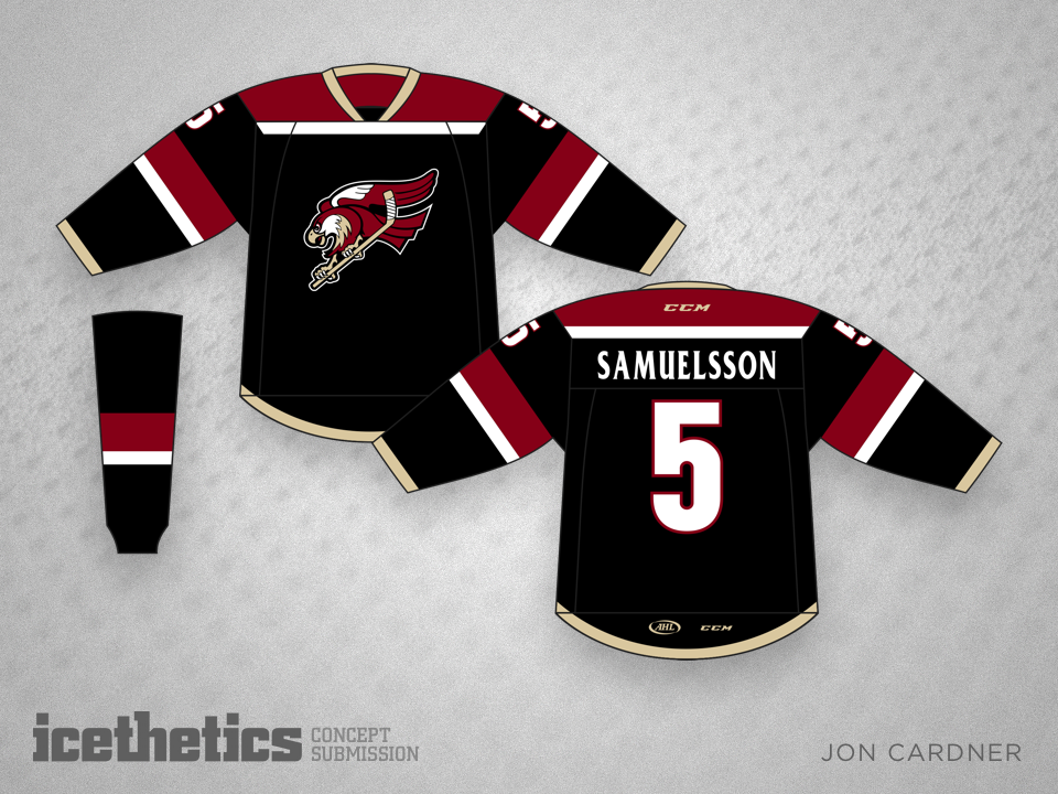
We learned this week that the AHL's Springfield Falcons will be moving to Tucson, Arizona next season. Any chance they keep the Falcons name and logo but switch to Coyotes colors? Jon Cardner originally designed this for Springfield, but it could work in Tucson too.

Classy Winter

The "black-and-blue" marketing tag lines practically write themselves when it comes to next year's Winter Classic between St. Louis and Chicago. And there's plenty of opportunity for colorful sweaters, but I kind of like Jamie Robertson's take. It may be a bit drab, but it's classy as hell.

Wild Wing Returns!

Twenty years after that bizarre third jersey debuted, newcomer Dakota Pitts proposes bringing it back in today's colors. You laugh, but there might be something to this. No? You're just freaked out?

Tampa Perfection

I'm off to Tampa today for a short visit, so I thought it might be appropriate to share one of the best Lightning concepts I've ever seen. Andy Bourne has just about nailed it. Perfect use of colors. Perfect striping. The one thing I'm not loving is the drop shadow on the crest, but I do like the 3D shading effect in the bolt. Put these on the ice. I'd buy all three.

Wild Earth Tones

Rick Meier makes his debut on the Concepts page with a rethink for the Wild. He writes:

Having a passion for the MN Wild and hockey in general, and having heard the criticism of its Christmas colors, I decided to go with a more earth tone variation. Earth tones virtually never clash. I also did a little redesign of the shoulder patch used on their away jerseys.