Redesigning Boston, Buffalo Unis
/Good afternoon, everyone. First off, apologies on the late posts today (including the new poll), but you'll understand once I explain. See, my girlfriend and I bought a Nintendo Wii today.
Enough said. That should explain everything.
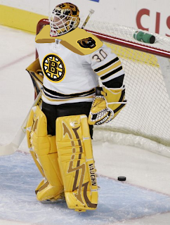
Now onto today's concept art. We'll start with the Boston Bruins, who I believe, already have perfect jerseys. However, I posted some pretty cool concept art a couple of months ago.
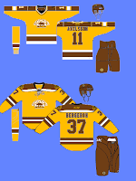
The other day I got an email from a reader who shows us what that idea might look like on a player.
I'm not completely repulsed by it. I like what they have now, but this isn't horrible. I sort of like that bear on the shoulder. Not so much with that spoked "B," however.
 This concept is along the same lines. I like the idea of brown and yellow for a potential third jersey, but they'd definitely need to use the new secondary logo with it.
That's just my opinion. But I really do think they need that yellow third jersey hanging around for the future.
I don't know about the brown pants though. It might look good or it might be a big mistake. I'd have to see it on the ice first.
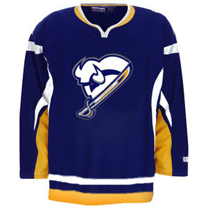
Anyway, here's something I really like for the Buffalo Sabres.
I think it needs a little sprucing up, but it's really sharp! I don't care for the horizontal stripes on this sweater, but that logo could work very well if the organization is insistent upon this particular type of bison.
It's a little too monochromatic the way it is now, but with a little color we just might have a winner.
Do you have an opinion on any of these designs? Well, you know what to do with it.


