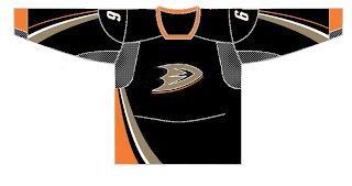
HF&P, Part 24: Anaheim Ducks
/I'm going to keep them coming. More fan-designed jerseys for you to look at today as part of the "Hockey Fans & Photoshop" series of posts. Now featuring the 2007 Stanley Cup Champion Anaheim Ducks.
I know, I know, it's the wrong jersey format. You want to know what happened to the Rbk EDGE. Well I didn't promise these would all necessarily be new uniform designs for the 2007-08 season. Today we have what I imagine are graphics designed last summer when the new Ducks logo was unveiled following the announcement that the team would be dropping "Mighty" from their name. The uniforms were announced at the same time, but it seems certain folks weren't impressed and wanted to take a shot at it themselves.
 So I guess somebody thought this is how they'd look. Yeah, not so much. On the other hand, it also appears another designer would have preferred to see a dark green instead of black. Someone apparently called "Fonz." Thing is, I actually like the color. The design is pitiful. Horribly pitiful. But I think the colors work — not that I dislike the black. I just dislike the logo in general.
Attention NHL teams: STOP SPELLING OUT YOUR TEAM NAME IN THE FUCKING LOGO! Perhaps my message came across that time.
No, but seriously I understand why they did that this season. They're trying to re-brand the club and get people to stop saying Mighty Ducks. It's cool but I really hope they switch things up with the new Rbk EDGE jerseys next fall.
More coming today: the Dallas Stars.

