All About The Isles
/The New York Islanders unveiled their new Rbk EDGE jerseys to little fanfare last week. Some fans liked them. Some were indifferent. And some were none too happy with the striping and patchwork essence of the sweaters.
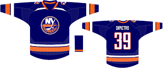
 This design is very simple and screams Islander hockey to me, no question. I'm not sure what those semi-stripes are protruding from the collar, but I kind of like them. The best thing about it for me is the lighthouse logo on the left shoulder. I really think the Isles should've kept that or something like it after their late-'90s uniform disaster. Fact is, it wasn't all bad.
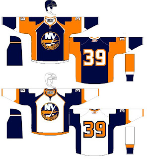
That's probably the best I've got to offer, but there's still more. One fan adapted this Los Angeles Kings concept with Islanders colors.
I think it needs a little work around the shoulders, but overall, it would be an improvement on the official jersey modeled by Rick DiPietro and Brendan Witt last week.
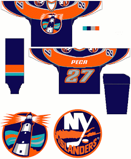
The last conept I have to offer comes from the same artist who created the designs I posted earlier today. And yes, it makes use of the lighthouse logo — as a primary crest. It might be going a little too far, but I figured it was worth a look.
Isles fans, any thoughts on these? Are the new Rbk EDGE jerseys that bad or am I making too much of that? Leave your comments below.


