Concepts For 'Hawks, Ducks, Devils
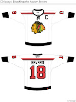
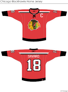
/I'm curious to see the reaction in this one. A lot of you profess the Chicago Blackhawks to have the "most beautiful" uniform in all of sports. I don't see it but that's only me. However, I could very much get behind a design like this.
 Even the white one is awfully sharp. The striping is clean and very minimalist. But would something like that result in an upheaval of the hockey world? Do things always have to stay the same?
Either way, the design work is very clean and I'm curious to see comments on this set.
This next one will be met with nothing but hate I'm sure. The striping is one thing. The name above the logo is another.
I'm sure that would result in even more blowback than 'VANCOUVER" across the front of the Canucks' jersey. But of course, these are all just fan-created concept designs. A bunch of what-ifs.
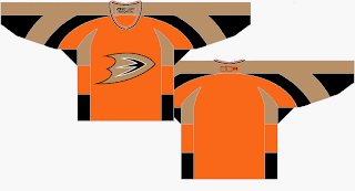
Here's a thought for the Anaheim Ducks.
It's the orange sweater Flyers fans have been begging for. Personally, I think it's too much for the Ducks. I think orange needs to be an accent for them. Let gold be the main color. As much as I don't like black jerseys, I think the Ducks' look sort of requires it. Thoughts on that?
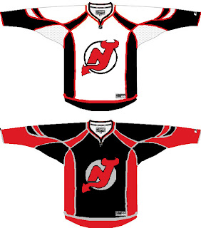
And then we have a look at all-star template-based New Jersey Devils concept.
You know you love the piping. I like the idea of a black Devils jersey — despite that fact that I just said I don't like black jerseys. The reason here being that too many teams have red jerseys now. You can add the Wild and Capitals to the fray this season. Red's a good color until it gets overused. Which is right about now.
I'll have more later. By the way, I have tons of Canadiens and Flames concepts for tomorrow — they day before their big unveilings!


