Design Tweaks
/If you've been paying any attention at all over the last few days, you've certainly notice that I've been doing a lot of tweaking to the design of the blog. I'm interested in some feedback. Let me know if you guys think I'm heading in the right direction.
I'm also introducing new logo graphics for the various polls and tournaments. I've debuted the new design with the two polls currently posted for the QMJHL Tournament of Logos. Have a look and tell me what you think.
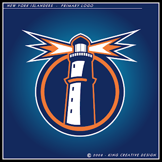
It's been a lot of work for me this weekend but I still felt like finding the time to put together a concept post for you. We're starting with a new artist with work labeled under King Creative Design. First, check out the Islanders logo he's come up with.
Outstanding, if you ask me.
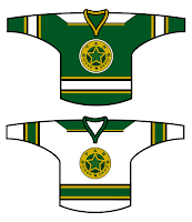
He's also got a cool new mark for the Stars and even a set of jerseys to go with it.
I'm a fan I hope to receive more from this guy to share with you all.
But moving on, here's an interesting Maple Leafs logo that turned up in my inbox.
And as you know, I've always got room for a new Blackhawks logo.
Obviously it's a tweak of the current logo. I wouldn't say it's better, but it's no worse really. Just something to look at.
I'm not sure if I do it enough, so let me take the time here to express my appreciation to all the talented artists who submit their work for me to post. You guys make this blog what it is. Anyway, that's it for today. Gotta get back to work on the site design now.

