
Where Are They Now?
/As the year comes to an end, I thought I'd update you guys on a couple of non-NHL related topics that dominated Icethetics in the later part of this year.
The USF Ice Bulls hockey club team came to Icethetics in August, looking for a new logo to get out from under the thumb of a fee-hiking university. Dozens of artists sent in amazing concepts. But only one could be chosen — designed by Gary Cekus.
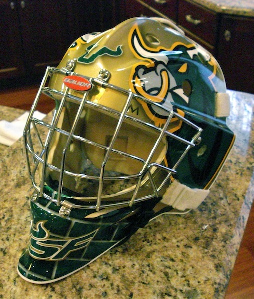 Ice Bulls goalie maskGary's design has since been implemented on the club's home jersey as well as the mask of the starting goalie.
I had to get this picture posted — not just because the goalie happens to be my brother — but because this is an awesome mask design that came as a direct result of an Icethetics contest!
The mask was designed by Todd Miska of Miska Designs, who is responsible for the artwork that adorns the helmets of such NHL goaltenders as Ed Belfour, Miikka Kiprusoff and Evgeni Nabokov.
Now he's put his touch on the University of South Florida's team and that could not be more amazing. I highly recommend checking out some of Todd's other work on his web site.
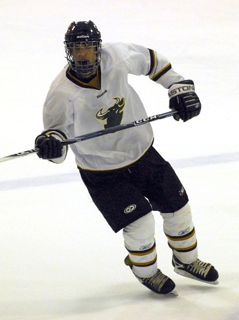 Ice Bulls home jerseyThe Ice Bulls' white home jersey also features the Icethetics contest-winning logo but unfortunately the team didn't have a lot of time to put together the best overall design.
As you can see here, they've used the Dallas Stars' road sweater, which is rather lacking in color. And while the crest logo may be a little small, they are planning to fix that for the 2010-11 season.
The road black jersey is custom-designed with the word BULLS spelled out diagonally across the front and does not feature the new logo.
For more game and team photos, check out the Ice Bulls' photostream on Flickr.
 Another big non-NHL story in 2009 was the controversy surrounding the logo selection of the SPHL's expansion franchise Pensacola Ice Flyers.
It yielded quite a bit of outrage — perhaps mostly from me — as the club announced a logo design contest then ignored the voting results right after.
 Ice Flyers road jerseySo after choosing to brand themselves with the worst logo in minor league hockey, how are the Ice Flyers looking these days? Glad you asked.
To the left you can see the jersey they had designed. Just as horrible as we all expected. It's dark blue with a lot of white and gold accents — including planes shooting across the bottom. We get it, your town is home to the Blue Angels.
The jersey is finished off with what is surely an iron-on logo on the chest. Have fun trying to embroider gradients.
 Ice Flyers in home whitesHere's a look at the home whites. Not quite sure what's going on at the bottom there. But it's definitely not the same as what's on the dark jerseys.
I hate to sound so mean-spirited toward the Ice Flyers. I'm actually not even bothered that much, but I was a little disappointed to see the mess they made here. Especially when they started out with such great options in that online poll.
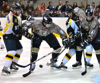 Ice Flyers in their camosFor what it's worth, the atrocities don't end with the home and road sweaters. They're all about the specialty jerseys as well. And being in a big military market, it's not hard to understand why camouflage jerseys made an appearance at one point this season.
If you want to see some more low-resolution game action photos, you might want to check out their web site. But all I can say is it's probably not worth your time.
I'm sure I've missed an update here or there, but this is all I have time to type at the moment. Have a great night and see you in 2010!