
Quack to the Future!
/Just days ago, hockey fans in Moline, Illinois were mourning the loss of hockey as the Abbotsford Heat unveiled its new logo and uniforms. But happiness now reigns as the league that once hatched the Quad City Mallards resurrects them — and with six new logos to boot.
Today the International Hockey League announced the approval of the expansion franchise. The team now has a bare-bones web site set up with the following splash page graphic — from which I borrowed tonight's headline.
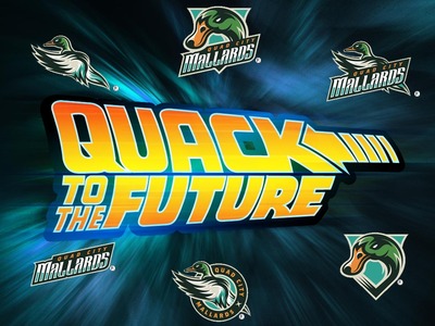
It features six different logos, two of which are textless. I didn't think you could make a mallard look intimidating but somehow these guys actually managed. And while I'm impressed by the look of this club, I can't help but wonder how wise it is to exist in the first place.
An article in the Quad-City Times points out the frequency of attendance trouble the i wireless Center has faced for hockey in the last decade. (Also talks about the management's marketing strategy for getting fans back.) The arena has been home to the sport since 1995, but has also lost two different teams — the original Mallards shut down when the Calgary Flames moved the AHL's Ak-Sar-Ben Knights to town in 2007.
Now they're gone and I hate to pass judgment on the fans, but it just doesn't seem like there are enough of them in Moline to warrant a team. Maybe you just make the 90-minute trip down I-74 to see the Rivermen in Peoria.
Having said that, there's more to this story. See, the IHL used be called the United Hockey League — the home of the first Quad City Mallards club. So in a way, it's like they just took a two-year vacation while the AHL tested the waters of a market that it found couldn't quite support it. So maybe they're right where they're meant to be.
Thanks to J.D. for the tip on this story and for making the "Mallards are re-hatching" joke. And now that you've heard enough from me, what do you guys think of the menacing green-headed bird logos above?