
Prepare the Cannon!
/ BlueJacketsXtra, the Columbus Dispatch's NHL hockey blog, broke more third jersey news over the weekend.
Turns out the Columbus Blue Jackets' 2010-11 alternate sweater will have yet another new crest, with the primary element being a cannon — a mainstay of Blue Jackets concept art here on Icethetics for a while.
Typical of Civil War imagery, it's not surprising to see Columbus work a cannon into their identity as they celebrate a decade of mediocrity with the sixth sweater in franchise history.
Here's what beat writer Aaron Portzline had to say on the matter:
NHL sources tell The Dispatch the Blue Jackets' new third sweater, to debut next season, will feature a cannon as the central part of the main logo.
It's unknown what the base color of the sweater will be, but it's unlikely to be red or silver for fear of looking too much like Ohio State.
Whenever the Blue Jackets tinker with their sweaters, fans should be compelled to raise a toast to former team president and general manager Doug MacLean. If not for MacLean, the main logo when the Blue Jackets took the ice in 2000 would have been Stinger.
First, I think it's unlikely the jersey will be red or silver simply because the team is called the Blue Jackets. It would be like the Red Wings wearing green jerseys. It would hurt my brain. Personally, I always liked the blue-black-red combo on the old third jersey from 2003. Maybe they go back to something like that?
 Second, that's cool about Doug MacLean keeping the bug off the front of the jerseys. Somehow that little tidbit escaped my radar all these years. It's like how Mike Keenan kept that awful Blues jersey from ever seeing the light of day.
Who's on board with forming the Icethetics Hall of Fame? We honor those who have made hockey look better. Keenan and MacLean should be the first inductees for taking preventive measures to protect us against ugly jerseys.
Anyway, here's a cannon logo for you. Think Keenan or MacLean would let that fly? (Out the window, maybe. Zing!)
A Whopper of a Jersey

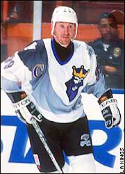 Wayne Gretzky #99Speaking of bad hockey uniforms...
One guy who will never get into the Icethetics Hall of Fame is Sam McMaster — the GM of the Kings in 1995 who approved this atrocity, then proceeded to let Wayne Gretzky actually wear it in NHL games.
Over the weekend, it seems a group of dedicated Los Angeles Kings fans held Burger King Appreciation Day — a tongue-in-cheek tribute to the 15-year-old third jerseys.
And if you don't believe me, The Royal Half and Life in Hockeywood have incredible write-ups on it as well as incredible photos of fans swarming in these sweaters.
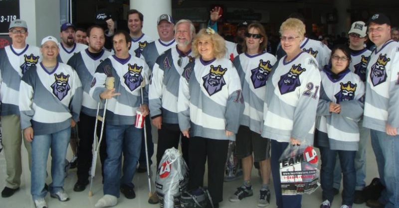 Some really dedicated Kings fans (Life in Hockeywood)
Such brave souls.
A Hell of a Jersey

 Devils' throwback uniformDon't forget, the New Jersey Devils will finally break out their red and green throwback jerseys on Wednesday night.
The one-time-only vintage sweaters, designed in the Reebok Edge style unlike the Flames' throwbacks from this season, will hit the ice on St. Patrick's Day when the Devils take on the defending Stanley Cup champion Pittsburgh Penguins — and then probably go back into hiding for another 20 years.
The Devils have a few photo galleries on their website showcasing the green-infused jerseys, including one just posted today. It shows jerseys belonging to Martin Brodeur and Zach Parise. Notice there's no black to be found — just like in the old days.
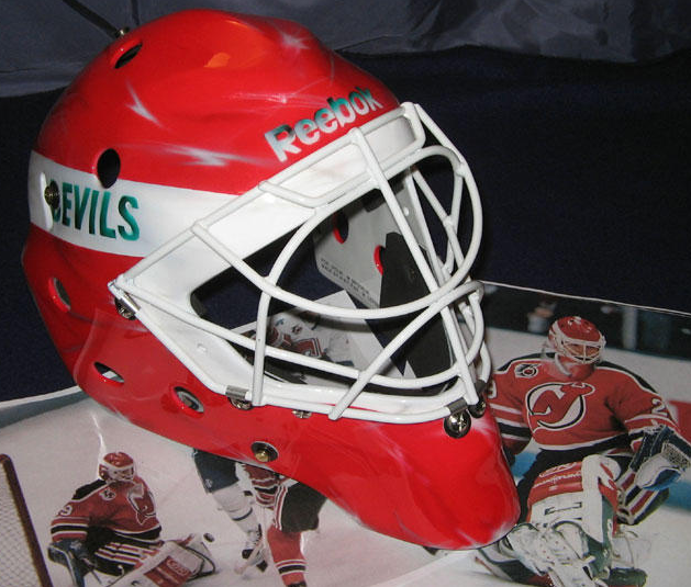 Brodeur's throwback maskI think the coolest thing is Marty Brodeur's throwback helmet — painted to match the original mask he wore as a rookie in the early 1990s before the black and red one that would later become an NHL icon.
And there's also this small gallery in which you can see Parise's helmet and some more angles of the jersey.
I'll try to have this Devils jersey gallery up right away this week. I know I've been slacking off in that area, but I really wanted to spend the time getting the new NHLToL going. And yes, I will be finishing up the Olympic jersey galleries in the near future.