
Season Preview 2010, Part I
/Squeaky clean seats not yet caked with the sticky remnants of spilled sodas. Your brand new jersey is free from mustard stains — for now. A fresh sense of hope lies ahead because this is your team's year. They're unstoppable at 0-0-0. The arena is buzzing as you settle in. Then you look to the ice and... wait, what are the players wearing?!
Icethetics can't do anything about the mess you'll make with that hot dog or the inevitable win-loss letdown, but we can get you prepared for uniform and logo changes for the 2010-11 hockey season. Welcome to the Icethetics Season Preview.
NHL Logo Changes
A handful of teams are changing logos or adopting new ones this season. We'll take a look at those in today's edition of the Season Preview.
Primary Logos
Two teams are changing their primary logos this season — both to updated versions of their original emblems used more than 30 years ago. Vintage is making a comeback.

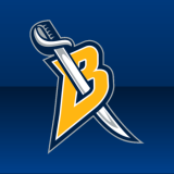
![]()
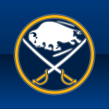
The Buffalo Sabres ditch the hated Buffaslug logo for a belated return to retro in this their 40th anniversary season. The classic logo which originated on the team's uniforms in 1970 is back with a modernized twist — silver outlining pretty much everything. The color scheme will remain unchanged. This logo was previously in use on the Sabres' third jersey.
![]()
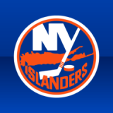
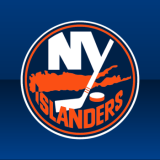
It's a subtle change but the New York Islanders go back to basics this year, swapping the navy for royal blue. The keen observer will also note that a fourth piece of tape has been added to the shaft of the hockey stick, a subdued tribute to the club's Stanley Cup championships. This logo was previously used on the Islanders' third jersey.
Alternate Logos
A handful of NHL teams will debut new alternate logos on their uniforms this season — be it on their regular sweaters or perhaps a new third jersey.
 The Toronto Maple Leafs unveiled new home and road uniforms over the summer. They both featured a brand new patch that calls back to past Leafs uniforms.
The logo matches the veined leaf seen on the team's third jersey and throughout its history, minus the text in the middle. The new leaf will be white on the blue home sweater (left) and reversed to blue on the white sweater.
The Maple Leafs have not had a secondary logo since the league-wide uniform redesign lead by Reebok in 2007.
![]()
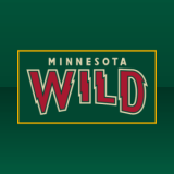
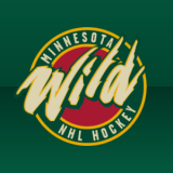
Uniforms worn in preseason games indicate the Minnesota Wild have changed their secondary logo. The ferocious wordmark, in use as a shoulder patch since 2000, has been replaced, rather ironically, by a tamer one. A version of the previous logo was the original mark used when the franchise was announced. The current primary logo was added later.
 Two teams will wear throwback sweaters for a few games this year, similar to what the Calgary Flames did in 2009-10.
The Vancouver Canucks return a fan favorite to the arsenal this season as they don a replica of their original 1970 uniform for their 40th anniversary season, featuring that classic stick-in-rink logo.
This logo was first retired in 1978. A white version of the original logo was re-introduced on the Canucks' blue third jersey for the 2006-07 season. A maroon and navy version was also worn as a shoulder patch from 2003 to 2006.
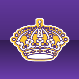 Joining the Canucks, the Los Angeles Kings will sport vintage attire on a handful of occasions, including opening night when they face Vancouver.
While the Kings have yet to officially confirm this, they did give a retro jersey to their top pick at the NHL Entry Draft, which they hosted in June.
That jersey featured this logo, which made its debut in 1967 and was in use until 1988. It hadn't been used in any official capacity until June.
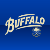 Earlier this month, the Buffalo Sabres unveiled a new third jersey with a brand new crest. It features a new script and the club's 40th anniversary logo (more below).
The logo was inspired by and pays tribute to the city's first pro hockey team, which pre-dated the Sabres by 30 years. The Buffalo Bisons wore a similar script on their uniforms. Team operations were ceased in 1970 when the Sabres began play.
The script is vintage white, emblazoned on a royal blue sweater. The Sabres' previous third jersey crest has been adopted as the primary logo this season.
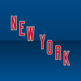 The New York Rangers will also add a third jersey, featuring a new script mark. While it has not yet been officially unveiled by the team, a sneak peek began making the rounds on the web when Sean Avery posted a photo on his blog. It is expected the team will make this official in November.
The original photo has since been removed, but we did get a look at the jersey which is dark blue and features NEW YORK in red text across the chest. The letters are outlined in vintage white, which seems to be all the rage this season.
The new script mimics what was used on the uniform during the 1930s, only it read RANGERS instead. The Rangers have not had an alternate uniform since the Reebok redesign in 2007.
 unofficialThe Anaheim Ducks will debut a new third jersey in late November. But Icethetics learned through a trusted source what it looks like earlier this month.
The sweater is highlighted by the use of the standalone webbed "D" logo, which has been in use as an alternate mark for several years. However, this is the first time it will be placed on the front of a uniform.
In addition, the Ducks are adding a new logo (left), also by looking to their past. The new mark will be worn as a shoulder patch on the alternate sweater and includes a recolored version of the original Mighty Ducks logo.
The team changed its name and colors in 2006. This marks the first time since then that the Disney-designed logo will be seen on an Anaheim uniform.
Lastly, the Columbus Blue Jackets will debut a new third jersey this season for their 10th anniversary. It is said to include a brand new logo with a cannon as the primary element. No further details have been made available at this time.
Team Event Logos
A half-dozen NHL teams are celebrating important anniversaries this season. And with that comes a number of specialty logos which will be used this season only.
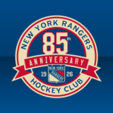
 The New York Rangers, established in 1926, will celebrate 85 years during the 2010-11 season. This logo, along with a secondary shield logo (right), will be used on team marketing materials.
In addition, this logo (left) is painted at center ice in Madison Square Garden. It uses the same colors as the yet to be released third jersey — dark blue, red and vintage white.
The alternate anniversary mark seen above is displayed in the Rangers' standard color scheme but is more likely to be seen in the "vintage" colors.
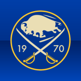
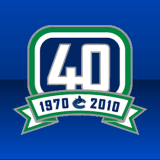 Established in 1970, the Buffalo Sabres and Vancouver Canucks will each celebrate their 40th anniversaries.
The Sabres (left) have simply taken their original logo, swapped the white for vintage white, and added the year 1970 inside the circle.
The Canucks (right), meanwhile, play off of their secondary logo, a modernized version of their original mark. The stick in the rink is replaced by a 40 and a banner beneath it displays the years 1970 and 2010 along with the club's primary logo.
Both teams will join the Rangers in using these logos at center ice during the season.
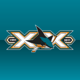 The San Jose Sharks, created in 1991, commemorate 20 years of NHL hockey in the Bay Area this season.
The Sharks will use this logo (left) as a sleeve patch, placed just below the sweater number on the left arm. Unusual placement for a patch, but the dimensions suit it.
Interestingly, this is not the only version of the Sharks' 20th anniversary logo. In fact, the team unveiled a total of five unique marks back in June.

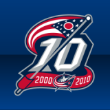 The NHL's most recent expansion franchises, the Minnesota Wild and Columbus Blue Jackets, both celebrate a decade.
The Wild (left) introduce a simple mark in which the roman numeral X stands in for a pair of crossed hockey sticks. The team's primary logo is centered in a banner displaying the years 2000 and 2010.
The Blue Jackets (right) make use of the Ohio state flag in their 10th anniversary logo, which features a large 10 underneath which a red banner shows the years 2000 and 2010 on either side of the club's primary mark.
Both teams will wear their logo as a patch on the front of their sweaters. But only the Wild have theirs painted at center ice.
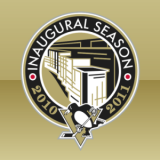 Finally, the Pittsburgh Penguins will wear a special shoulder patch, commemorating the inaugural season playing in their new arena, the CONSOL Energy Center.
The logo features a stylized drawing of the building encircled by the text INAUGURAL SEASON 2010 2011 and the Penguins' primary logo at the bottom.
The patch is situated just slightly above of the sweater number on the right shoulder. It's a little low but that may change when the season begins.
League Event Logos
The NHL will hold a number of special events throughout the 2010-11 season, each of which gets its very own branding.
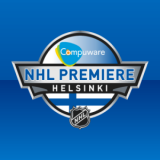
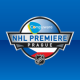

The first event of the season's calendar is the NHL Premiere, in which a few teams play their first games of the season in Europe. It's been an annual event since 2007. This season six teams will face off in three cities — each of which has previously played host to NHL Premiere games.
Helsinki will host the Hurricanes and Wild. The Bruins and Coyotes will open the season in Prague. And Stockholm will see the season begin for the Blue Jackets and Sharks. Each city will host two games and use a customized version of the logo with its name and national flag. This year the NHL Premiere is sponsored by Compuware, whose logo is prominently featured in each version.
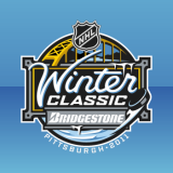

 Next on the agenda is the 2011 Winter Classic, which takes plays on New Year's Day.
The Pittsburgh Penguins will host the Washington Capitals at Heinz Field. It will be the second time the Pens have taken part in the yearly event since it began in 2008.
Special retro logos were unveiled for both teams along with the Winter Classic logo itself back in July. The Penguins' logo was team's primary mark from their debut in 1967 but was never worn on a uniform. The Capitals logo was used from their inception in 1974 until 1995.
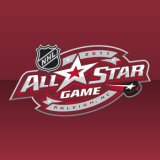 Less than a month later, the Carolina Hurricanes will host the 2011 NHL All-Star Game and Weekend in Raleigh.
The logo was unveiled in July and features Carolina's colors of red and black along with maroon. The general shape of the mark is similar to the Hurricanes' logo. The 58th NHL All-Star Game will take place on Jan. 30, 2011.
It will be the Hurricanes' first time hosting the event, which happens every year except when the Winter Olympics are held. The previous All-Star Game took place on Jan. 25, 2009 in Montreal.
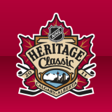
 The last big event of the season until the playoffs will be the 2011 Heritage Classic, another outdoor game which takes place between two Canadian teams.
This year, the Calgary Flames will host the Montreal Canadiens at McMahon Stadium on Feb. 20, 2011. Like the Winter Classic, both club will don specials jerseys for the game.
Montreal will feature only slight changes to the uniform and no new logos. However, the Flames will use a recolored version of their primary mark (right) on a specially designed sweater.
The last Heritage Classic was held in 2003 when the Edmonton Oilers hosted Montreal.
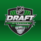 The final event of the 2010-11 season is the 2011 NHL Entry Draft which will be held at the Xcel Energy Center in St. Paul, Minnesota on June 24-25.
The logo is part of a new design standard for NHL draft logos introduced with the 2010 draft held in Los Angeles. The word DRAFT and the name of the host location can easily stand alone as needed.
The Entry Draft was previously held in Minnesota only once, in 1989 when the Minnesota North Stars were a member of the NHL.
Retired Logos
In addition to the aforementioned logos which have been replaced this season, there are a couple more which will be retired in 2010.

The shoulder patches previously worn on the Sabres' and Islanders' jerseys will not be used on the new uniforms. These two logos have seen action for the last time.
Tomorrow we pick up with Part 2 of the Season Preview, featuring new and changing logos in the minor leagues — specifically the AHL and ECHL.