Does Mask Design Hint at New Logo?
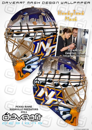 Pekka Rinne's new mask / daveart.comSwedish airbrush artist Dave Gunnarsson paints goalie masks for some of the best netminders in the world. His most recent work was done for Pekka Rinne and was revealed to the world via his blog this week.
Gunnarsson creates new masks all the time, but what makes this one noteworthy to Icethetics readers is the never-before-seen logo featured on both sides of the freshly painted helmet.
We already know the Nashville Predators are redesigning their home uniforms (presumably, the road ones as well). What we don't yet know is what they will look like.
The NP lettermark on Rinne's new mask does not look like any mark that the Predators have used before. So here's the question: Is it a future Predators logo that has yet to be publicly released? Or did it simply spring from Gunnarsson's mind?
[UPDATE 2:26 PM: For the record, if this is an actual Predators logo, my guess is that it would be nothing more than a shoulder patch or helmet decal or something.]
In his blog post, Gunnarsson talks about the HonkyTonk theme of the paint job but makes no reference at all to the NP logo. Is that because technically it's not supposed to be seen yet? Or are we reading way too much into this?
From what little I've seen of Gunnarsson's work, it seems he mostly adapts existing or past logos rather than creating new ones. This could be a departure from that. Or not. Don't know.
Your thoughts? Is this a sneak peek at a new Preds logo? Or am I making a mountain out of a goalie mask?
For a better look at the design, check out the mask gallery at daveart.com. My thanks to Nick F. and Kevin H. for sending along this information.