
Jets' New Look Hits the Ice
/ It was 112 days from the announcement of the Atlanta Thrashers' demise to the first time its' players would suit up as Winnipeg Jets. And for a blog like this one, watching the branding process unfold before our eyes was nothing short of a rollercoaster ride.
I'm not from Winnipeg. Or Canada. Or Atlanta. So I didn't really have a stake in the team itself. I was only interested in watching the first NHL relocation (since I started the blog) play out. Once the jerseys were unveiled, I went back to looking at them the same way I look at any other team. An enemy the Lightning need to beat. Even moreso this season since they're a division rival.
But that's not the end of the story. I haven't told you what I think of the uniforms yet. And many of you have been asking. Now that they've seen their first game action, I have no reason to hold out any longer.
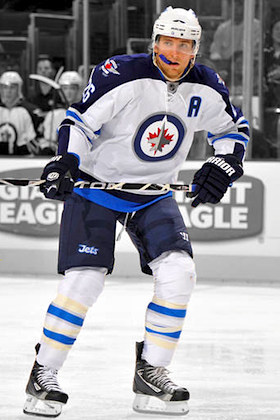 Blake WheelerIn a funny twist, the Jets' first pre-season opponent was the Columbus Blue Jackets. Funny, because sentiment among many readers is that Winnipeg's new sweaters are a bit of a fusion of Columbus' uniforms.
And I see what they mean. The crest is blue, red and silver. On the road jersey, blue covers the top of the sleeves from the neck line to the wrist. Just like the Jackets.
There are light blue sleeve and waist stripes wrapped in silver. Just like the Jackets' third jersey. Even the font is hauntingly reminiscent of what's on the alternate Columbus sweater — only more rounded.
But those are other people's opinions. You wanted mine. And many of you have been waiting patiently for it. So I have to get it right. Not that it has to be popular, just an honest assessment.
It's no secret I'm not a fan of the primary logo, the crest. I made that quite clear when it was unveiled. And got a lot of hassle for it, I should add.
There's a lot I dislike about it. The central element, the jet, has no distinguishing features. The jagged maple leaf it sits atop is red, making it look like the plane is exploding. And worst of all, it's set in a circle.
I understand the impulse to go with a circle when your team is named Oilers or Islanders. But Jets? It's a name that conjures so much whether you were a hockey fan in the 1980s or not. Jets! They're meant to fly freely but instead this one is locked up inside a fat blue circle. Why?
Because True North liked Winnipeg's military connection and wanted to take advantage of that. It's one thing to have a military night and give free tickets to soldiers and have the players warm up in camo-colored jerseys that are auctioned to support the people that serve their country. I'm 100% behind that.
I'm just not sure an NHL franchise should market itself (read: try to turn a profit) by capitalizing on the iconic imagery used by the people who put their lives on the line almost daily. To me, it's just wrong. I know the Jets aren't the first team to use military-inspired marks, but I'm not making comparisons here.
Whether you agree or disagree with the military theme, the fact is the design itself is quite poor. It looks like a compromise. One guy wants the roundel. Another guy wants a red maple leaf. And the other guy says, "wait, don't forget to get a jet in there too." I don't mean to harp on it, especially considering they had to rush to get this done. All I'm saying is I stand by my initial review of that logo.
Now, the uniforms. Those I like. I like the two-tone blue and silver color scheme. I like that the red is nothing more than an accent color on the crest and shoulders. It really pops that way. I like the shoulder patches and the socks. And the fact that the sleeve stripes wrap completely around the arm. I even like the new number and nameplate font. All of these things bring some much-needed originality to this club's look.
Everyone wants to call the Jets unoriginal for using dark blue, the new "in" color, apparently. Actually, the only other teams that will have dark blue home jerseys this season are the Sabres, Maple Leafs and Blue Jackets. Granted, there are five teams that have dark blue thirds. But really, the biggest color offender is red. Eleven different teams use it on their jerseys in some form. And for 10 of those 11, it is the primary color of the home jersey. Let's praise the Jets for avoiding that color and looking more like Columbus than they already do.
There are some things about the uniforms that I don't like. Just a few. I don't like that the collar tie is the same color as the jersey. No contrast there. And I don't like the wordmark on the pants. Or the wordmark at all. I don't mind them using a wordmark on the pants, but I just don't think this particular custom font works well. It doesn't feel as modern as I would've expected.
So there you have it. My view on the Jets' new uniforms. Some of you will agree, others will not.