
NHL Draft Logos for 2013 and 2014
/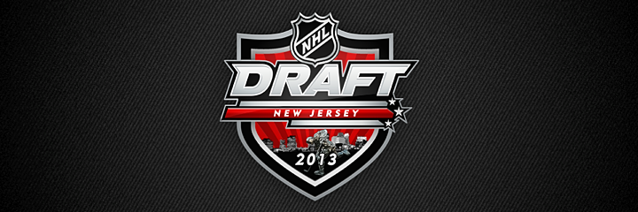
Apparent 2013 NHL Draft logo turned up online in September
First up is this gem. It appears to be the logo for the 2013 NHL Entry Draft, which will be hosted by the New Jersey Devils this summer. I say "appears to be" because I haven't yet been able to track down and a solid source for where the logo came from.
(UPDATE: Turns out this was a concept designed by a fan that got picked up by more than a few sites since the NHL took its time releasing the real one.)
From what I've been able to find, it looks like the logo first showed up online in early September in a blog post on PuckCentralHQ. It was a post discussing preseason draft rankings. But there's no reference to where they got the logo which appears at the top of the page (and as a repeated background image).
It has also popped up on a number of other minor websites and blogs (which you can find via a quick Google search). But no official NHL sources or media outlets have posted this logo. That said, it certainly looks like it should be the real thing.
It has the same design theme we've seen on past draft logos. However, what's interesting is the typeface that identifies the city and year. It's not the NHL's standard font. This could indicate a change moving forward, or it could be that this logo isn't the real thing. You can draw your own conclusions.
Abbreviated draft logos for 2013 and 2014 seen on NHL websites
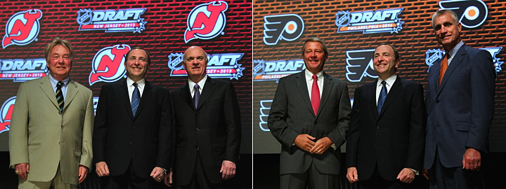
During the 2012 draft, held in Pittsburgh, the NHL announced the next two draft hosts as New Jersey and Philadelphia. Photos showing the 2013 and 2014 draft logos showed up in photo galleries on the host teams' websites shortly thereafter.
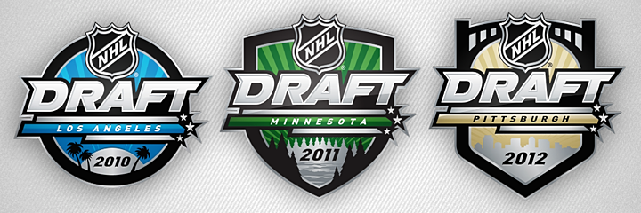
The photo on the left was posted on the Devils' website. The photo on the right can be found on the Flyers' website. The two logos seen in background of these images are the simplified versions. The current NHL draft logo standard was introduced in 2010 when Los Angeles hosted.
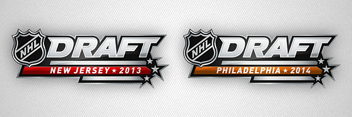
For each, the abbreviated versions are the same shape and design but with the host's name and color (except for Los Angeles, which was blue). The full shield versions have all been unique shapes. You can see all three previous logos below. The 2013 logo at the top of this post fits in nicely.
By the way, it's disappointing to think that if this NHL labor dispute doesn't get resolved soon, the draft may just be next NHL event that takes place.