
Buffaslug Designer Talks More About Process
/ The designer behind one of the most hated logos in NHL history is once again talking about the process of rebranding the Buffalo Sabres back in 2006 — a rebrand which has since been completely dispensed with.
Kristopher Bazen made news here last year after he asked Sabres creative services director Frank Cravotta to remove some old sketches of the "Buffaslug" from his online portfolio. Bazen said it might've been "misleading" since the design was a "collaborative effort." However, a year later, Bazen has posted more of that early conceptual work on his own website. Here's a look at those designs:
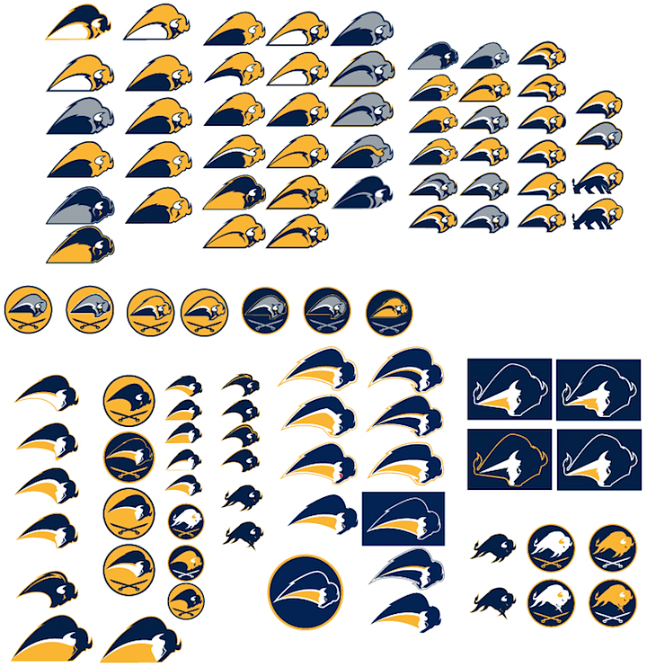 Buffalo Sabres conceptual work (2005) / Kristopher Bazen
There are a lot of neat ideas in there, but I'm not sure any of them would've been an improvement on the original 1970 logo — an updated version of which the Sabres use today.
On this subject, Bazen made the rounds yesterday on some popular hockey websites. He posted the above link on the SportsLogos.net message boards and spent a lot of time talking about the design process. If you have some time to kill, there's some stuff worth reading. Basically, for an artist, he's one thick-skinned human being and he's good at responding to questions. More on the SportsLogos.net blog.
Also yesterday, Puck Daddy had a long in-depth feature about Bazen and his work with the Sabres. I highly recommend taking the time to read this one. Greg Wyshynski leaves no stone unturned and if you like hockey logos, you'll find yourself fascinated by almost every word.
I think the reason Bazen keeps coming up is that despite the fact he is a fantasic logo designer, he's being haunted by what the higher-ups in the Sabres organization ultimately wanted. He doesn't need to defend himself as he's quite talented as you can see in his portfolio. But I like that he's giving us a little insight into how it all works.