
NHL Unveils 2013 All-Star Game Logo
/ Outside Nationwide Arena today in Columbus, the NHL unveiled the 2013 All-Star Game logo in front of a surprisingly large crowd.
The logo is par for the course on NHL All-Star logos over the past decade. Nothing surprising. The designers honed in on a recognizable symbol (Ohio's state flag) and were sure to work in some other elements of the host team's identity.
The star and crossed hockey sticks were lifted off the Jackets' shoulder patch. Though technically the sticks are an emblem on a Union soldier's hat, but you get the picture. Plus you wouldn't want anyone in Columbus to see the logo and mistake it for another sport.
All right, I'm not trying to take potshots at the logo. It's a good logo. It's just not mind-blowingly impressive or anything. To quote a fittingly tired phrase, it is what it is.
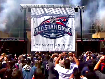 A big crowd takes in the logo unveiling ceremonyEarlier, I expressed surprise at the size of the crowd, not because of the rotten seasons the Blue Jackets have been having (ergo, jaded fans), but rather because this was nothing more than an unveiling for a logo with a shelf-life of 275 days.
Goes to show that hockey fans in Columbus don't need a winning team to be great hockey fans! My fellow Lightning fans from the '90s and I know a thing or two about that. Granted, there probably weren't as many of us back then.
I didn't hear any mention of the All-Star uniforms today. If I had to guess, I'd say we get the same ones for a third year in a row — which would be a first since the mid-90s. Those teal and purple jerseys were used from 1994 to 1997.
I'm not saying it's necessarily bad thing that we'll get them again. I actually like them a lot. But it would be one less new NHL design to anticipate in 2012. But I assume Reebok spent a lot of time on those 2010 jerseys, so they want to get their money's worth.
If you missed the live-streamed unveiling today, you can watch the cannon fire here.
I'd love to know what everyone else thinks. Share your critiques in the comments.