
Islanders' Stadium Look Revealed
/
Newsday provides uniform sneak peek 10 hours early
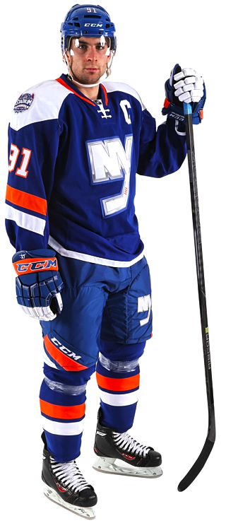 Photo from Newsday (via New York Islanders)Late tonight, the Long Island newspaper Newsday presented an early look at the uniform the New York Islanders will wear for their 2014 Stadium Series appearance on Jan. 29.
The photos appeared on the paper's website just after midnight ET, presumably with the team's permission (a reporter announced it was coming earlier in the day).
According to a later tweet from @NewsdaySports, the official unveiling is scheduled for Wednesay morning at 10 AM ET. What's unclear is whether the Isles will go it alone or if the league plans to unveil all seven Stadium Series uniforms in one shot.
But as we're now just hours away, it won't be long before we find out.
Regardless, the Isles' newest uniform is here now. So let's discuss. Here are a few details I noticed:
- The crest — believe it or not — is the chrome logo the NHL recently unveiled. So that's an interesting development. My guess: It's not embroidered. It may be screen printed like the guitar-string numbers on the Predators' uniforms.
- A flat version of the NY logo, however, is also visible on the pants — bigger than most pant logos.
- The shoulder yoke is unusual, not unlike what we see on the Blues' uniforms — though without the piping on the front.
- The right shoulder bears the Stadium Series patch while the left shoulder has the classic primary mark to remind us all it's not going anywhere.
- Looks like everything is on an angle. The pant detail is new and different as is whatever is happening on the sleeves. Hard to judge based on this.
- What is clear on the sleeves is the stripes do not wrap all the way around the arm (probably because they can't if they're angled).
- The elongated numbers we talked about last week do not appear on the sleeves. They do, however, appear on the helmet.
- Haven't seen the back of the jersey yet. That'll come in the morning.
- The collar laces seem to be tied on the inside of the jersey rather than outside. Player preference or design feature?
- The CCM branding is very prominent in this photo, clearly seen on the helmet, gloves, pants and skates. The only Reebok logo is on the stick and barely detectable. Of course, CCM is Reebok, but I have to wonder if this is significant beyond Tavares' own deal with the company.
I don't like to make instant judgments on the blog, but my initial reaction to the overall design is positive. There are certainly some unique aspects to it, but that only makes me like it more.
In an NHL being overrun by "traditional" and "retro" uniform designs, it's refreshing to get something out of left field every so often. If the look of this uniform is any indication, I'm really going to like the Stadium Series.
Check back tomorrow for more on the official unveiling.
 Photos from New York Islanders
More photos on Islanders' website
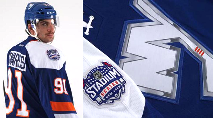
The Islanders have now posted a photo gallery to their website, showing more aspects of the uniform. As suspected, there are elongated numbers on the back. But surprisingly, there's a reverse color nameplate. (Really hoped that was dying out.)
There are only 10 photos of the jersey and most are detail shots of the collar, shoulders and crest. Still don't have a good sense of the sleeve design, though it certainly appears everything is angled.
Based on this, do you have any expectations for the rest of the Stadium Series jerseys?