
Review: New Star Rising, Part 1
/
The Dallas Stars were the second of two teams to unveil new uniforms on Tuesday. And they were generous enough to invite me to attend the big event. However, in this review, I'm just sticking to the details of the new logos. I'll do another review this weekend to talk about the event and the uniforms.
First, I have to express a little disappointment. Unlike the Hurricanes, the Stars have not released publicity photos or videos breaking down the details of their new designs. I hate to draw a comparison to a different team, but with the events happening so close together, it's difficult not to.
That said, I was told by Jason Walsh, the Stars exec who led the rebranding efforts, that his production team was putting together a making-of documentary video to be posted online at some point. By the way, keep that name in mind, I'll be referencing Walsh a lot during this review.
The New Primary Logo
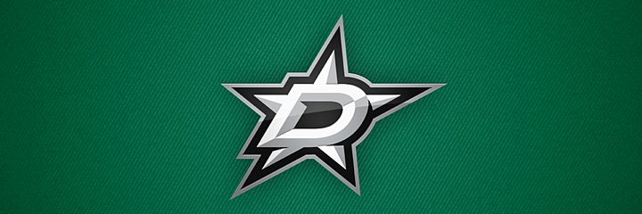
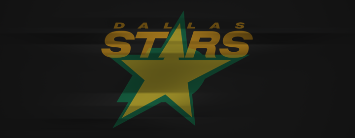
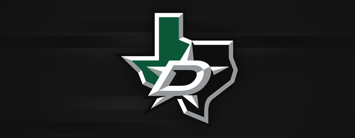
We have to start with the new primary logo — the very symbol of the rebranded Dallas Stars franchise. On first glance, when we saw it a couple weeks ago, it felt like a major change. The lack of gold was shocking. But since then, the more I look at it, the more I feel like it's been around forever. This is THE identity of the Dallas Stars. How did they ever wear anything else?
Perfectly represented is the club's moniker, the Stars, and its city, colloquially known as "Big D." The logo is a star with a big D inside of it. Can't get much more literal than that. It accomplishes everything it needs to for this brand. The only question is whether it could have been done better. Let's see.
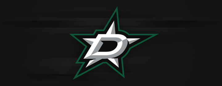
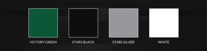
The logo has a color variation dependent upon its backdrop. On black or white, the mark is outlined in Victory Green, a new shade that's brighter and deeper and one that has never been used before in the NHL. Of course, as you saw above, when it sits on green, the logo is outlined in silver.
Either way it's eye-catching and a sharp-looking sports logo. But that doesn't mean it's not without flaws. Some fans have taken issue with the notches where the star connects to the D along with the beveled aesthetic. The two are intertwined and understanding it requires a graphic design lesson.
At the event on Tuesday, I talked with Jason Walsh about this. Walsh is the Stars' vice president of production and entertainment. He put on the night's presentation but he also led the development of the new branding. He told me about the choice to go with the 3D beveled look. In a nutshell, it's this...
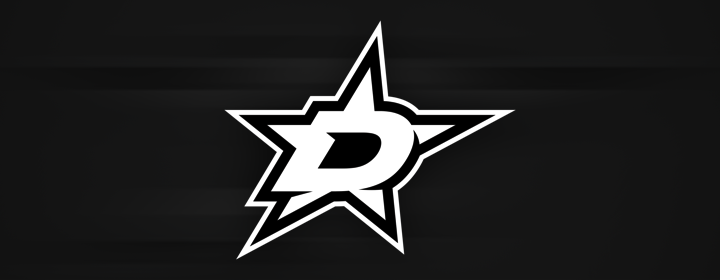
This is the single-color version of the primary logo. Any complete logo package has single-color versions mostly used for print when full color printing is not an option. It gives you an idea of what the logo looked like before the beveling was added. Even now, the mark looks rather flat and unfinished. It doesn't look terrible, but the silver beveling adds that extra flair to complete the look.
So what about those notches? The beveling tells us the logo exists in three dimensions and that there is a light source, in this case, from the upper left. It stands to reason then that the D, which sticks out above the star, would cast a shadow on it. That accounts for the notches. And it just so happens that they make the D stand out better as well. Without the notches, the D isn't as easy to make out.
Now how about the star itself. Does it look familiar? It should.
Part of what prompted the Stars' rebrand was the desire for a "made-in-Texas" symbol, according to Stars owner Tom Gaglardi. When the franchise left Minnesota 20 years ago, it continued using the same logo in Dallas. So last year when the redesign process began, one problem the team kept running into, according to Walsh, was finding a star that didn't look like the Dallas Cowboys' logo.
Luckily, the Stars already had a unique star shape in their existing logo. So with that in mind and a desire for a little continuity from old to new, that shape found its way into the new mark. The D was then added to it to create the final version. In that way, this logo isn't a huge departure from what came before it. In fact, it's an excellent transition into a new era.
But as I said before, it's not without flaws. The overall shape bugs me, actually.
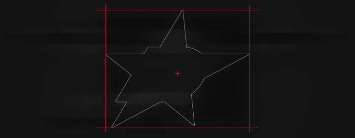
Take a look at how the corners of the star form a bounding box in which the logo doesn't quite feel centered — and, in fact, leaves a lot of empty space. Another oddity is in how the lower right point doesn't align with the lower left. But that's all in the outline. The points of the star itself (the white part), do align properly.
The whole thing is still left looking a bit unbalanced. Ideally, the crosshairs in the middle should land on the center of the D. But they're pushed to the right because of how far out the right point of the star extends. In theory, this problem could be fixed by skewing the star to the left so it's not slanted.
However, it then starts approaching the Cowboys' star shape — a problem Walsh mentioned earlier. Then of course, we also lose that carryover element from the original logo. But just for the heck of it, I decided to see what it might look like if we straightened it out.
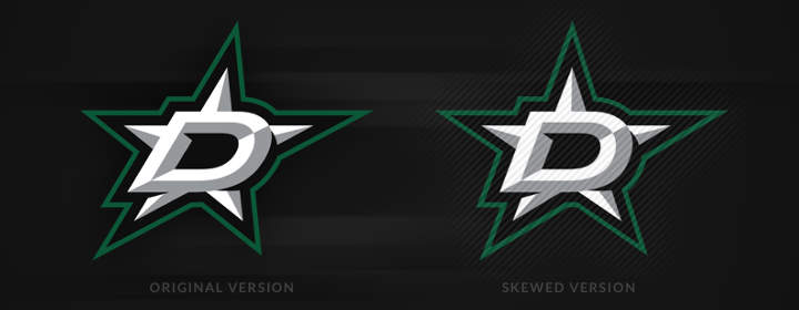
Not bad. It helps with the center of gravity and balance issues. And it's more symmetrical. However, we lose a bit of what makes it a cool sports logo. Slant anything to the right and it looks "faster." When we straighten out the star, it actually starts to look a bit boring and, well, static.
Seeing this helps me reconcile the design choices, even if I'm still left feeling like the balance is off. But I don't mean to be second-guessing Walsh and his crew. This was a long process and I'm sure these are all things they considered. Ultimately what matters is how the crest looks on the sweater. We'll get to that.
The Secondary Logos
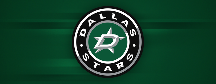
Part of the Stars' new identity is this secondary logo. It incorporates the new D-star in a roundel design. This logo will be used primarily on the shoulders of the new sweaters and wherever else a circular stamp might be useful. It's a classic style for brand that's quite modern.
By the way, I hate to beat a dead horse, but this logo further demonstrates the awkwardness of that D-star. The delicate balance of trying to center the logo by its center of gravity forces the right point of the star to just graze the edge of the circle. It looks fine, it's just tricky.
Regardless of that, I'm not a fan of this logo. I mentioned it's a classic style, but it's also overused. The Tampa Bay Lightning introduced a similar logo with their rebrand in 2011. Neither franchise had ever had a mark like it before and it just feels less creative than the rest of the package.
The third logo in this set includes another nod to past logo designs. The Stars carry over their Texas-shaped mark here but unlike in years past, it won't be used on the shoulders. Instead, it'll be found exclusively on the pants of the uniform. Walsh said they looked at putting it on the shoulders, but it just didn't work. I'll explain when we get to that part of the review.
I also asked Walsh whether it would be considered for a third jersey down the road. He dismissed that idea outright. One of the many uniform variations he looked at had this logo on the front, but it just didn't work there. He didn't talk much about what might be in store for a future third jersey. I think he was just happy to have this rebranding process complete.
The Wordmark
Finishing off the new logo package is the Stars' new wordmark. Simple and straightforward with that same nod to the past, this logo is more of an upgrade to the original wordmark than something altogether new. And as upgrades go, this is a sharp one.
There's also a version for dark backgrounds such as green or black.
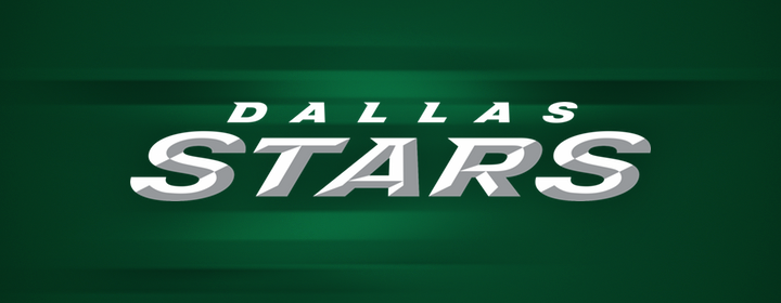
I'm not sure the beveling is necessary here, but it does tie in well to the primary logo so I'll give it a pass. I do want to commend the design team on not beveling the green version of this logo, hence adding a second shade of green. That would've been an easy trap to fall into.
The Color Palette
Speaking of colors, I think the Stars hit the jackpot with their new palette. To make a pun, they're money. If you've read Icethetics any length of time, you know I preach the Gospel of Green when it comes to this NHL, which is sorely lacking in that department. It's a great color and only three of 30 teams use it. Meanwhile, we have 18 in some form of blue.
In fact, blue was part of the initial rebrand discussion in Dallas, according to Gaglardi, who was convinced by fans and even Mike Modano that green was the ONLY color for this franchise. Thank god he listened. Stars TV color man Daryl Reaugh was a proponent of using the red, white and blue in Texas' state flag. Yeah, because there aren't enough red and blue teams in the league already.
I was thrilled to see the Stars keep what makes them unique. And honestly, I was even happier to see that gold was no longer part of the equation. While the old gold might have looked fine on a jersey crest, it often looked yellow or brown on paper or on a computer screen. It just didn't translate.
Gaglardi said he would've been satisfied to stick to green and black alone until it became apparent that the beveling was needed for the logo. He pointed out that when you look up at the stars in the sky, they look more silver than gold. So silver ended up being the perfect addition to complete the palette.
I've heard a lot of fans complain about the lack of gold but I have yet to hear a good reason why. The Stars are the green team, as Gaglardi mentioned, not the gold team or the black team. Moreover, the there's now nothing in the palette to compete with green so it really stands out beautifully.
In a nutshell...
Well, the logo review went much longer than I expected. I don't want to feel like I need to keep the uniform review short, so I've decided to make that a separate post to go up tomorrow. I'll incorporate that into my review of the unveiling event. We'll call that Part 2.
Now the nutshell portion to wrap things up.
The Good:
- GREEN!
- Texas secondary logo upgraded beautifully
- Nods to team history in the new marks
The Bad:
- Primary logo feels off balance
- Roundel design lacks some originality
Overall, this is a great update to the brand. It's a better symbol for the organization. And best of all, it's Texas-made. There are some drawbacks, but no dealbreakers. A lot of NHL logos have eccentricities but few are as sharp as this one. When I saw it Tuesday night, it immediately became one of my favorites. I even bought a T-shirt right there on site. And this fall, that green jersey will be in my closet.
On that note, check back tomorrow for my review of the Stars' new uniforms.