
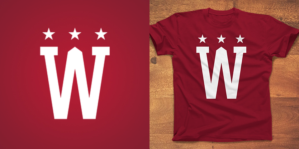
The Washington Winter Classic logo that didn't make the cut
/


Here's something cool. A couple of Icethetics readers pointed me to the Dribbble account of graphic designer Andrew Sterlachini.
It turns out Andrew not only created the crest on the Washington Capitals' 2015 NHL Winter Classic jersey, but he designed at least one other logo that didn't make the cut.
You can see above the W intertwined with a shape that looks like a D on one side and a C on the other. As clever logos go, this is by far one of my new favorites. It's just a shame the Caps didn't see fit to use it in some way. (At least not yet.)
If you're on Dribbble, give Andrew a follow.