
Sharks officially unveil 2015 Stadium Series uniform!
/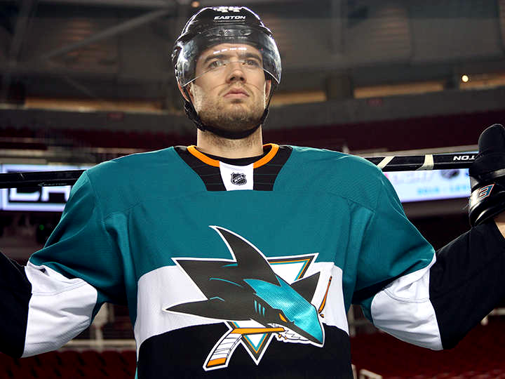
One week after we got a sneak peek at the 2015 NHL Stadium Series uniforms, the San Jose Sharks have made their new jersey official!
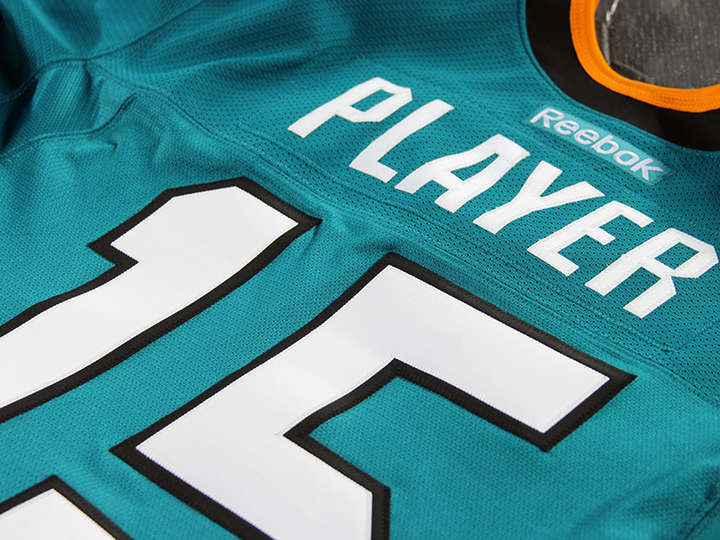
The new look was unveiled on the Sharks' website this morning. It showcases a handful of new features for a Reebok Edge jersey — including a flat collar design, "carbon fiber" crest, and giant sleeve numbers.
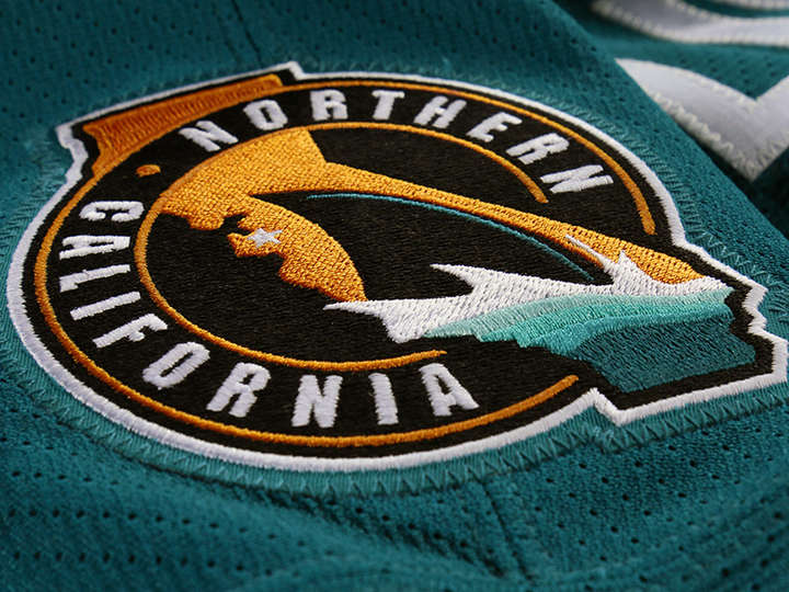
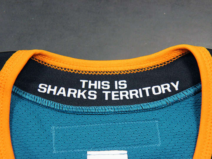
A new "Northern California" shoulder patch has been introduced to the Sharks' branding lexicon and a new hanger effect treatment in the collar uses the team's marketing slogan, "This Is Sharks Territory."
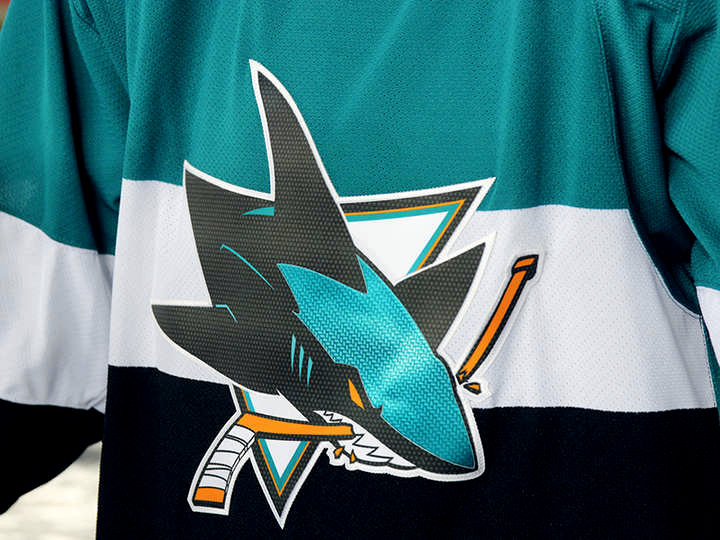
But the most attention-grabbing element of the design is the half-and-half color scheme, teal on top, black on bottom and a white stripe across the middle — not unlike the classic Canadiens' jersey feature.
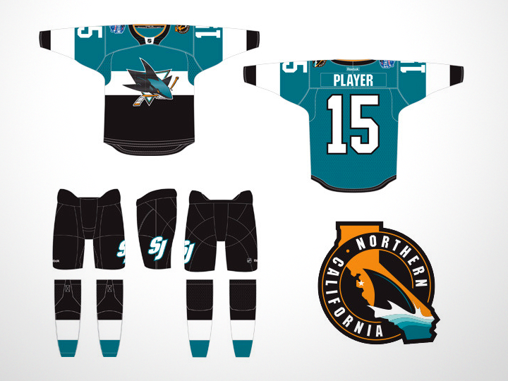
A look at the full uniform in this rendering from the team shows a simplified version of the "SJ" ligature on the left leg of the pants.
We can also see the white and black areas on the front of the sweater do not continue around to the back. This is to make sure the numbers are easier to read from long distance.
In fact, the Sharks' press release explains in detail many of the new features of this uniform. Reebok designers worked under the motto, “If you can’t see it from 200 yards away, does it need to be there?” — hence the oversized numbers.
The numbers on the back were increased from 11.5 to 13 inches in height while the sleeve numbers jumped from 4 to 7 inches. Fans seated far from the ice at Levi's Stadium will surely notice and appreciate the difference.
Also from the release:
The collar construction was designed to be to be more streamlined and robust, integrating it into the construction of the jersey more seamlessly. It now lays flatter, and cleaner against the shoulders and neck area.
The problem I have with this is its similarity to Nike's hockey jerseys. Personally I like to see some definition in the collar. This flat collar just looks incomplete.
The crest, although not enlarged, has been executed in lighter weight materials and features a carbon fiber finish for greater visual impact.
Basically, Reebok heard the backlash against the awful-looking Photoshop-enhanced flat, printed chrome crests and decided they should do it all over again — only worse.
Honestly, are the embroidered logo crests really doing that much to impede the greatest athletes on the planet? As long as it's just for a single game, I'm fine with it. But I'm worried about the trend.
Appearing on the shoulder is a new mark that was created to pay tribute to the Sharks' devoted fans in Northern California. The mark incorporates the state of California, with a star on San Jose, marking the exact home of the team. Placed at the bottom of the mark is the iconic dorsal shark fin, which has been borrowed from the SJ ligature the team currently uses.
This logo is a great way for the team to lay claim to a larger geographical region and I'm sure we'll see more of it in the years to come. It's a solid design and makes more use of the orange in the Sharks' palette — though I know many Sharks fans would rather it disappeared entirely.
By the way, we now know Marc-Edouard Vlasic was the guy posing in the photo I shared last week.
The Kings are scheduled to unveil their Stadium Series jersey on Tuesday. Expecting the same basic template with Kings colors and logos.
Overall, I'd call this an acceptable jersey for one-time use. What about you?