
Sochi Sweaters
/2014 Olympic Jersey Preview
The 2014 Winter Olympics finally begin this week. So what do Icethetics readers really want to know about? Not the rosters. Not the match ups. We want to see the jerseys!
Before we start, what do you need to know?
First, a total of 14 countries will participate in ice hockey in Sochi. That's a lot of jerseys. Twelve teams qualified for the men's tournament and eight in the women's. Six nations will send teams to both tournaments.
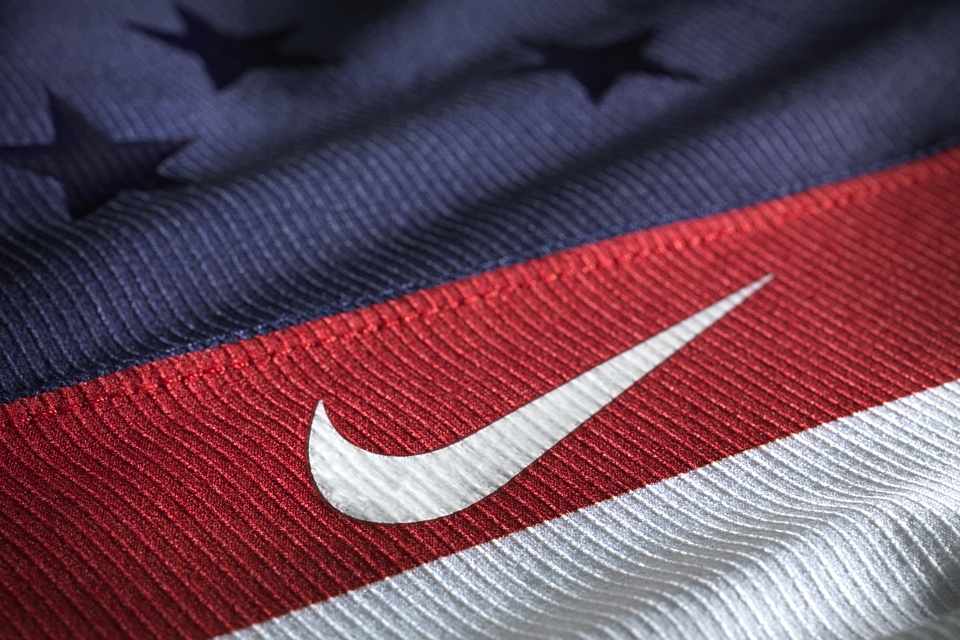
Then, there's Nike. The sports equipment giant has a deal with the International Ice Hockey Federation (IIHF) and the International Olympic Committee (IOC) to produce the official game jerseys for all of the national teams. (Kind of like the chokehold Reebok has on the NHL.)
That's a quick look at all 14 uniform sets. Now we'll take it team-by-team with plenty of photos. At the end, we'll discuss what was involved in Nike's design process.
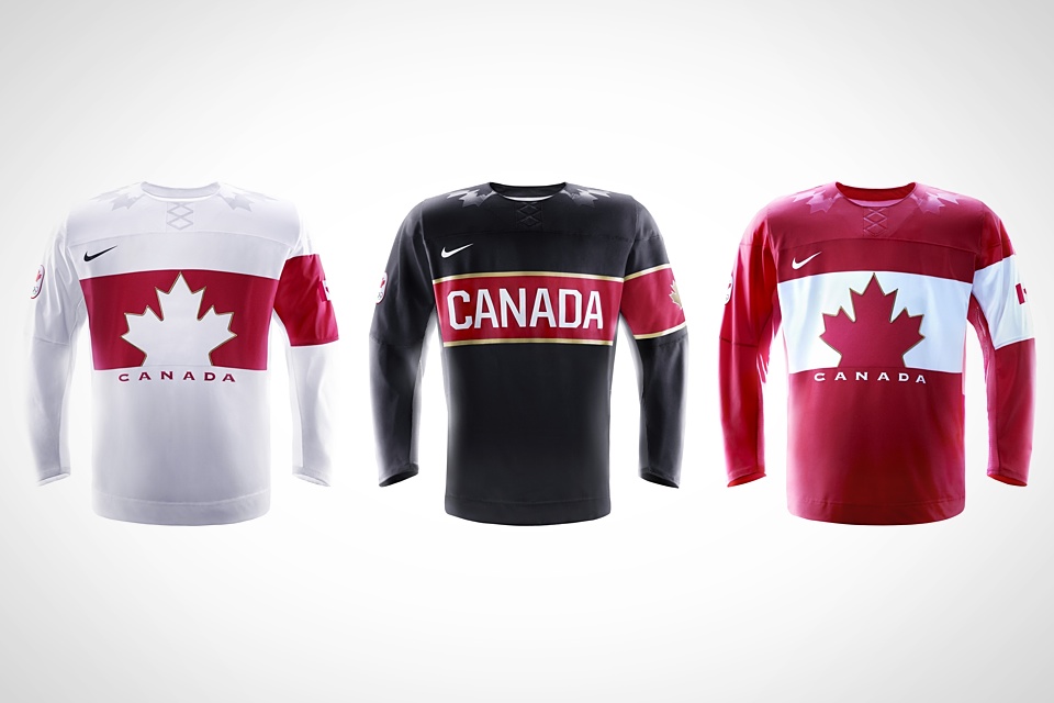
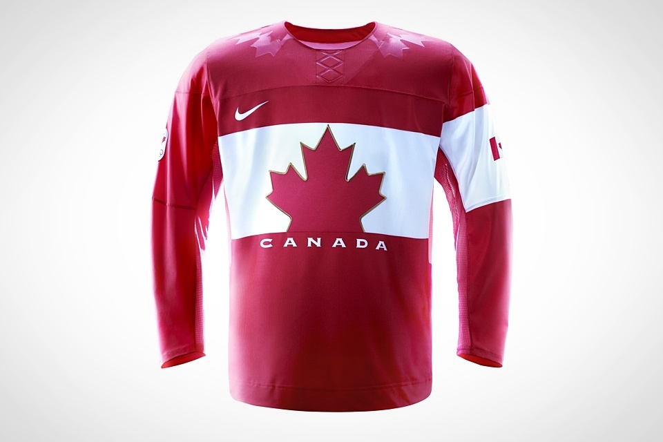
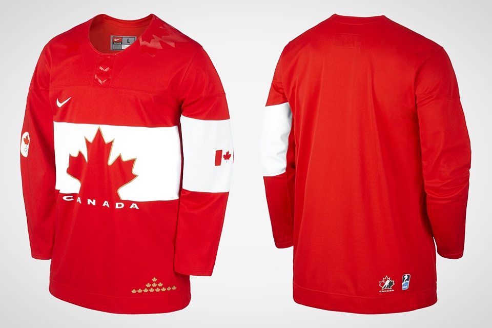
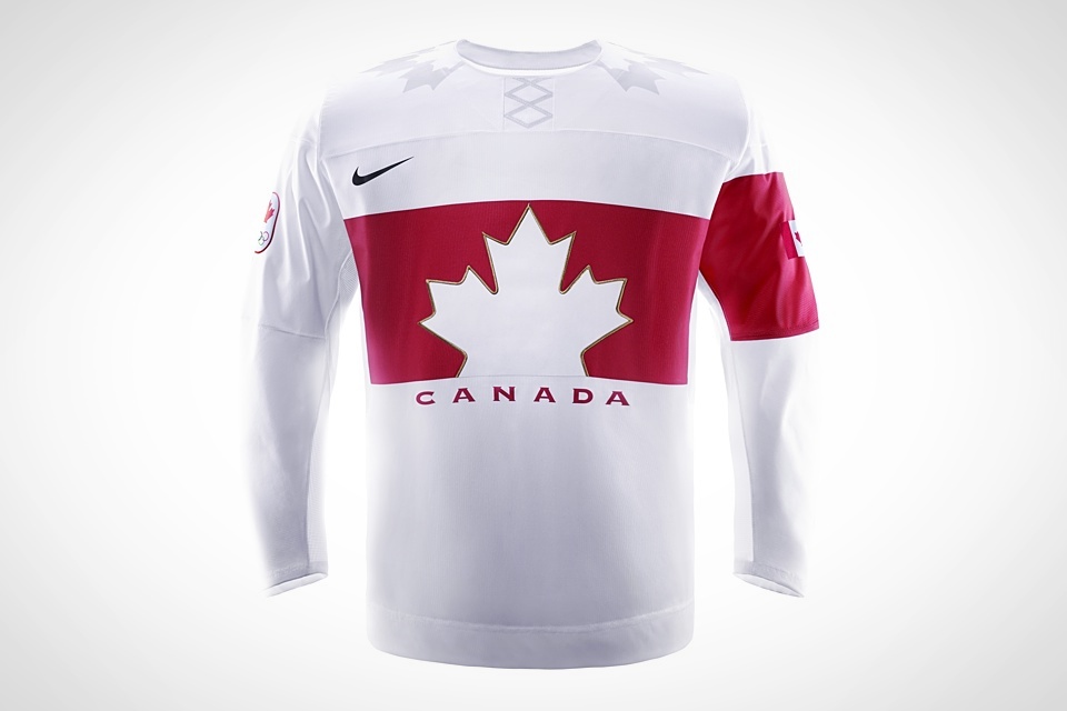
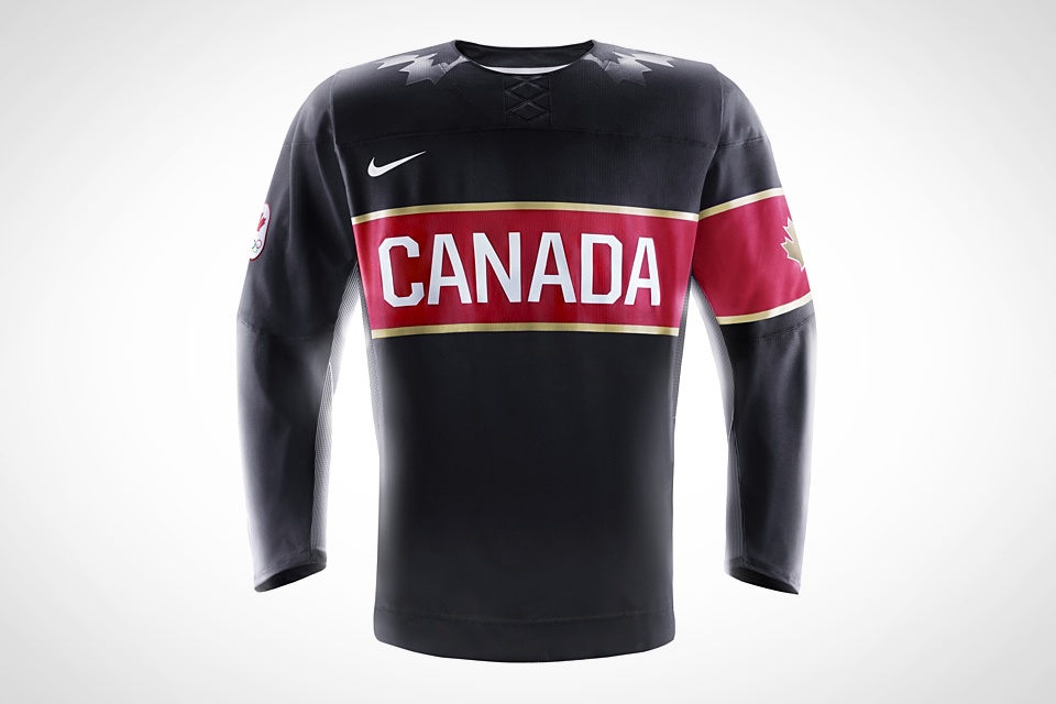
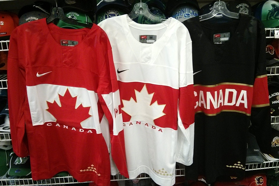
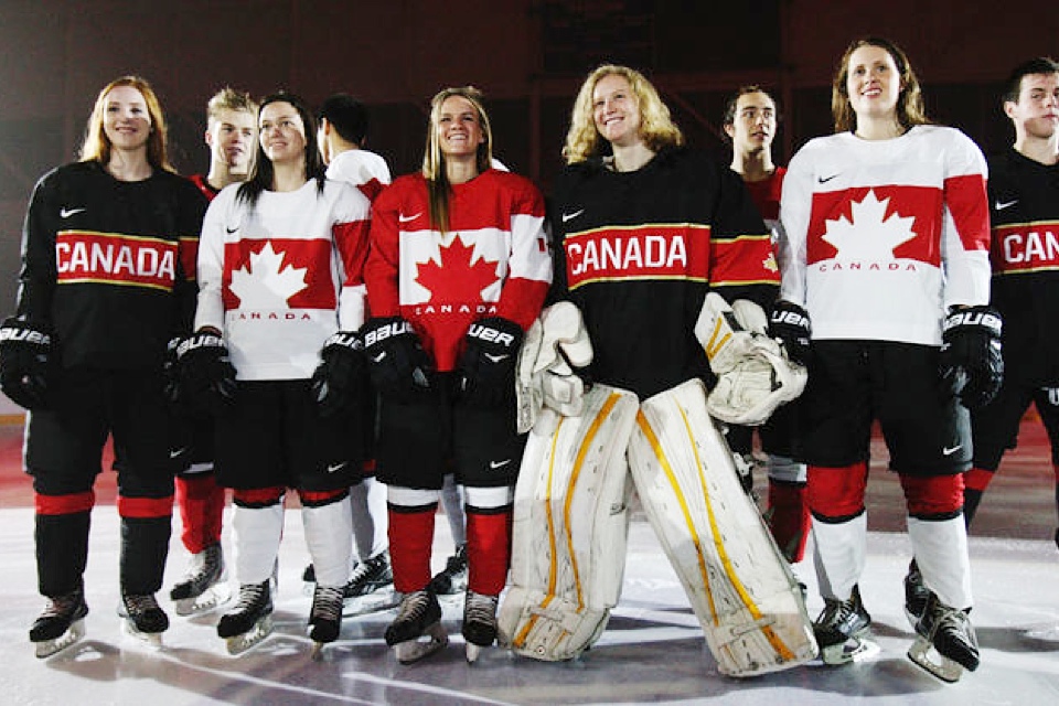
Canada
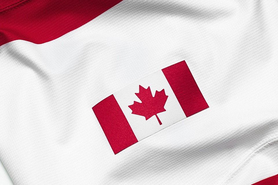
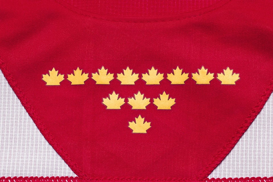
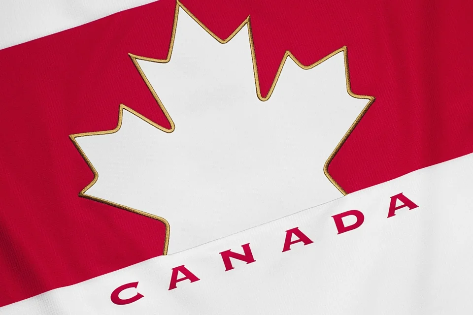
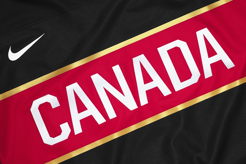
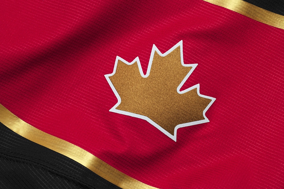
Naturally, we begin with the defending gold medal champions. Canada unveiled its new Nike Olympic jerseys on Oct. 8. And as far as I know, they'll be the only country with three options — red, white and black.
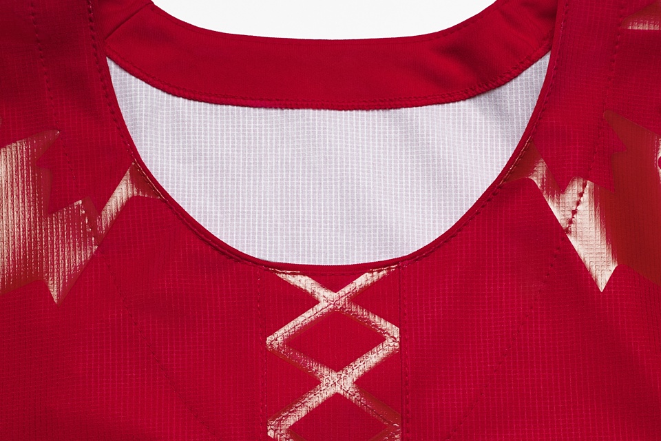
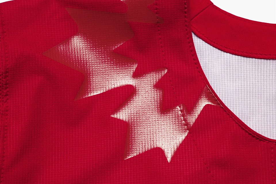
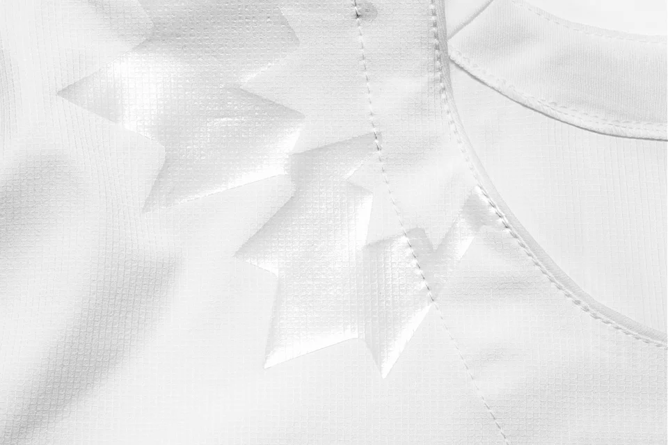
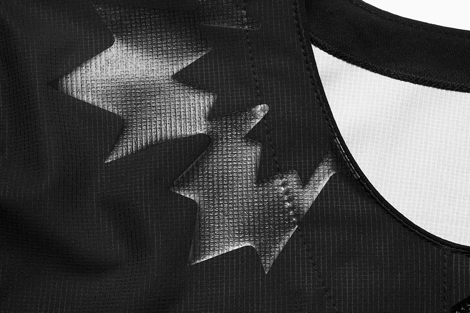
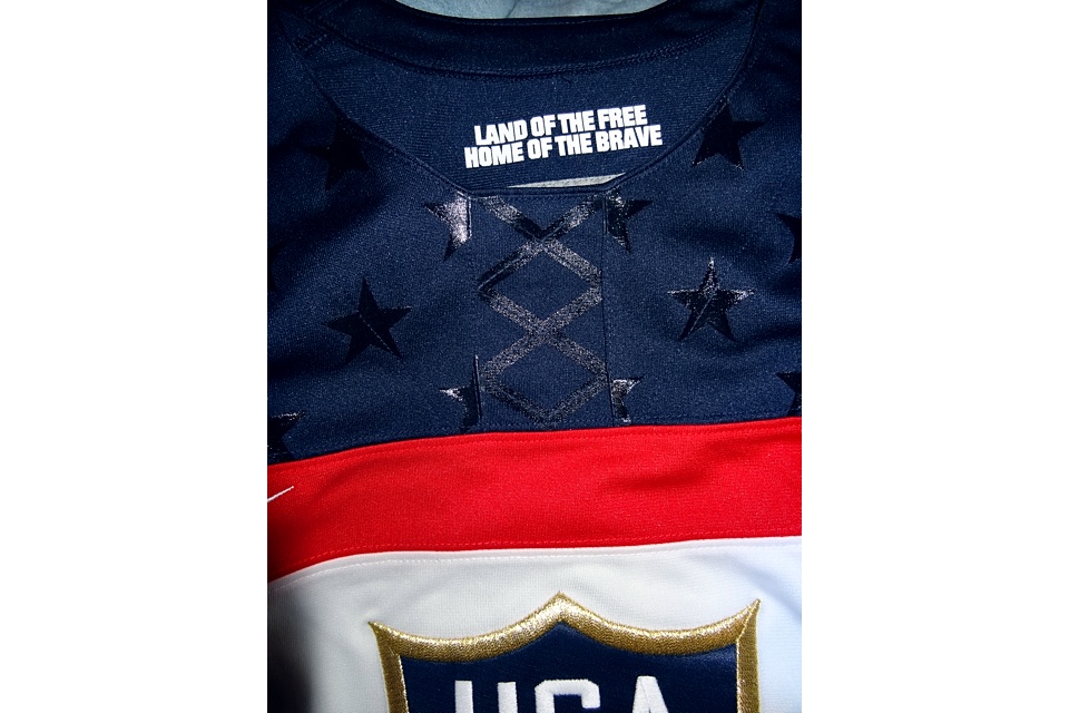
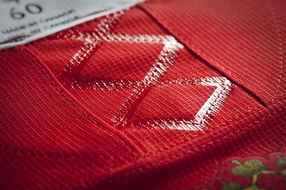
One thing I should mention at the beginning is the fake lace-up collar on these jerseys. It's a Nike technology called FlyWire and it serves a purpose (which I'll address later). But we should get used to it because there's a lot more to come.
Be sure to click through all the photos in the slideshow above for close-up looks at some of the details. Most of the shots come straight from Nike.
By the way, I'm hoping to make blog posts and features more interactive in this iteration of Icethetics. Look to the right to rate the jersey set and vote in the poll.
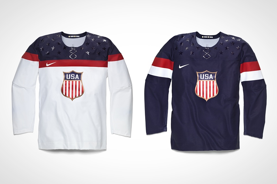
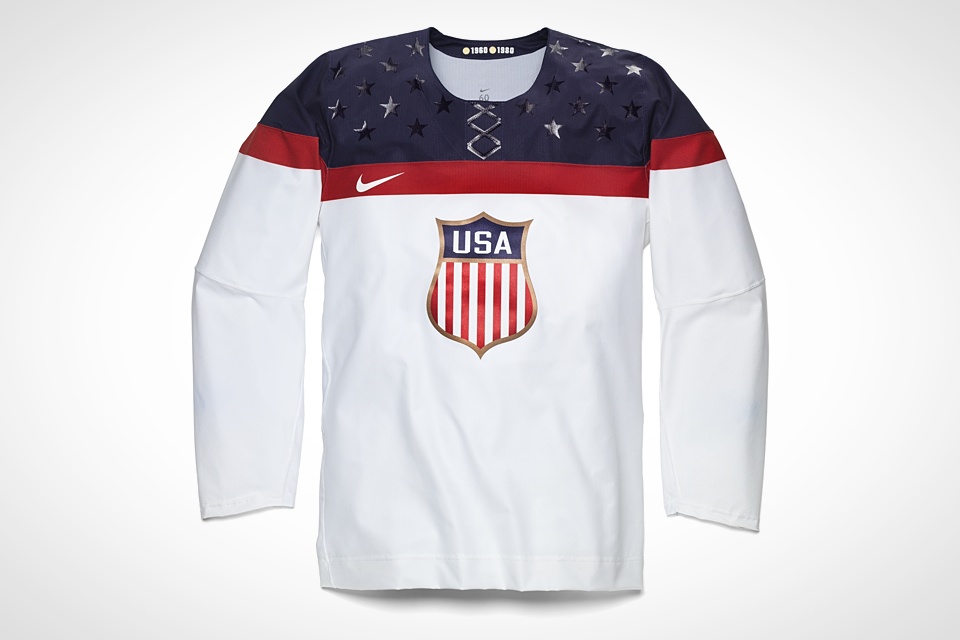

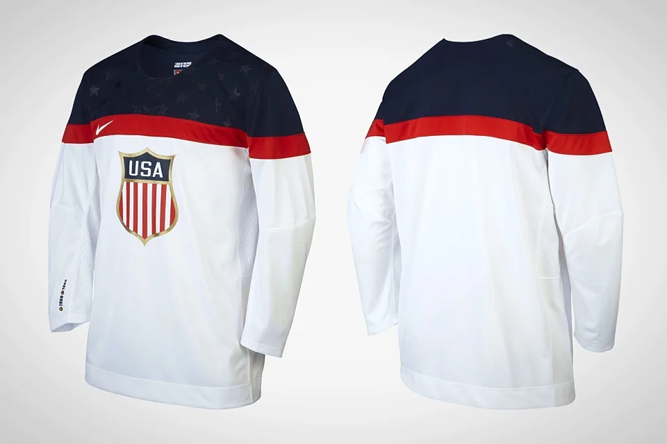

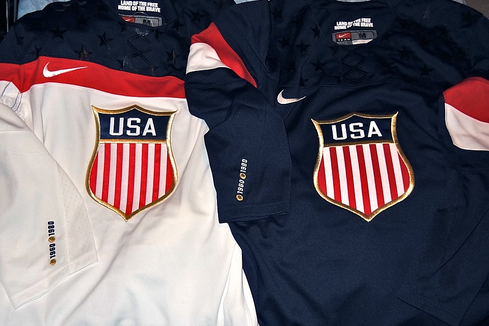
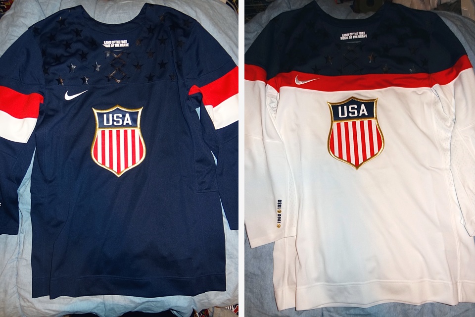
United States
At the peak of summer, Nike unveiled the uniforms the United States will debut in Sochi. On Aug. 27, we got our first look at the new red, white and blue. It was a big changed and received wildly mixed reviews in the press and on social media.
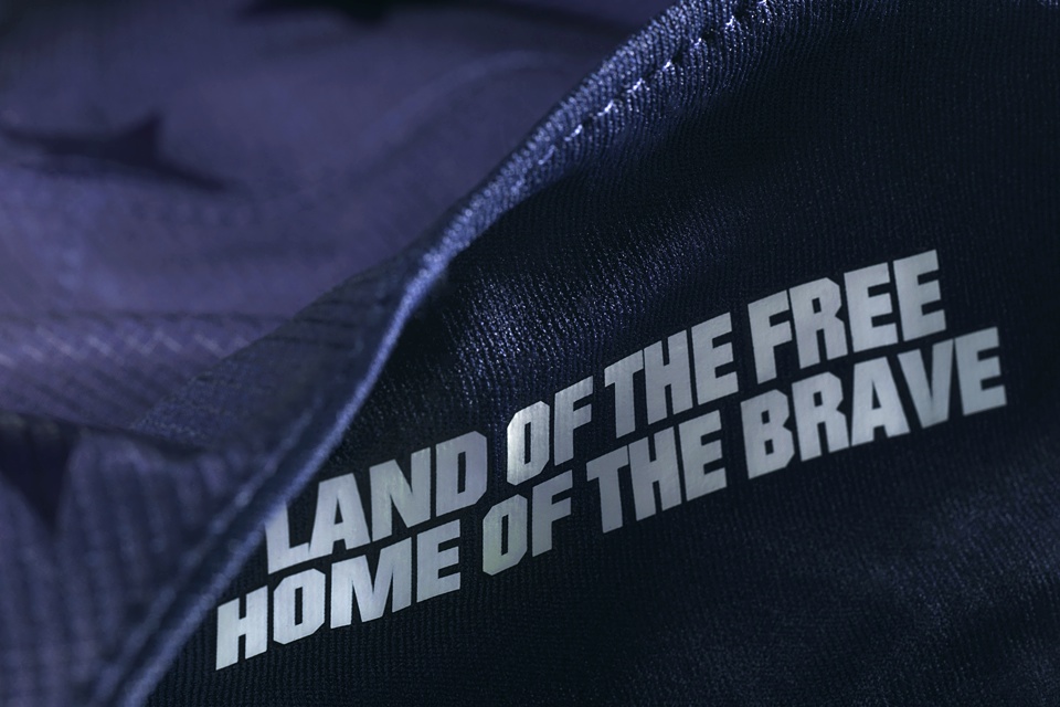
Like Canada's jerseys, there are some hidden gems within the design that are easy to overlook. Be sure to click through the slideshow above to see some detail photos from Nike.
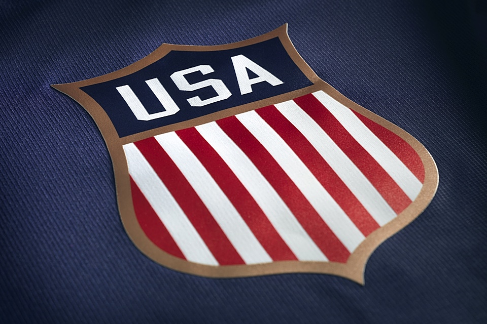
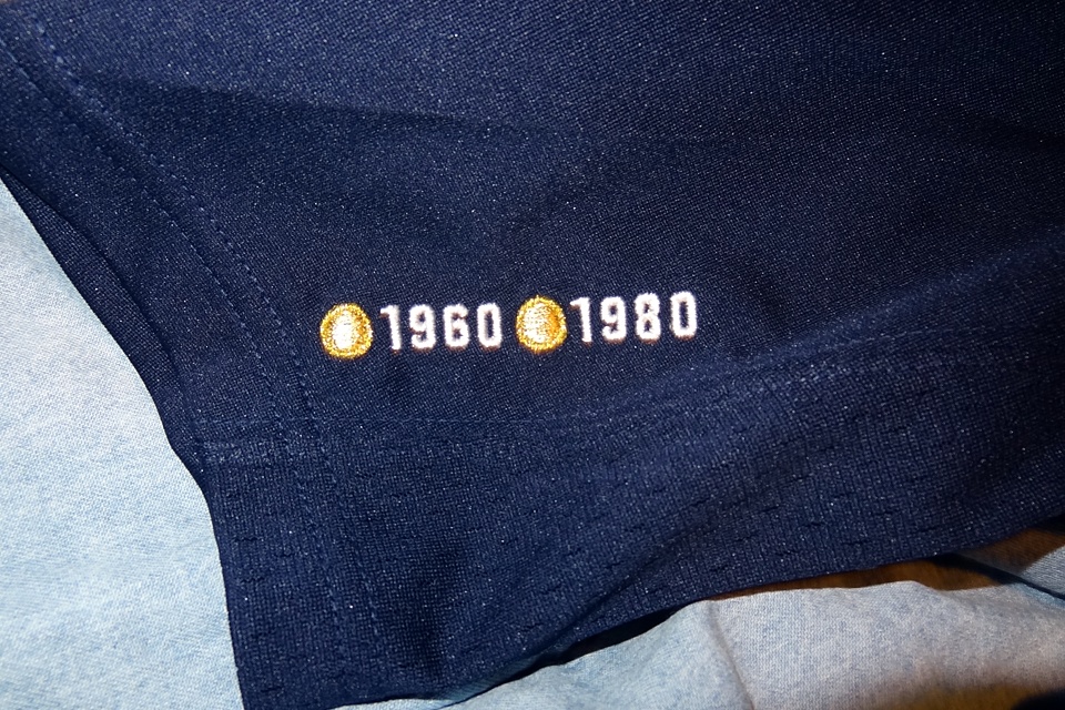
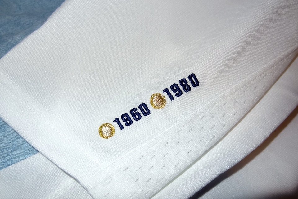
Among other things, the years of the USA's gold medal championships — 1960 and 1980 — are printed on the inside of the collar. But the location is different on the retail version you can buy.
Don't forget to rate the jerseys and vote in the poll!
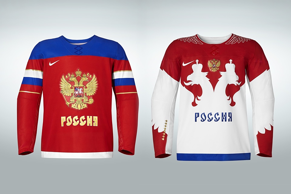
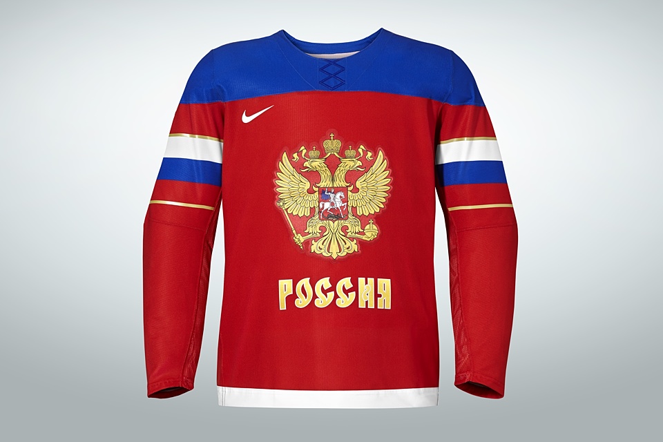
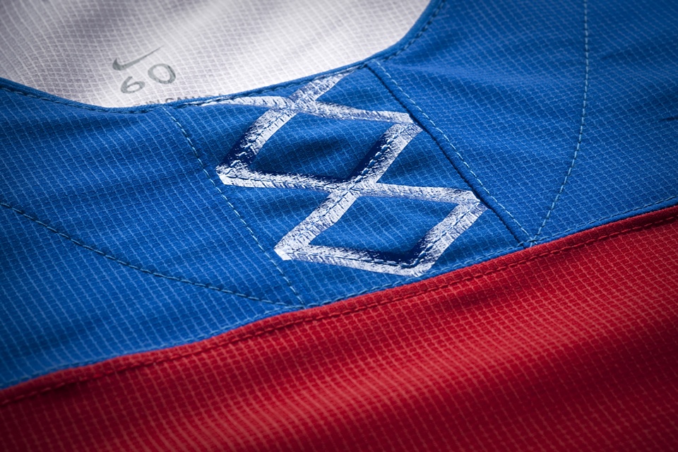
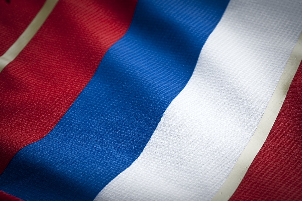


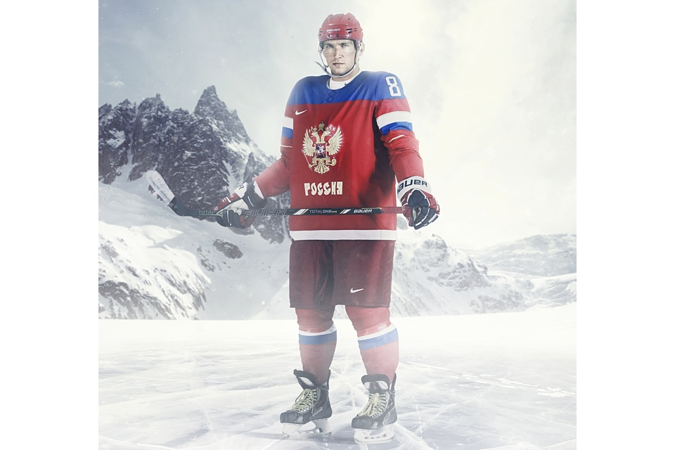
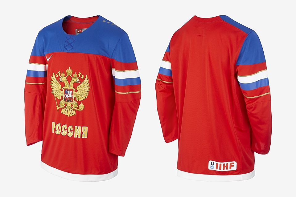
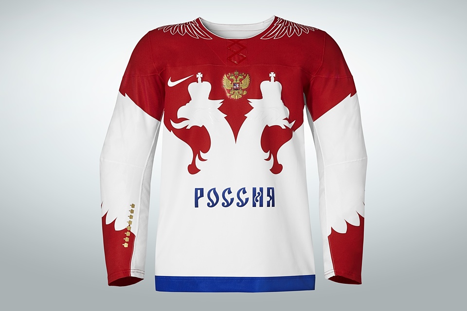
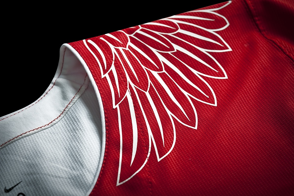
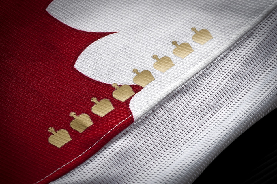
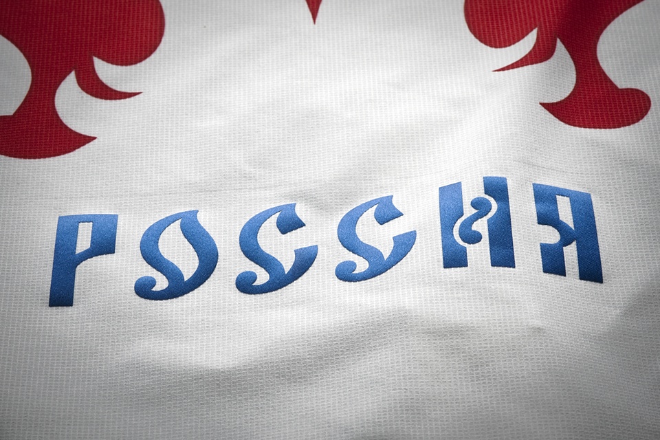
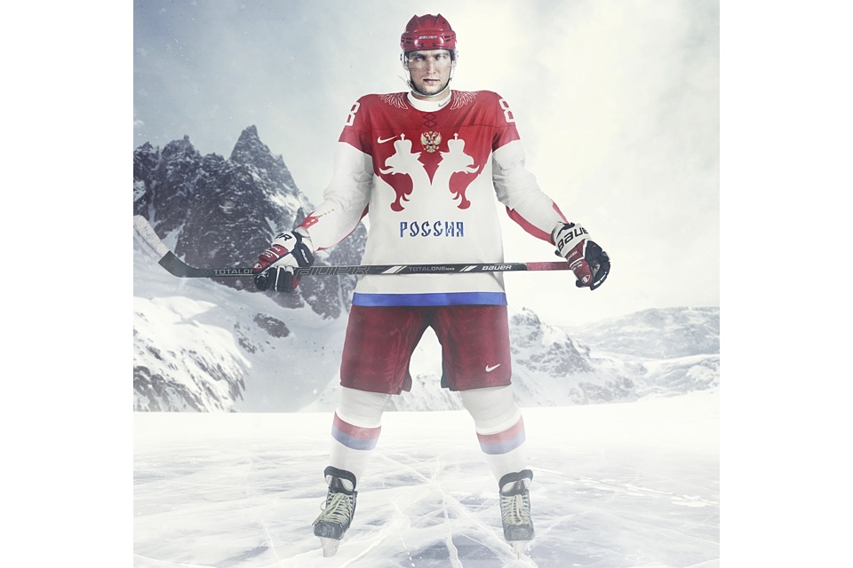
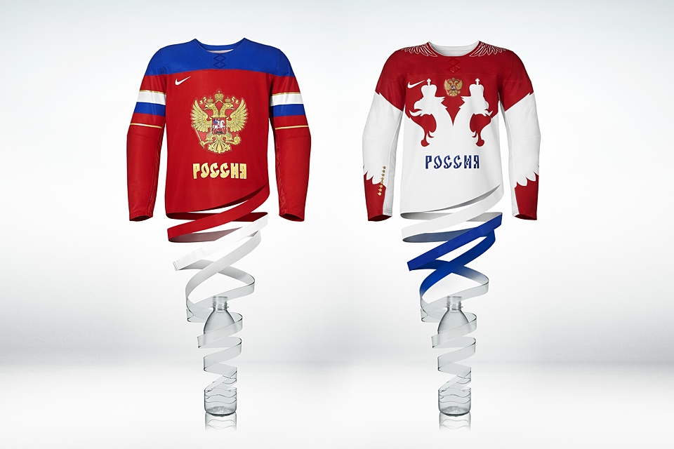
Russia
As the host of this year's Winter Olympics, Russia ended up with great pair of new sweaters from Nike. They're surprisingly different both from each other and anything the country has worn in the past.
The Russian jerseys were unveiled the day before Team USA's on Aug. 26. And with it came lots of great photos from Nike. Be sure to flip through them for some extra details. (You're probably getting the hang of this by now.)
Nike's press release breaks down the uniform designs.
Red Uniform
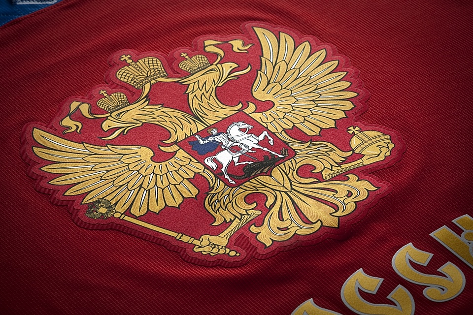
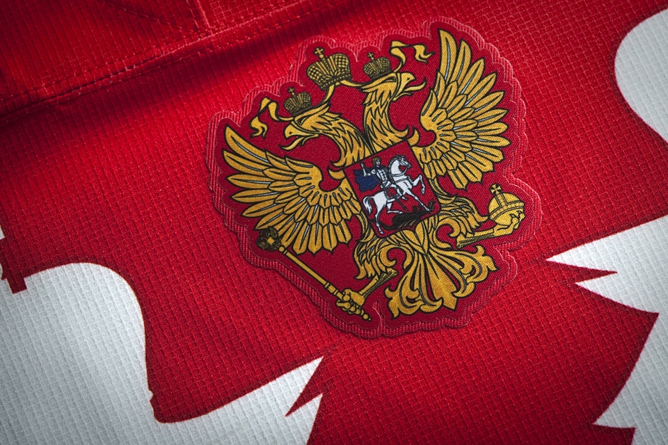
The red jersey has been designed in more of a traditional approach. It celebrates Russian pride through the large crest at the center front, with ‘Russia’ emblazoned underneath in championship graphics. The four golden stars on each shoulder represent the Russian team’s past successes.
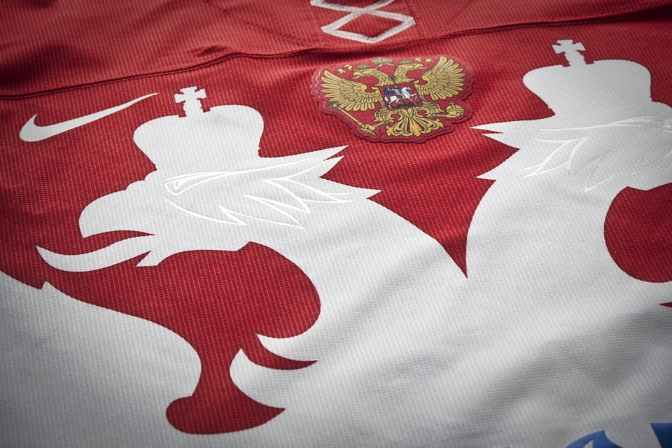
White Uniform
With the Russian coat of arms in the center infused with golden graphics, the silhouetted eagle spreads its wings to take flight, like the Russian hockey team on ice. The red neckline features white eagle feathers on the shoulders, giving Russian wings to every player. The eight golden crowns on the right sleeve add the finishing touch.
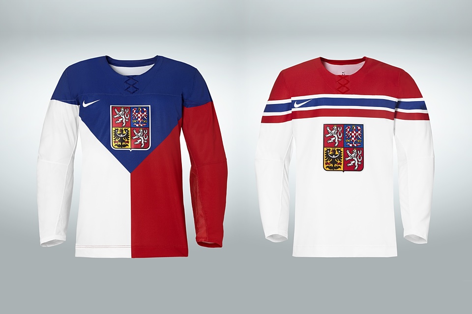
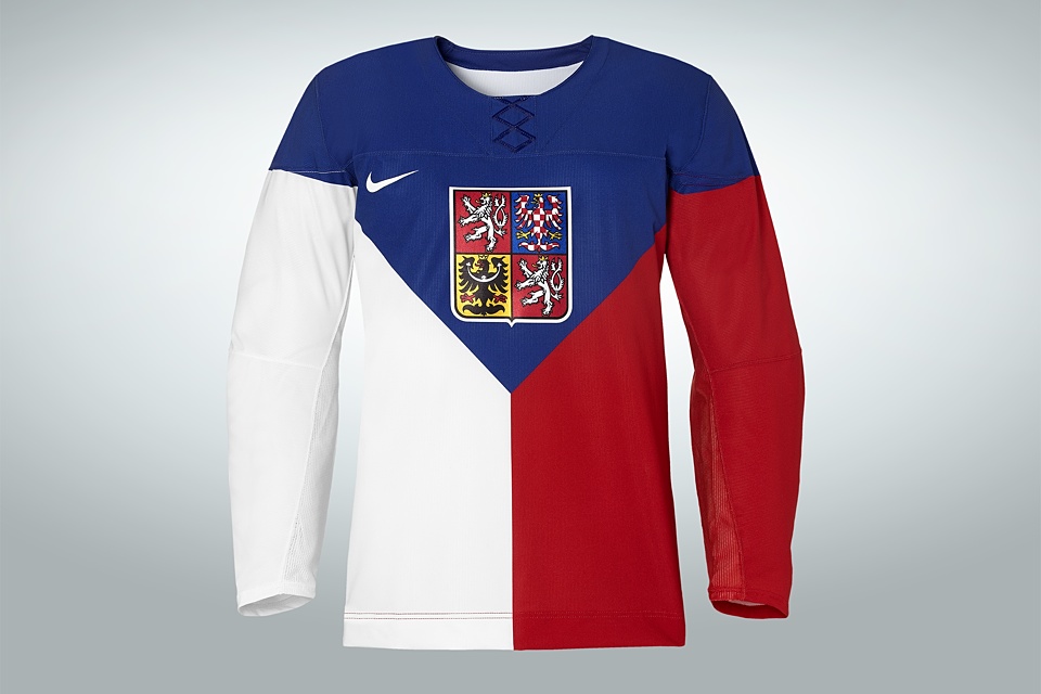
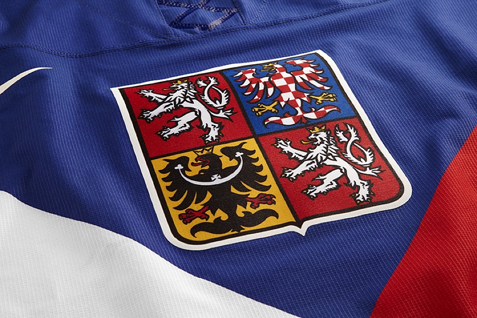
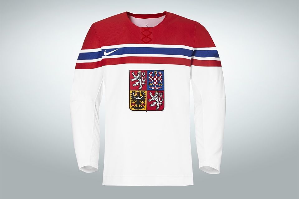
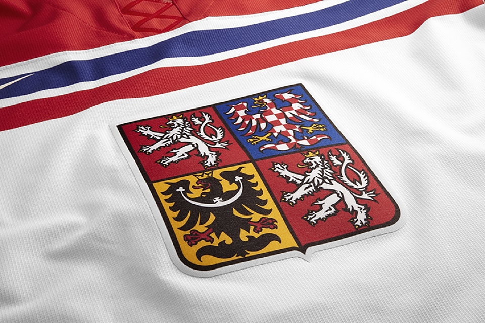
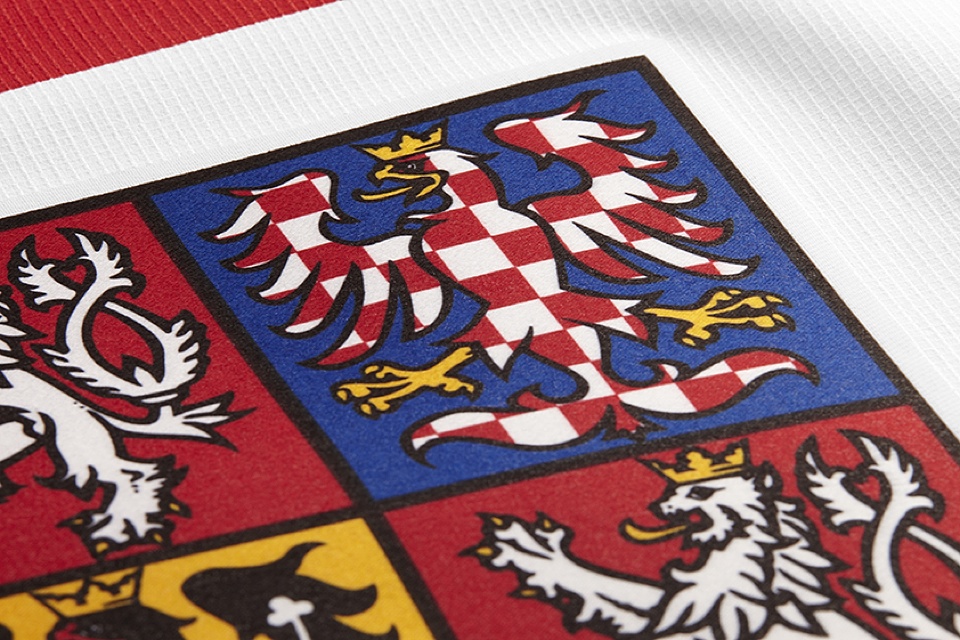
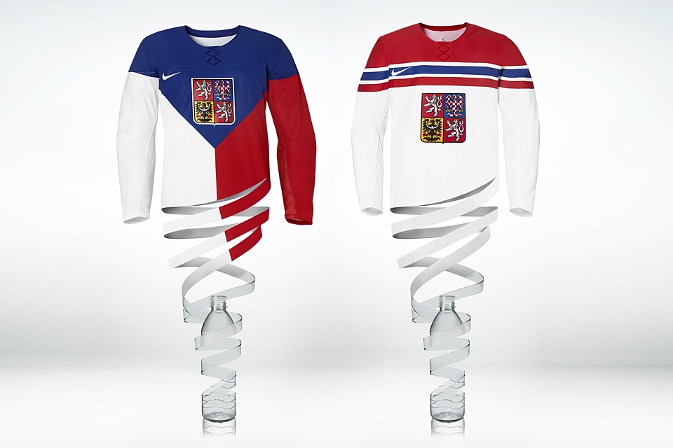
Czech Republic
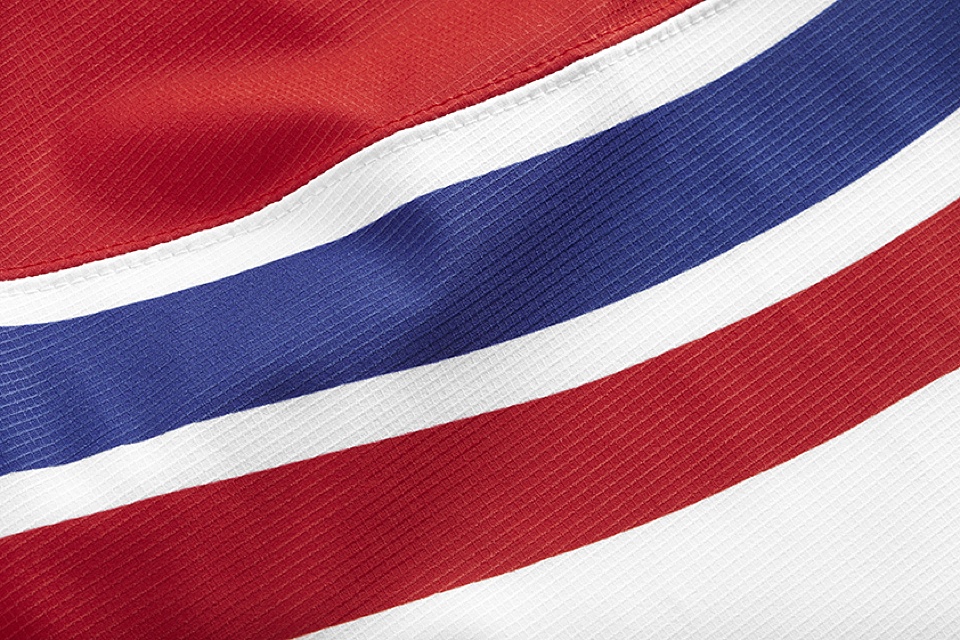
Another team proudly sporting red, white and blue is the Czech Republic. Their new Olympic jerseys were unveiled on Oct. 7. It's fascinating to see how Nike is giving such unique uniform treatments to nations using the same colors.
When the Czechs wear their dark jersey, they'll essentially be wearing their national flag. That's where the unusual pattern comes from. The white jersey's striping has a bit of a Montreal Canadiens feel, but like that's the worst thing in the world.
Overall, these jerseys balance simplicity with distinctiveness. it helps that while the Czechs have won gold before, they don't feel the need to gloat on a jersey.
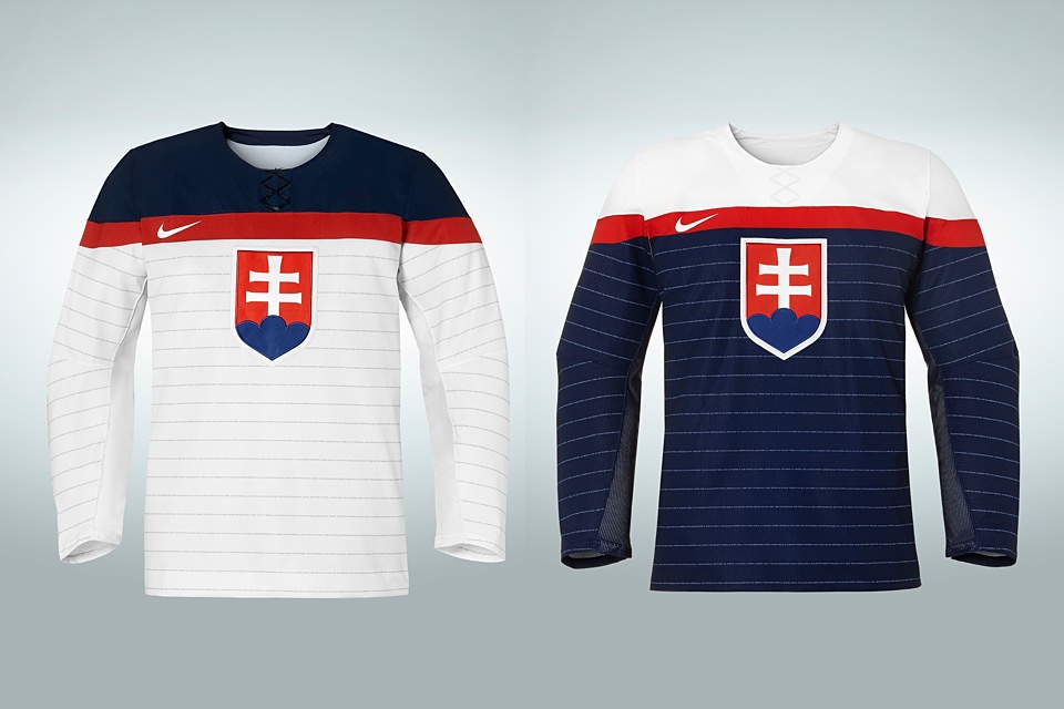
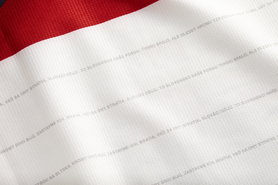
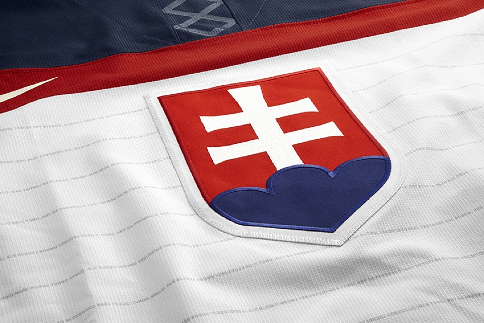
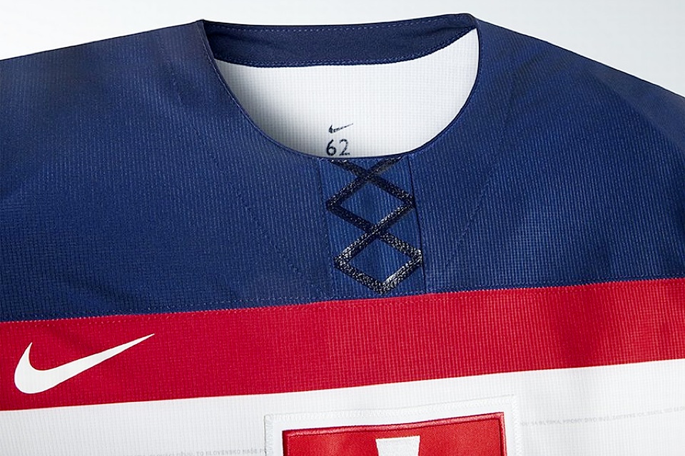
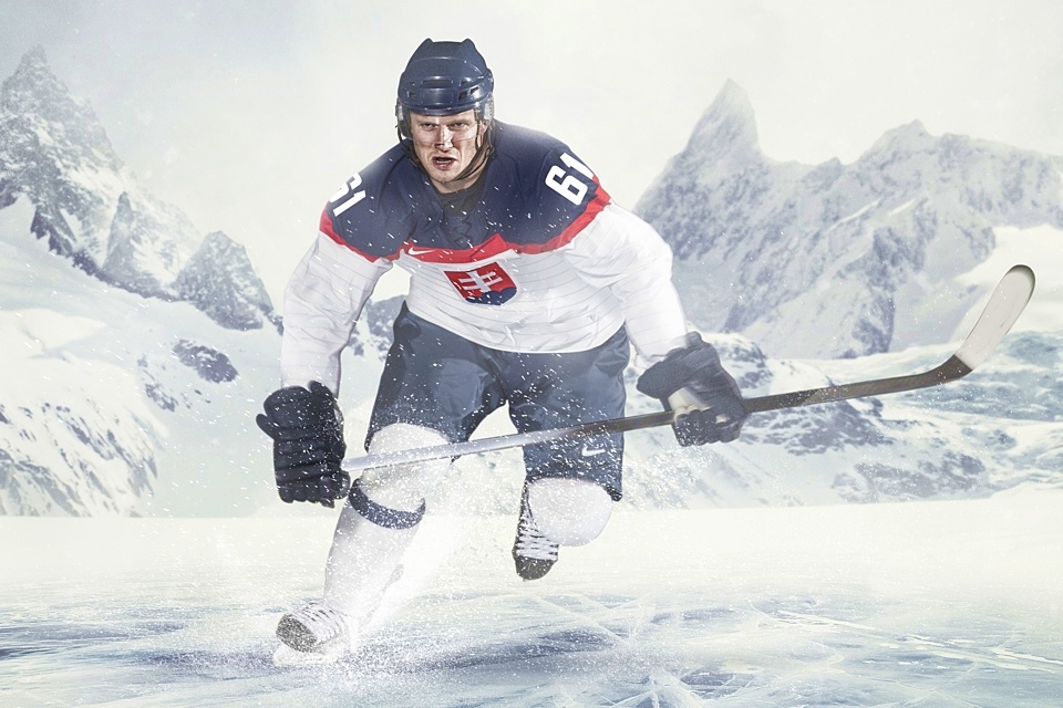
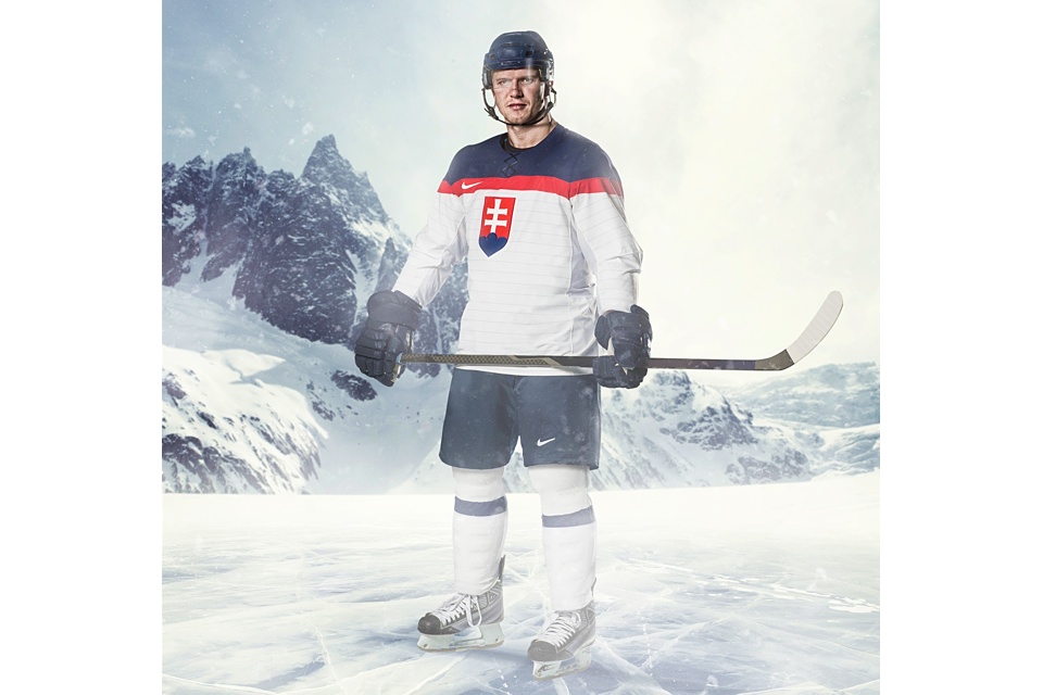
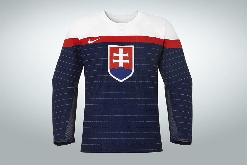
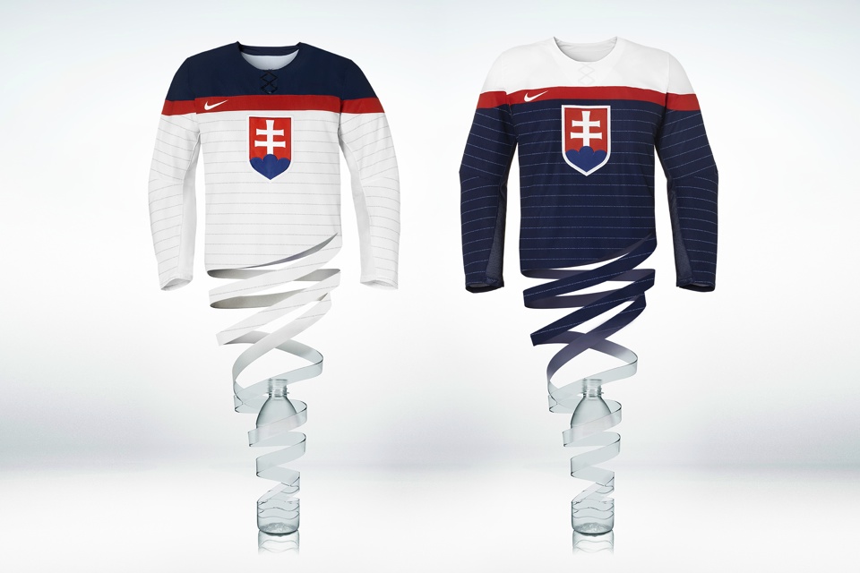

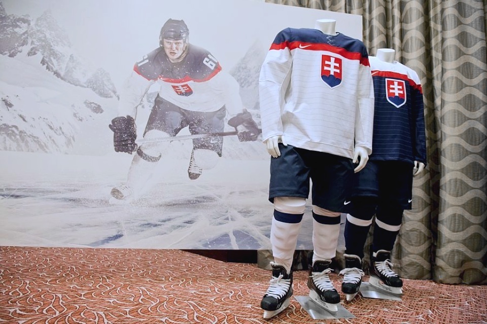
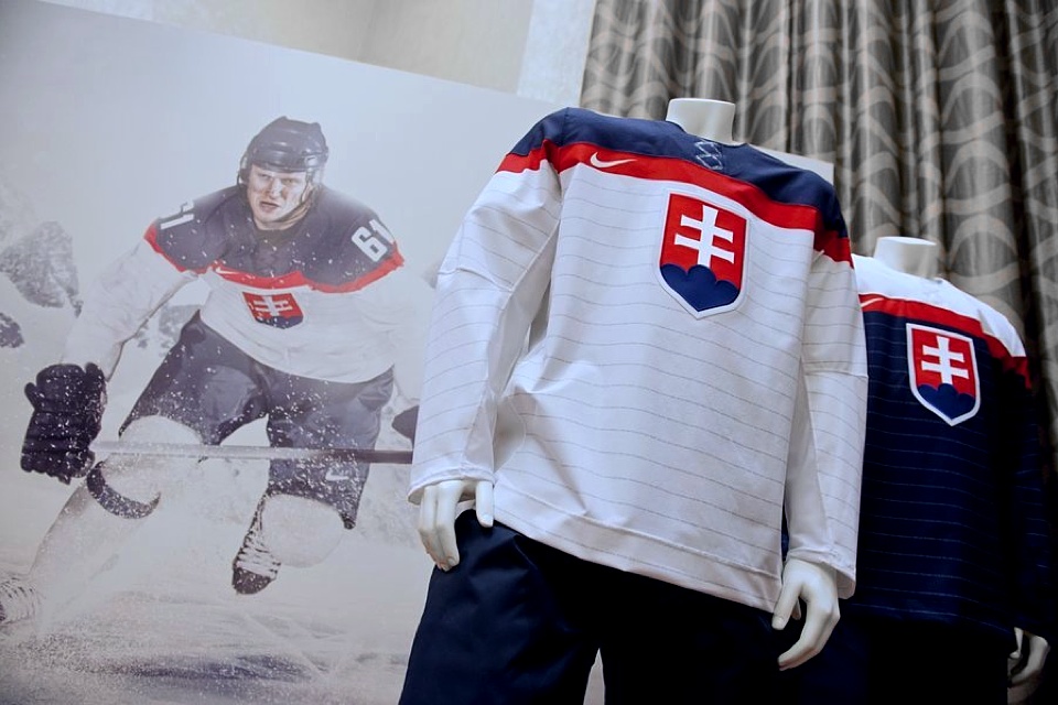
Slovakia
More of the red, white and blue. But this time it's a little more familiar. Slovakia ended up with a pair of jersey that are awfully similar to Team USA's. But the key element that separates them is what makes all the difference.
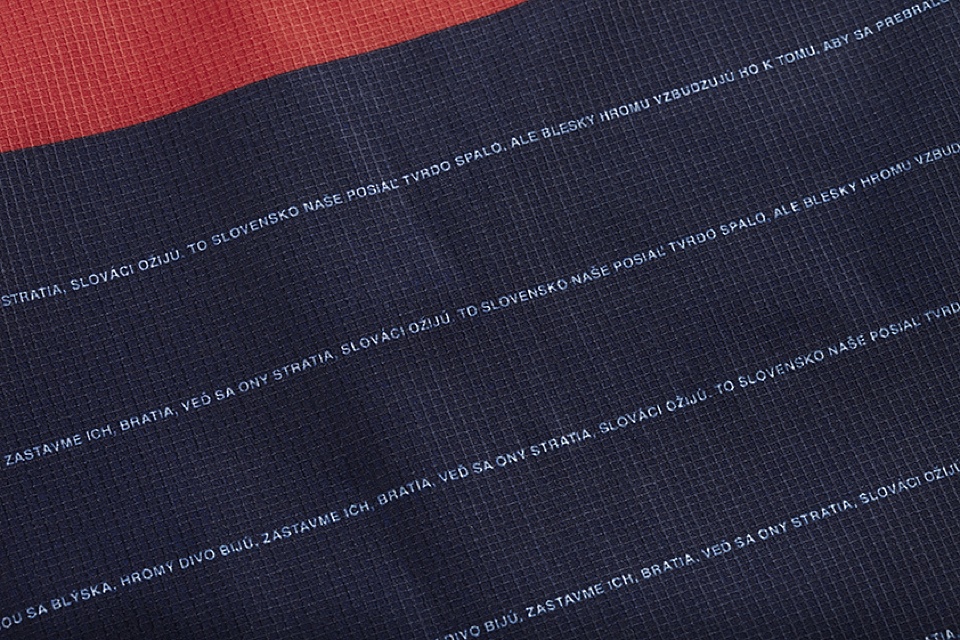
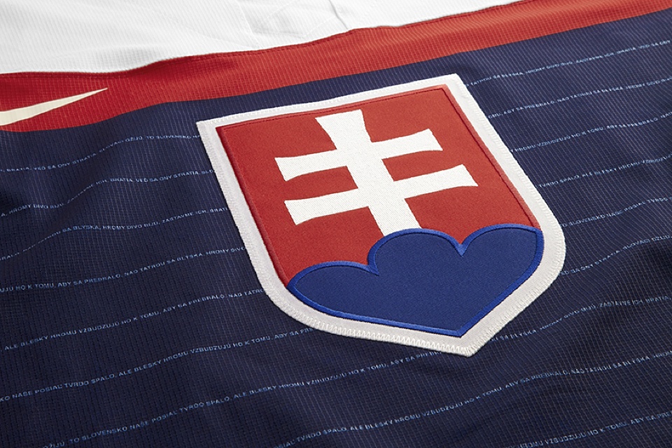
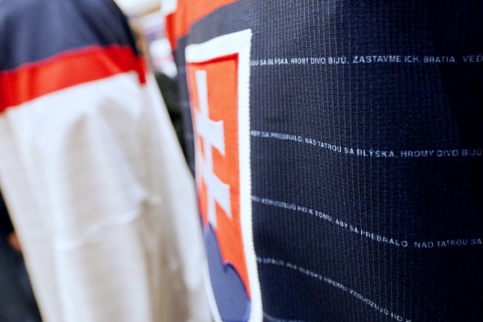
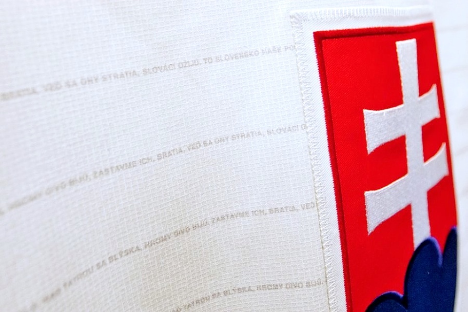
Those pinstripes on the two jerseys hold a secret. View them up close and words begin to emerge — like the security signature line on a check. They're the words to the Slovakian national anthem. It's such a simple yet brilliant touch — and one that may be unequaled in the history of Olympic hockey.
According to Nike, it seems these five countries are the only ones that have "officially" unveiled their Olympic jerseys. In other words, Nike has not issued press releases or official photos for the other nine nations. However, as we'll see, plenty of them have made their new sweaters public in their own ways.
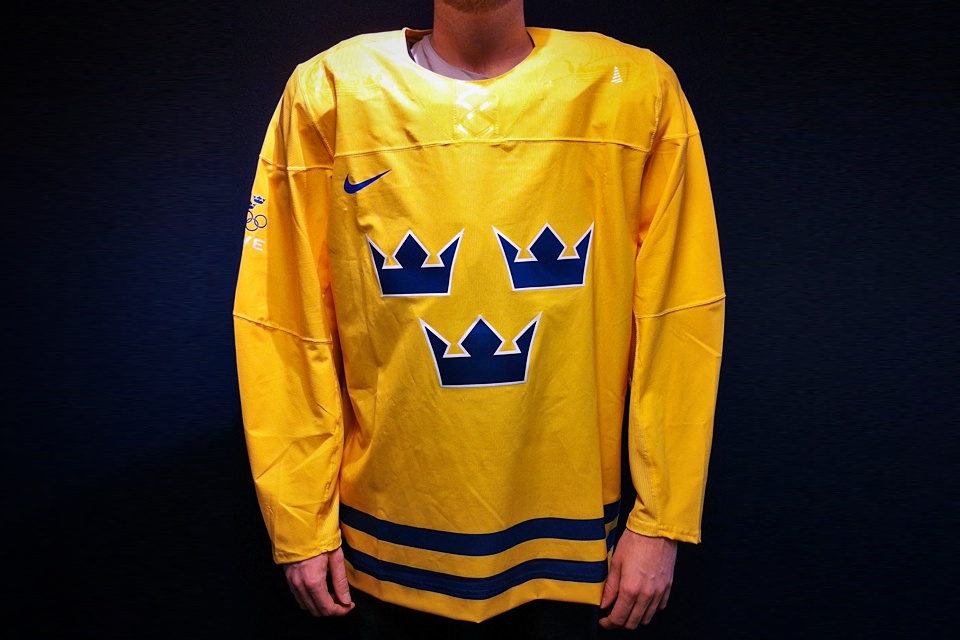
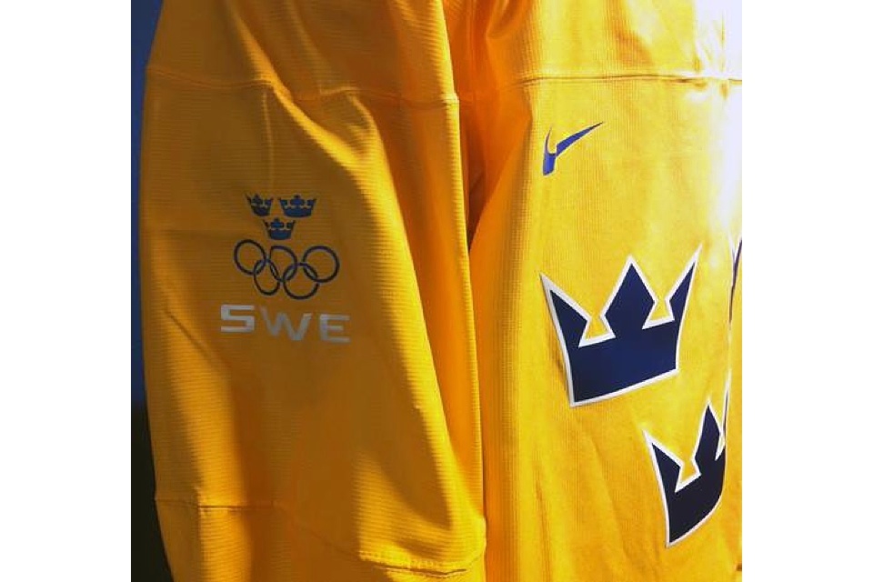
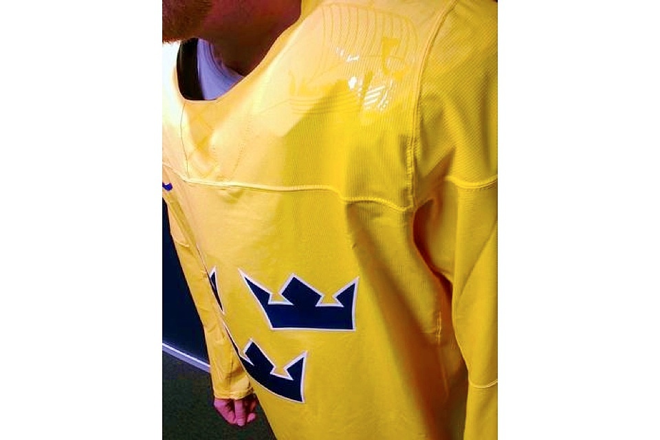
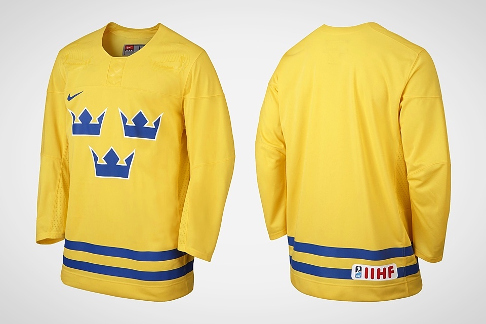

Sweden
According to the Swedish Ice Hockey Federation, Nike and Sweden didn't see eye to eye when it came time to create new uniforms. Tomas Bjernudd, the organization's marketing manager said Nike was eyeing sweeping changes to the Swedes' traditional jersey design. Needless to say, he wasn't having it.
Still, there were some changes. Sweden's national ice hockey organization, Tre Kronor, posted a photo of the new yellow jersey to their Facebook page. They also supplied a couple to Aftonbladet, a Swedish tabloid, who published them as "exclusive."
A low-resolution rendering of Sweden's blue jersey, can be seen above, but photos have yet to surface. I'm still hoping we see some official photos from Nike before the games begin.
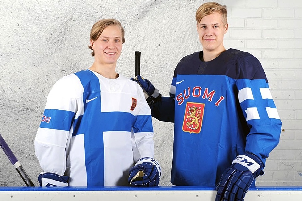
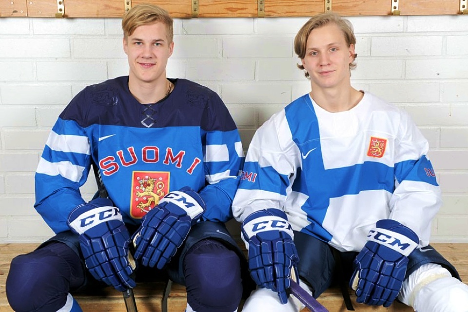
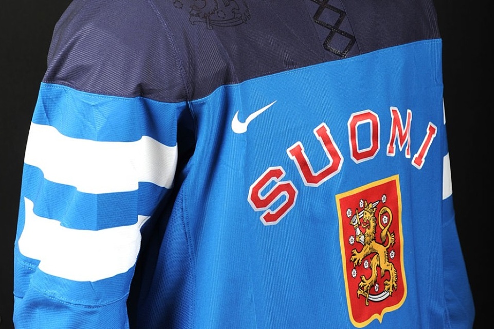
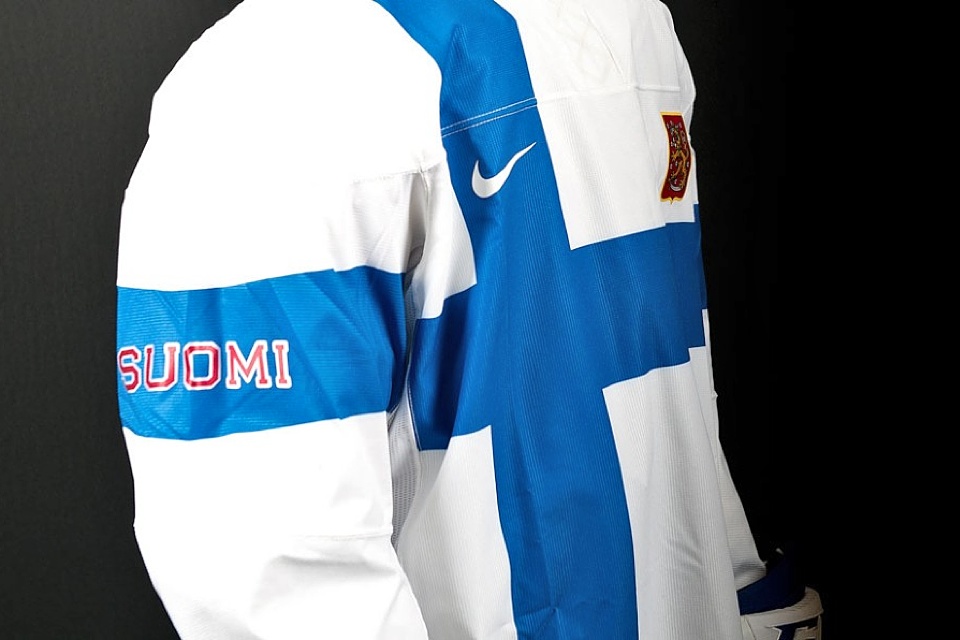
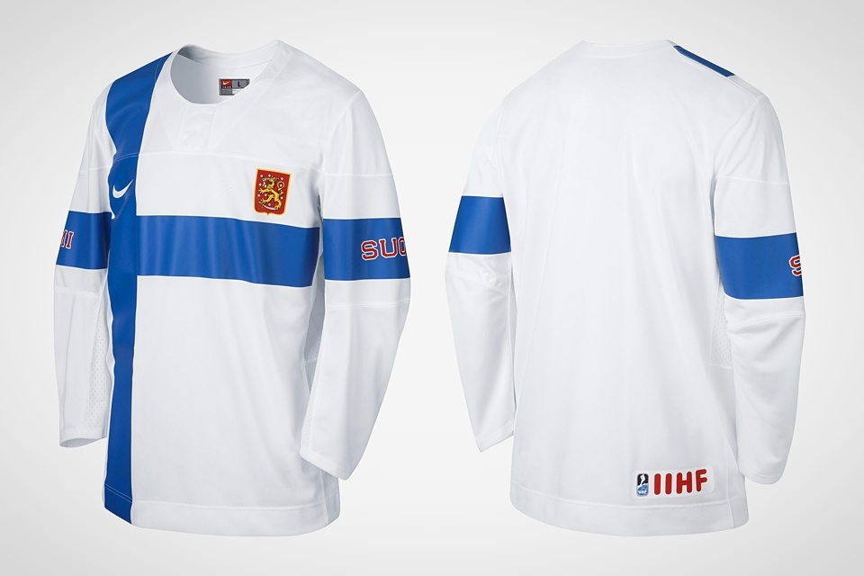
Finland
Finland unveiled their new Olympic jerseys on Nov. 6 and the first images were posted online by Finnish TV station MTV3. But Nike's participation was absent.
The white sweater is modeled after the nation's flag while the blue one is a nod to Finnish jerseys of the past. Both have their share of Nike flourishes.
We saw the Czech Republic get a flag jersey. We saw Russia get the sleeve flag treatment. While both of these jerseys stand out as unmistakably Finnish, it's hard not to notice Nike's recycled creativity.
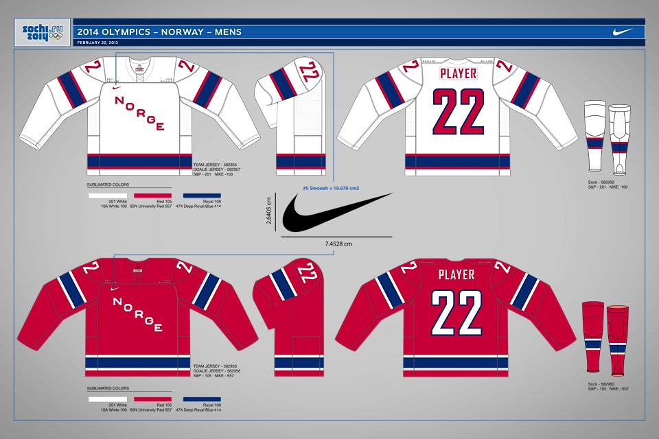
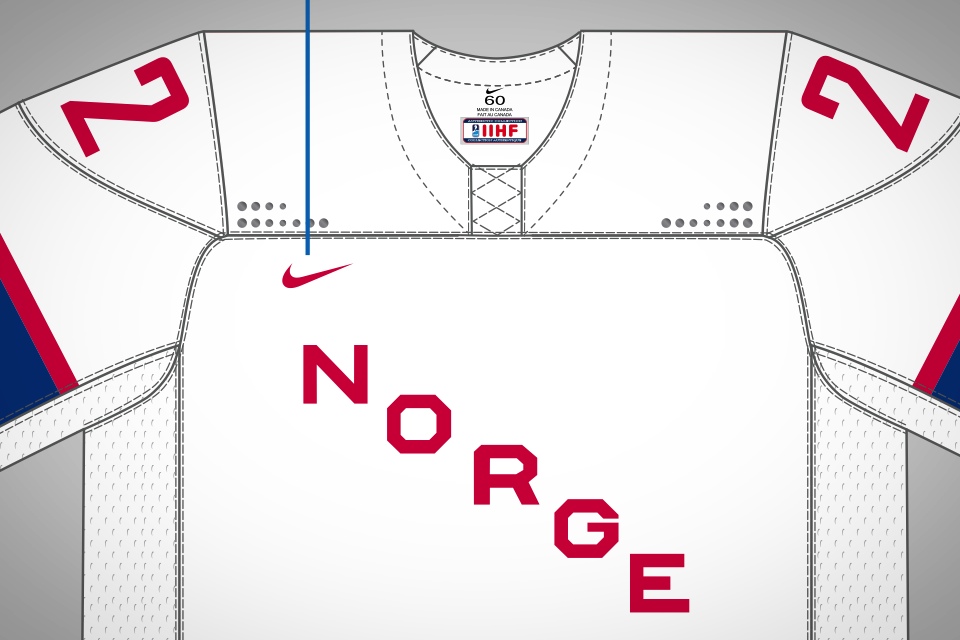
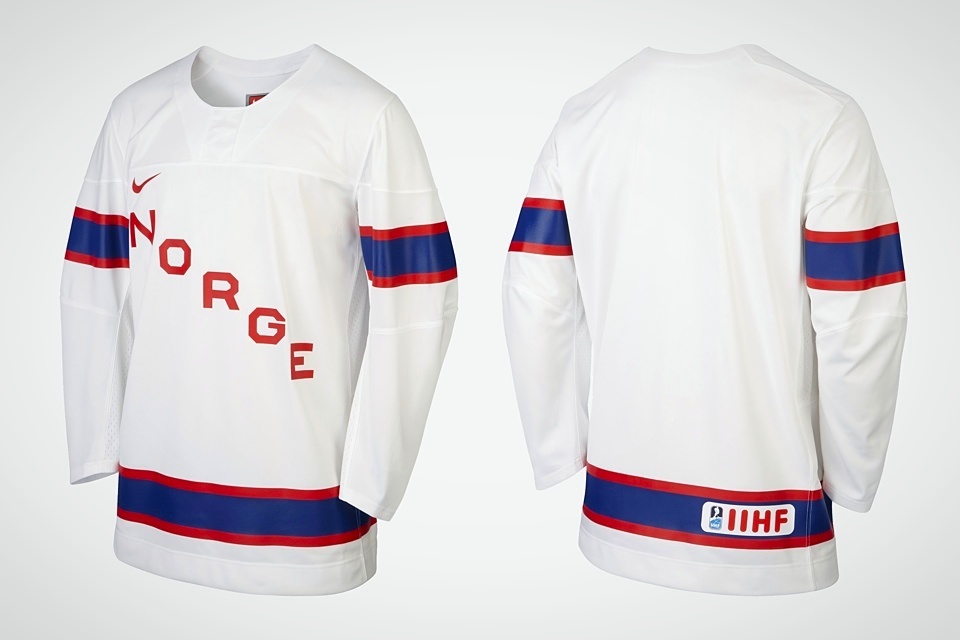
Norway
We'll wrap up the Scandinavian nations with a look at what's to come for Norway. On Jan. 15, the Norwegian Ice Hockey Association did reveal the designs by way of a digital document from Nike.
While no photos of the official game jerseys have shown up online yet, Nike's online store does feature the retail version of Norway's white sweater. You can see both the digital rendering and the retail jersey in the slideshow above.
Basically, Norway is getting a set of classic, traditional jerseys. Nike was happy to let them stay true to their history, apparently. In fact, apart from the new collar design, there appears to be no significant difference between these jerseys and the 2010 ones.
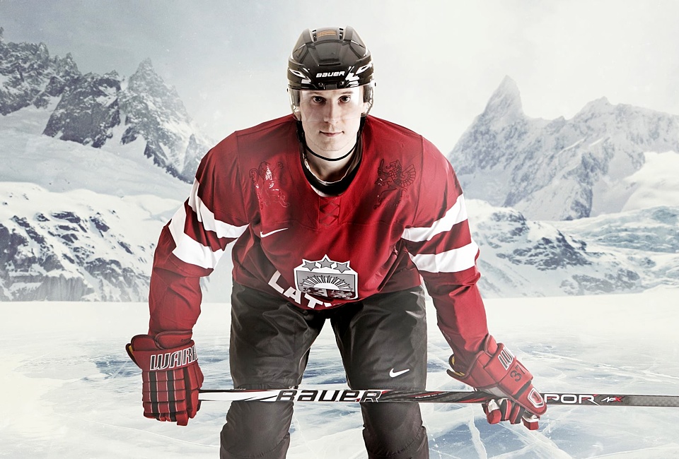
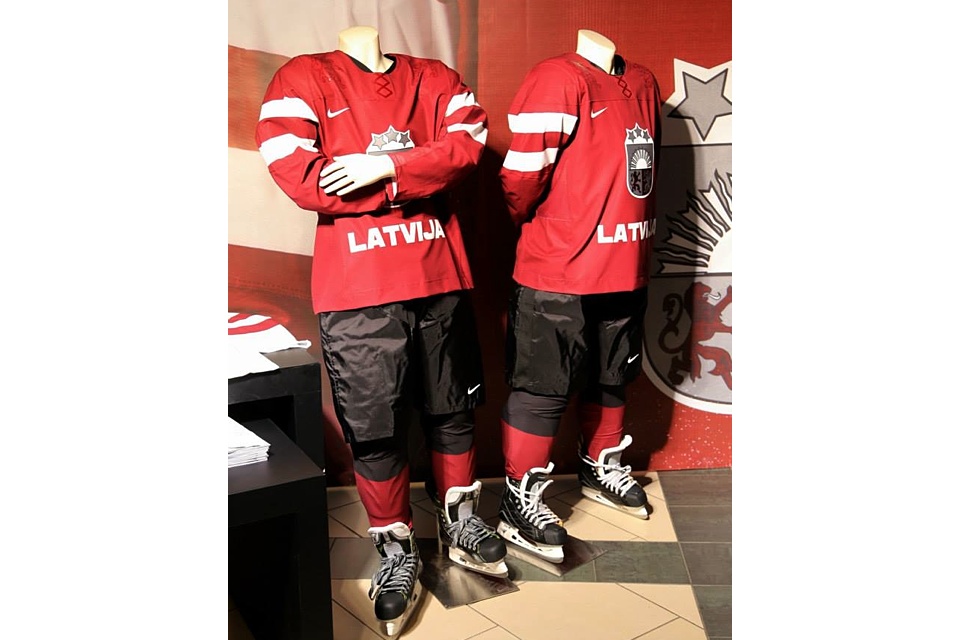
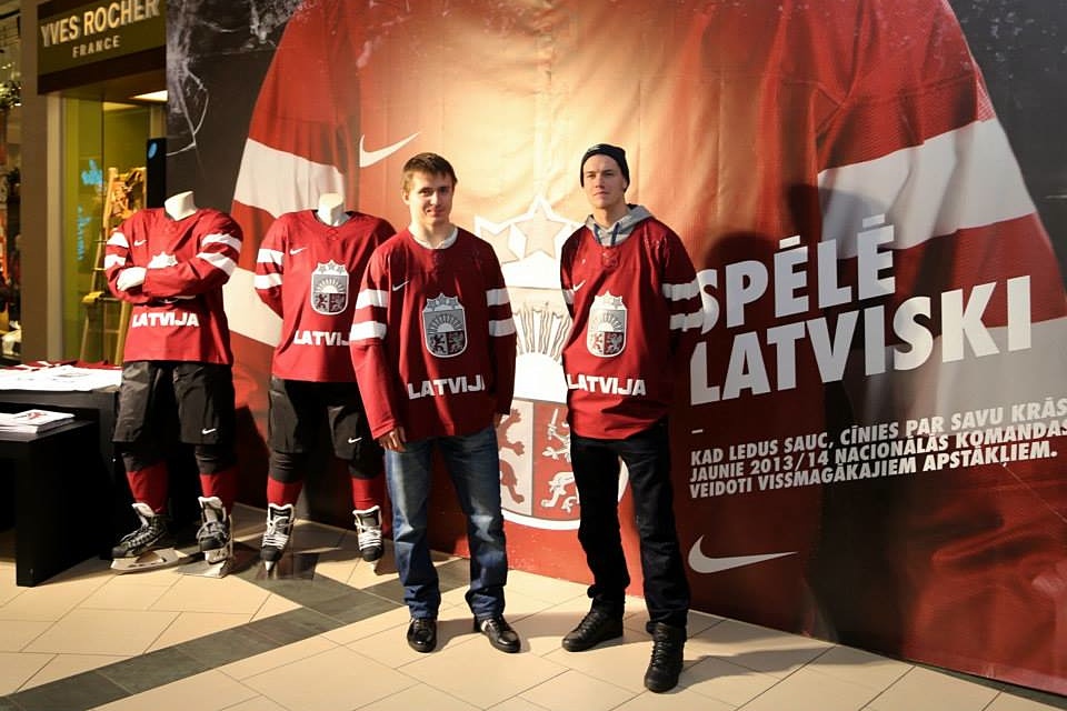
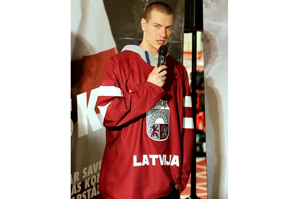
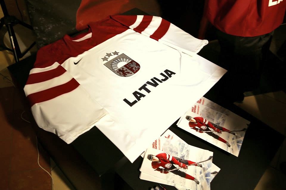
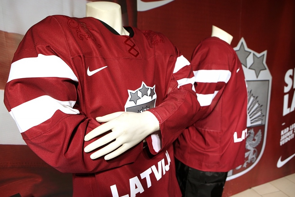

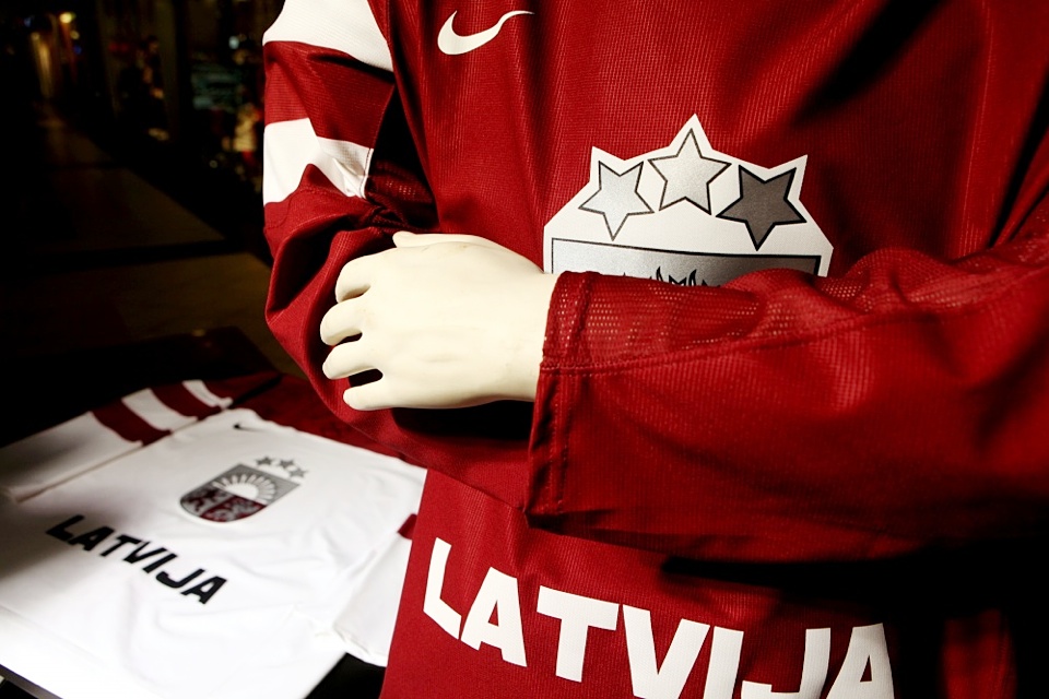
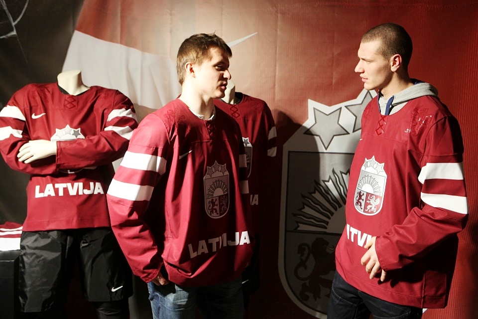
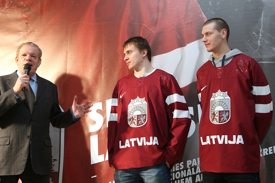
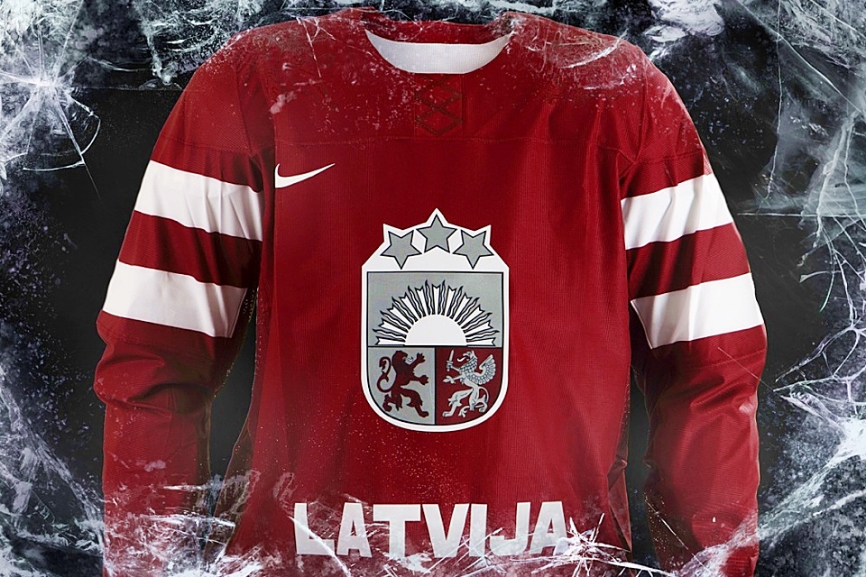
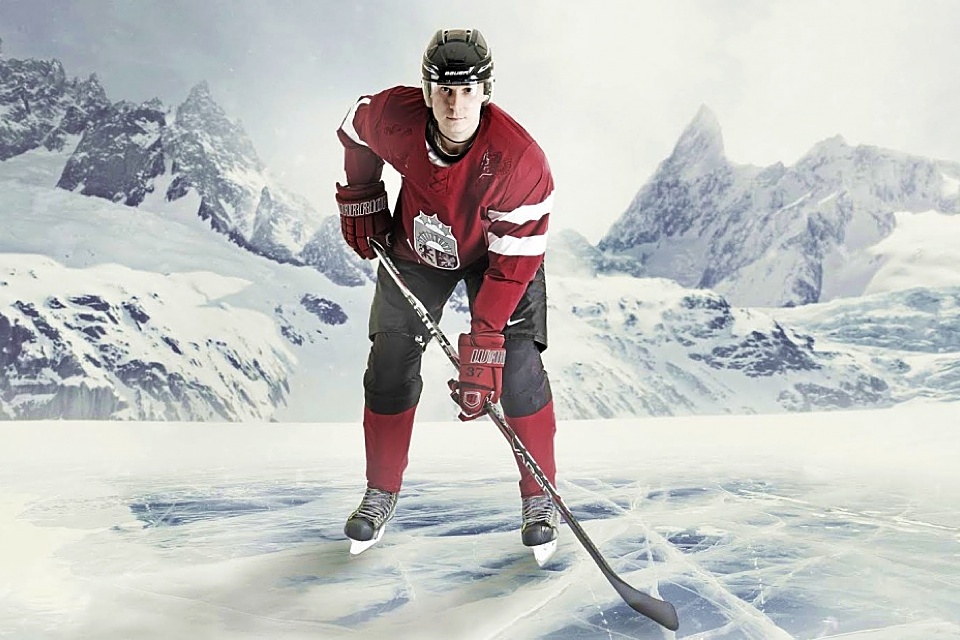
Latvia
On Dec. 20, the Latvian Ice Hockey Federation held a special event in Riga to unveil their new Olympic uniforms. Photos were posted on their Facebook page along with a publicity shot from Nike — though there was no corresponding press release from the jersey maker.
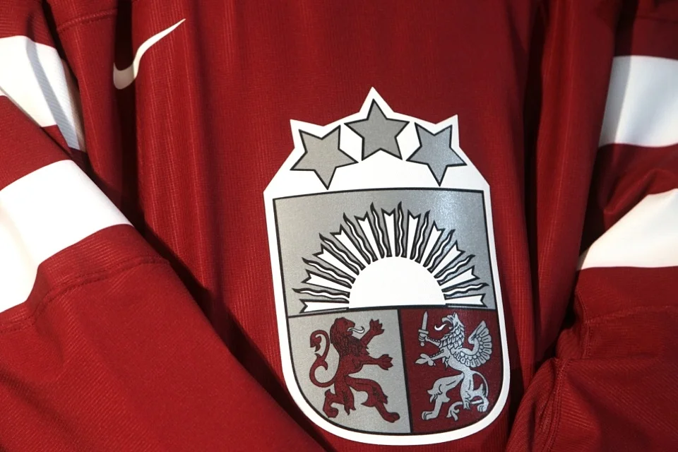
Latvia will head to Sochi looking a lot like it did in Vancouver. But Nike has simplified the striping pattern and removed the waist stripes entirely. They've also stamped it with their new shoulder embellishment — we find the lion and griffin from the coat of arms crest.
It's a traditional, sensible design for Latvia, who distinguish themselves from the rest of the crowd with an unusual color palette of burgundy and silver. As we get into the group of teams least likely to compete for gold, it seems to me Nike has spent less time trying to make them stand out. It's disappointing but not surprising.

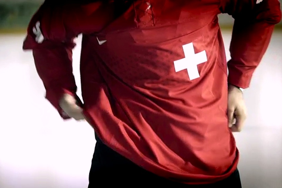
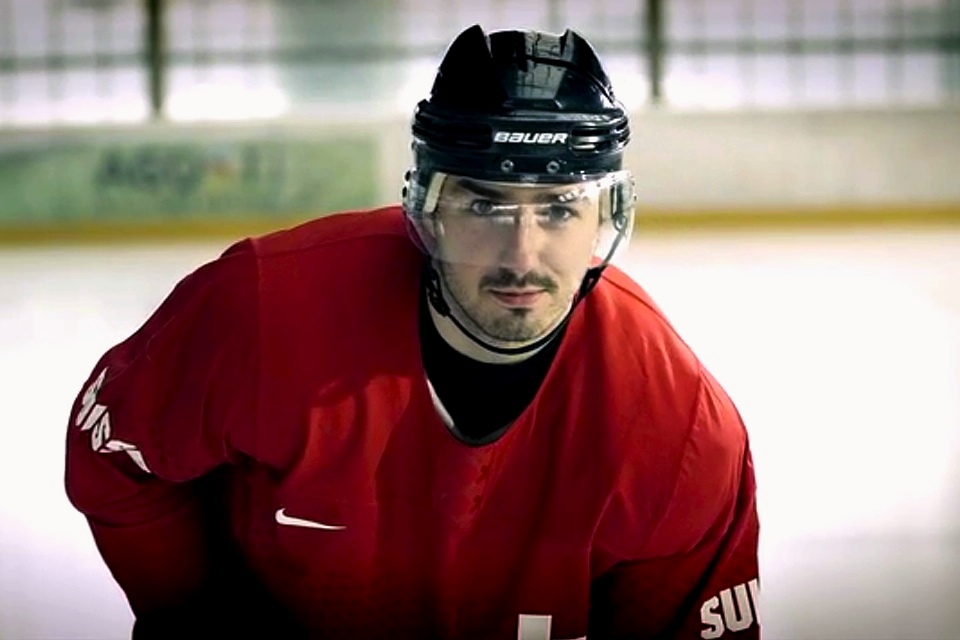


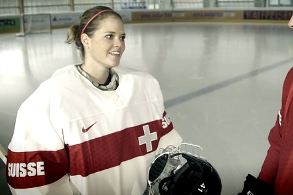
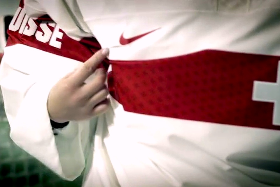
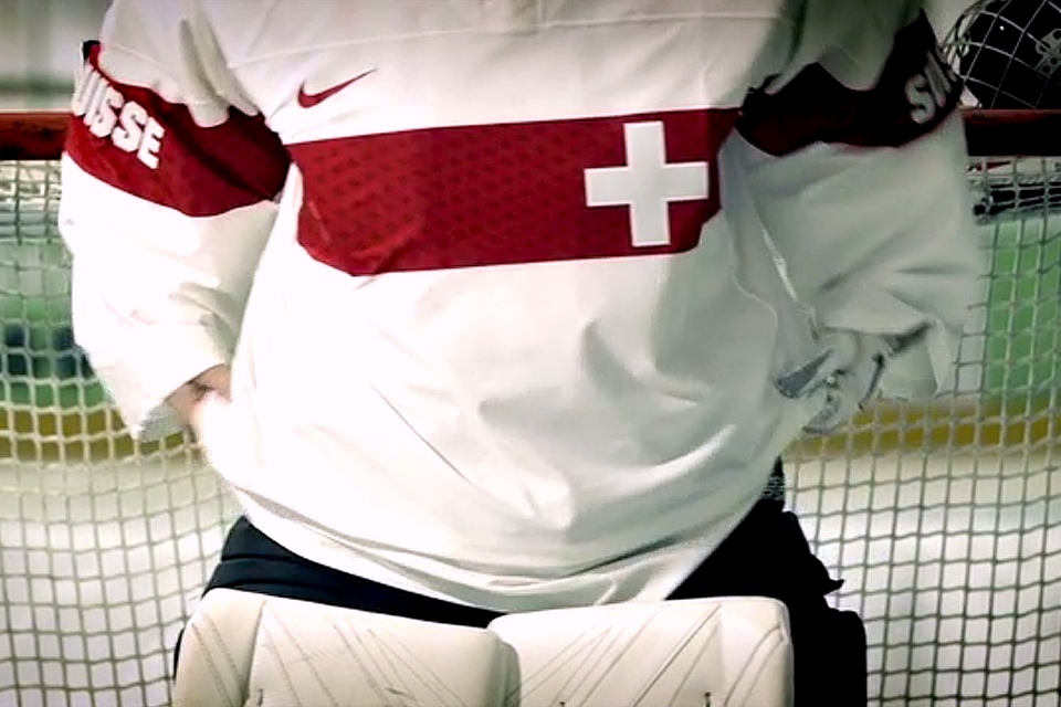
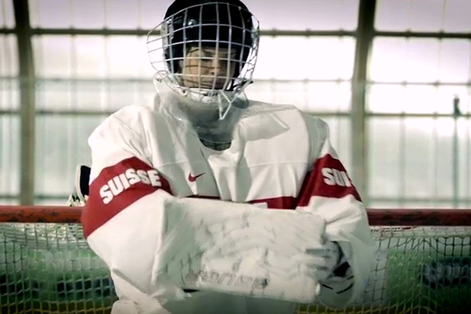
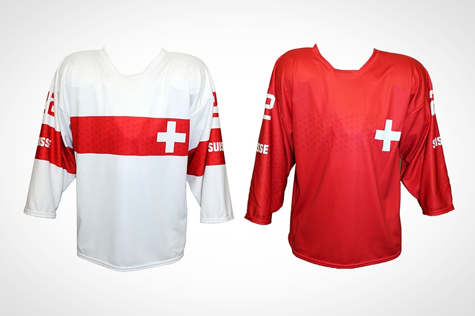
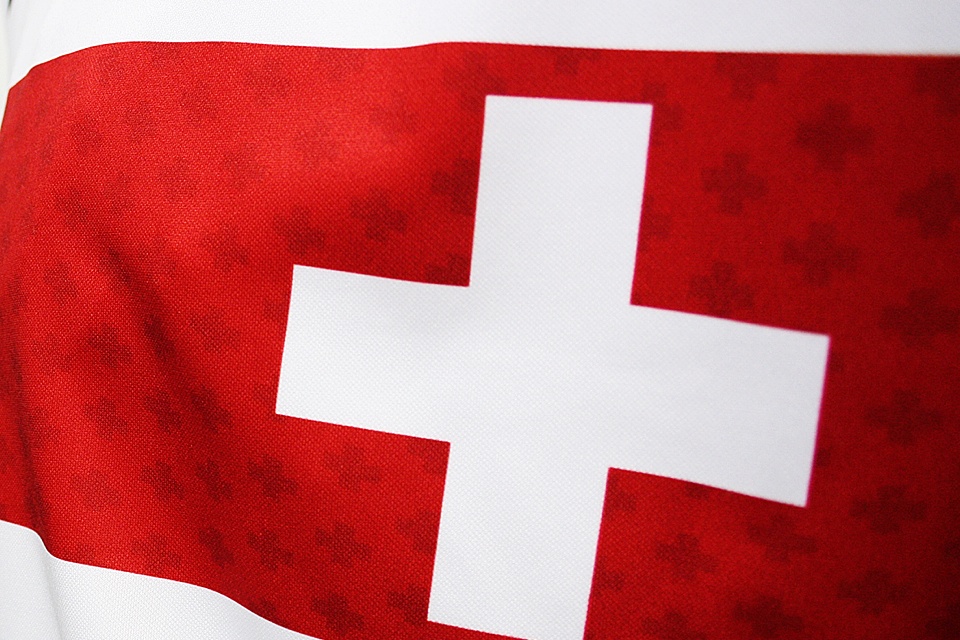
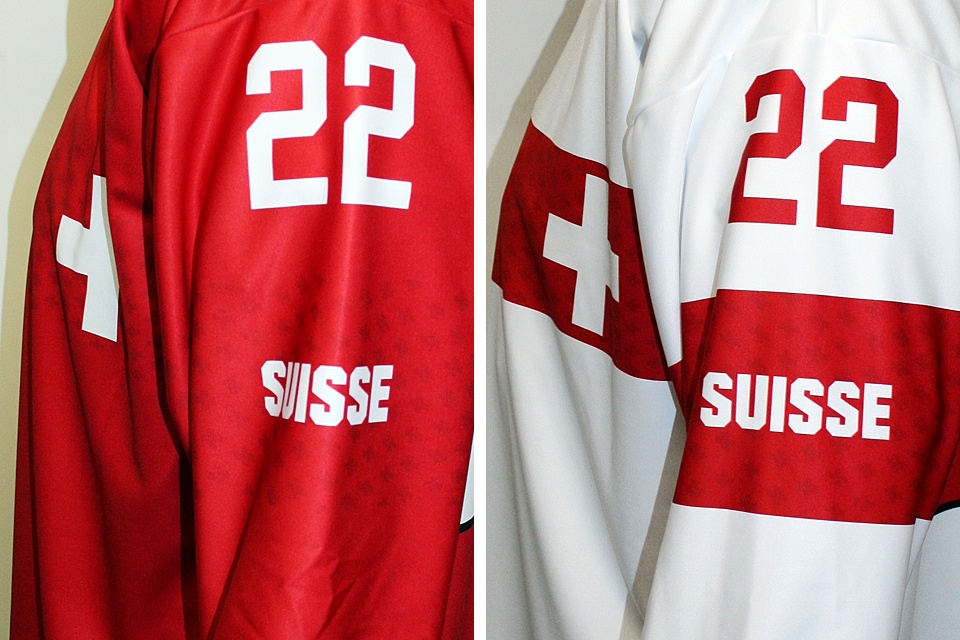
Switzerland
Switzerland is an odd story. They haven't technically unveiled their new Olympic jerseys yet, but they were on display in two online videos posted by Swiss Ice Hockey on Nov. 14 and Nov. 21.
With help from Google Translate, I can tell you the videos seem to be about a contest to win an autographed, game-worn Olympic jersey. It also mentioned that new jerseys would be available to purchase online starting Dec. 2.
In the slideshow above, you'll find some handy still frames from both videos along with the photos of the jerseys being sold in the Fanshop. What's interesting is that the jerseys on sale are clearly not Nike jerseys. For one thing, they don't have the Nike logo on the chest or the FlyWire collar.
To be fair, they are specifically listed as "replica" jerseys, but it's surprising Nike would allow the Swiss to sell what essentially amount to knock-offs. Regardless, based on what the players in the video are wearing, the replica designs do appear to be accurate.
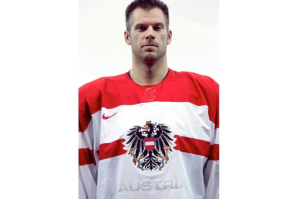
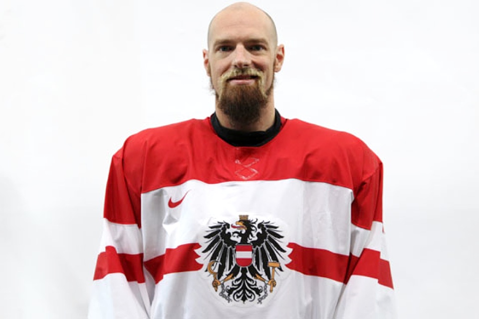
Austria
Switzerland's similarly-colored neighbors in Austria have been playing their new look pretty close to the vest. I've only managed to track down a couple of player head shots that show it. One came from the Austrian hockey team's special Road to Sochi Facebook page. The other was in an article about Austrian hockey player Markus Peintner on SportNet.at.
How do we know this jersey is really the new one? Two words (smashed together). FlyWire. That collar style is a new development for the Sochi Olympics, as we've come to know. Also, Austria hasn't qualified for Olympic play since Salt Lake in 2002.
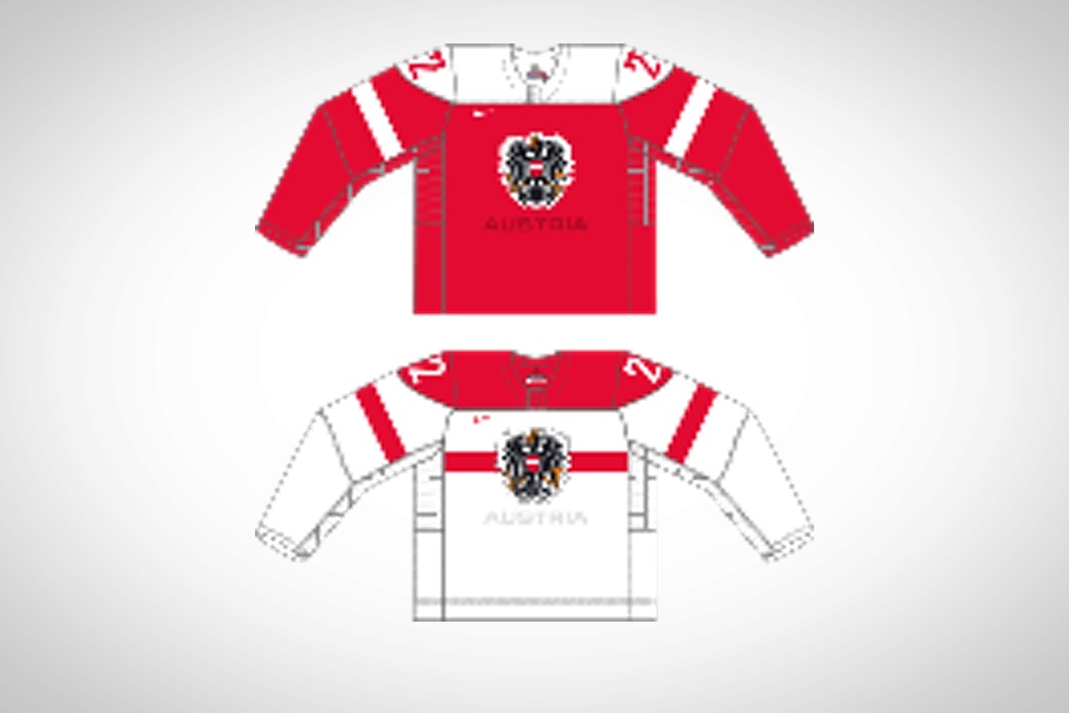
As with Sweden, we're only getting to see one jersey in pictures at this point. The low-quality rendering in the slideshow shows us the red one is a simple reverse.
Featured on the front is the Austrian coat of arms over a chest stripe. And worth noting is the fact that emblazoned beneath is the country's name as it's spelled in English. Russia, Finland, Norway, Latvia, and Switzerland are all using their native spellings.
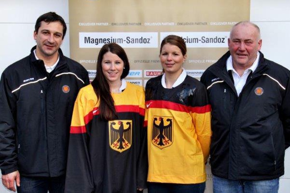
Germany
Sweden won't be the only team in Sochi without a white jersey. Germany is joining that small club with their new Nike sweaters. And the women's tournament in these Olympics will be our only chance to see them in action.
The German Ice Hockey Federation unveiled the uniforms on Jan. 15. There's a black one and a gold one and they're perfect reflections of each another. According to the article, "The design was created exclusively for the 2014 Olympics and is only [to be] seen in Sochi."
The German men's team did not qualify this year, so you'll have to catch the women in action if you want to see these special sweaters. And it'll be well worth it too. This new look is top notch and it's a shame they're getting limited use.
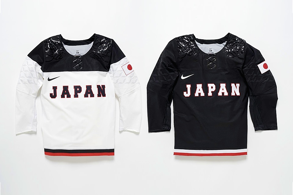
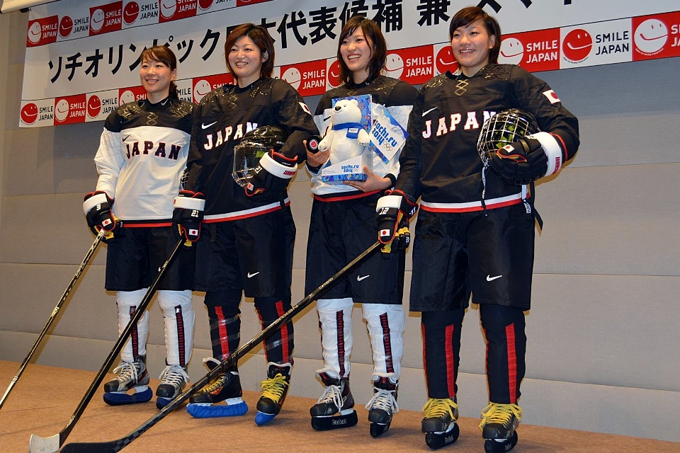
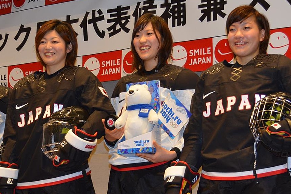


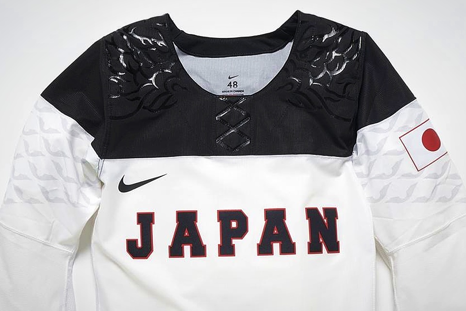
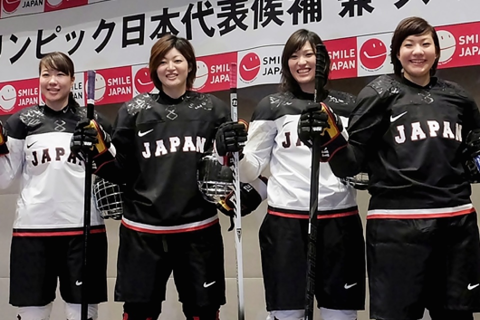

Japan
Like Germany, Japan is only fielding a women's hockey team in Sochi. But unlike Germany, they won't look particularly great while doing so. The Japan Ice Hockey Federation unveiled its new black and white Olympic jerseys on Dec. 4 with photos on Facebook and their website.
Yes, while some teams went a little outside the box with Nike, Japan went the collegiate route. I'm not normally against that, but this is Japan. The possibilities for creativity are almost endless and this is what we get? And by the way, like Austria, it's the English spelling of the country's name on the chest.
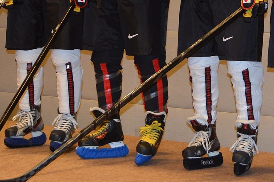
The one element I do like is the sock striping. The vertical design will set the Japanese apart and the dotted red line inside the black stripes is cool even if you barely notice it. And so far I'm having trouble making out the shoulder embellishment and sleeve sublimation designs.
Update
February 4: An Icethetics reader named Jason emailed in this week with some details about Japan's uniforms. I'll let him take it from here.
Apparently, the uniforms feature the "dragon god" (龍神)that watches over them as their chosen team symbol. The dragon god has been the god of water since ancient times.
The explanation comes from this website, which put it in quotation marks, making it seem like it's the official explanation from the press conference. Major newspaper sites didn't mention any specifics about the uniform in covering the unveiling, though.
If you look at the last photo of the Japan uniform that you feature on your site, you can see the eye of the dragon right by the collar on the black uniform, among the scales and long whiskers on its face. The design on the sleeves appear to be dragon scales.
Big thanks to Jason for the research!

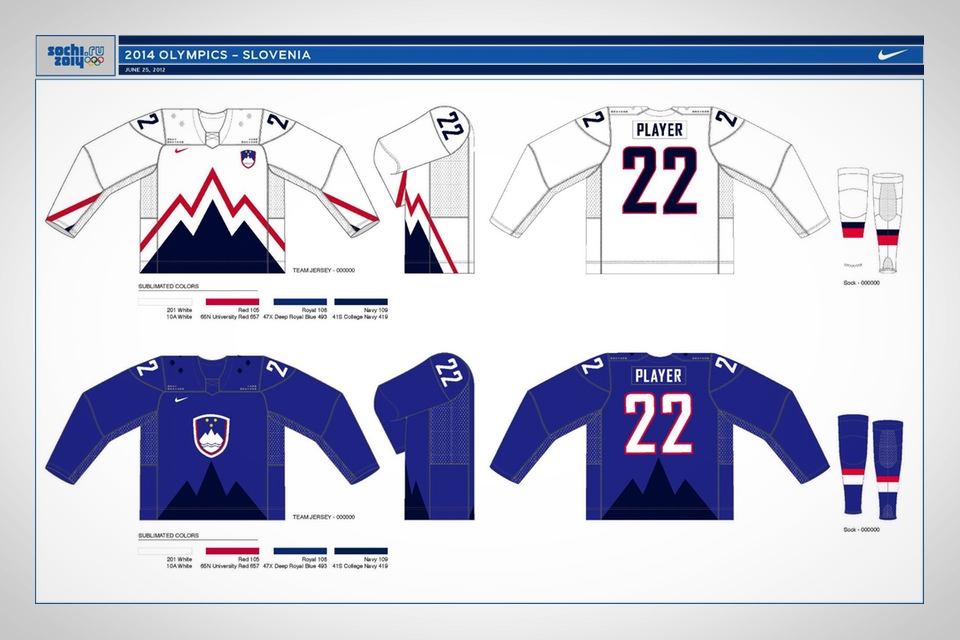
Slovenia
The last nation headed to Sochi is one that has yet to reveal any photos of its new Olympic jerseys. All we have for Slovenia right now are the small, low-resolution graphics being used on the IIHF's website.
According to Team Slovenia's Twitter account, the uniforms will be officially revealed Monday.
However, as you can see the slideshow, Slovenia did release a rendering of an earlier prototype design from Nike following their Olympic qualification last February. Obviously the final design saw significant changes — including the color palette.
While their flag is red white and blue, they've adopted blue and lime green as their Olympic colors. And that's a relief considering five other teams will already be wearing those colors in Sochi. Slovenia will certainly have a unique flavor!
Update
February 4: Monday came and went without any jersey unveiling photos that I could find from Team Slovenia. However, I did come across a neat photo from the Ice Hockey Federation of Slovenia's Facebook page.
A quick translation of the text associated with the post tells us it's a contest for a game-worn, autographed jersey. Among other things, you have to sort all nine sweaters shown from oldest to newest.
Nike
A lot has been said about Nike's execution of the new Olympic jerseys. In particular, many are bothered by the FlyWire collar design with its "fake laces" — really little more than a stitching pattern. But according to Nike, it's not all aesthetics. There's a practical reason for it.
Phil Cook, brand director for Nike Canada, was interviewed on SiriusXM NHL Network Radio on Nov. 15. You can listen to the interview on the right.
I've also transcribed some of the more noteworthy things Cook had to say about the whole undertaking. He began by talking generally about how the jerseys come together.
It's a project we take with great passion. This isn't done in a vacuum. Nike's been a partner of Hockey Canada since 1995 so we've been making Canada's jerseys for all international competition for almost 20 years. We've gone through this process with them a number of times.
In this particular case, we start with the needs of the athlete. We're trying to design a jersey that's going to allow the athlete to maximize their play and make sure there's no distraction as they're trying to get done what they need to get done on the ice.
We start with that in mind and we look at our own innovation. When we get into the graphics and visuals, that's when we start to collaborate. We look into some archives. We worked closely with Phil Pritchard from the Hockey Hall of Fame. He was able to provide us some insights and share some of his favorite designs that our own designers could then take inspiration from.
The process itself takes many months. It's more than a year in some cases to design a jersey. In this case, because we have three different jerseys, there's one added wrinkle into ensuring that third jersey is definitely unique and special and has deep rich heritage.
Cook was asked how many design prototypes Nike went through.
We understand that this is a community effort of Nike and Hockey Canada together. We probably looked at many dozens of designs before we landed on this.
Keep in mind that we're also designing uniforms for every other nation that's attending Sochi. So we have a process of timelines to adhere to. But you have to ensure that each jersey is special and unique in its own way and draws inspiration from that nation's rich hockey history and insights around that nation's cultural make-up.
In response to comments comparing Team Canada's white jersey to the logo of Petro-Canada, Cook explained the design's genesis.
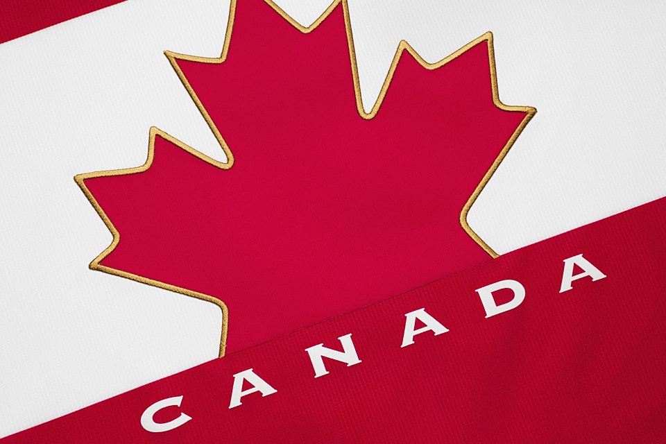
In the case of the white one, we look at the 1972 Summit Series as the iconic large leaf play on that jersey. I can see Esposito raising his hands up with that giant leaf on his white jersey. That was part of the inspiration.
In the case of its resemblance to a non-hockey brand, there's only so many things you can do with a maple leaf, right? A leaf is a leaf. Between Canada's flag and the inspiration from the '72 series, this is what we've come up with.
Icethetics concept artists may find fault with his question, but let's move along. Cook also responded to criticisms of the fake lace-up collar.
We call that a functional graphic. We've enhanced the strength of the neck line, which is a fairly vulnerable point of contact within the jersey. The materials we're using now are lighter [and] thinner than what you've had in the past. This jersey's 15% lighter than the jersey we delivered for Canada at the Vancouver Olympics just four years ago.
If we're going to take weight out, we have to build strength into it. The lace design on the front of the jersey [uses] FlyWire, which is a Nike innovation that we started with footwear. We've applied tensile rigidity to the jersey to give it strength and then we used the lace from the heritage jerseys as kind of a design insight to apply the FlyWire into.
Cook went on to confirm these will be one-off jerseys for Canada.
This jersey is uniquely an Olympic jersey. It can't be worn at any other competition other than the Olympics. We seek [the COC's] input on this. The IIHF is the overall governing body of international hockey. They don't have a say in the jerseys in terms of its design but we do certainly share the designs with them across all the nations so they ensure that it's adhering to both the IOC charter and the IIHF specifications.
The interview wrapped up with Cook talking about Nike's IOC relationship, which runs through at least the next Olympics in South Korea. He also mentioned that Nike will be designing more new international jerseys in the coming years, including the 2015 World Juniors.

Nike was inspired by the 1972 Summit Series jerseys worn by Phil Esposito and his Canadian teammates, says Phil Cook.
Cook mentioned the new innovations in his interview. Let's look at at some of the new features mentioned in Nike's press releases in the fall.
- About 17 plastic bottles are melted down and formed into the yarn woven into one jersey (five bottles for socks).
- Russia's red jersey weighs only 424 grams (less than a pound).
- Nike says the jersey has a "redesigned modern neckline for a refined fit."
- The "reduced seaming eliminates weight to streamline and modernize design." Waist stripes are so yesterday.
- Lastly, "the bottom back of jersey has a new simplified construction, which eliminates the drop tail to allow for more precise tailoring for the individual athlete." That drop tail has been a complaint from some about the Reebok Edge jersey design.
So that's Nike's side of it. Some may still be unhappy with certain aspects of these jerseys, but at least now we have the pertinent facts related to the construction and design.
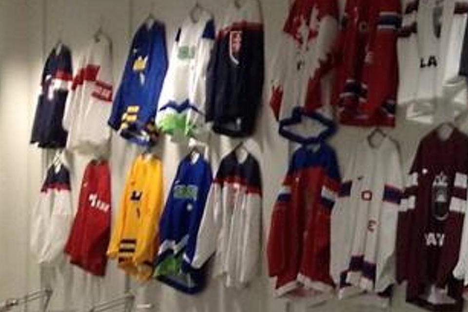
By the way, if you want to see the IIHF's Jersey Service Center in Sochi, check out this tweet from Thursday. I referenced it in the Sweden slideshow, but it should be seen again.
Final Thoughts
The debut of the Icethetics Cover Story has been fun. I enjoyed stepping outside the bounds of North America to take a look at some new hockey jerseys filled with deep meaning and representative of the national pride felt by hockey fans worldwide.
In the end, the designs both surprised and underwhelmed. Impressed and disappointed. And just like the games in which they're about the compete, some teams were winners. Others were not.
I'm excited to see these teams finally hit the ice next weekend. For now, we'll wrap up with our 2014 Olympic jersey rankings. Mine are on the left. Yours are on the right.

Chris' Rankings
- Czech Republic Two creative jerseys and no complaints about either.
- United States That crest is timeless and beautiful.
- Canada Asymmetrical sleeves and head-to-toe black alternate uniform lost them some points.
- Slovakia National anthem stripes are a nice touch.
- Russia Great creativity on the white; great patriotism on the red.
- Finland Blue looks great, not sure the flag jersey works here.
- Sweden Could use a few stripes.
- Germany Proof that great jerseys don't need any white.
- Slovenia Colors and striping stand out in this crowd of great jerseys.
- Switzerland That red jersey is very red. Stripe embellishment is clever though.
- Latvia Compared to the rest of the group, a little bland.
- Austria Lacks personality and distinction from the Swiss.
- Norway What can I say? I'm not a sucker for tradition.
- Japan Wasted potential.
I'm sure you'll disagree with my picks, so make yours in the poll on the right.
Your Rankings
Pick your favorite jerseys, then see what the rest of the Icethetics community thinks.
If you've got more to add to this subject, the comments are waiting just below. In a couple of weeks, as the Games are winding down, we'll compare these jerseys with Olympic uniforms of the past.