
Florida Panthers reveal logo for the 2015 NHL Draft
/The Florida Panthers will host the 2015 NHL Draft in about five months. For now we're getting a look at the logo that will represent the event.
It showed up recently on the Panthers' official website.
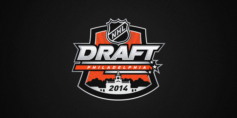
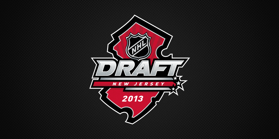
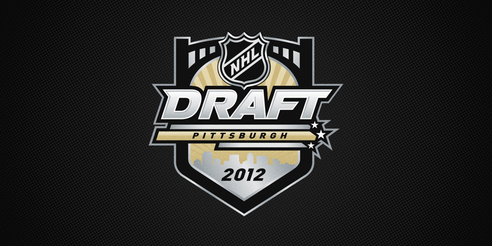
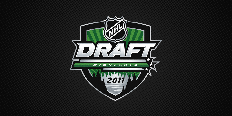
This logo continues a design standard for NHL Draft logos which launched in 2010. Logos typically feature four key elements — the draft wordmark with the host location and three bars capped with stars, a silver shield with a unique shape year to year, an accent color usually representing the host team, and an image at the bottom that represents the host city.
Flip through the mini gallery below to see the other draft logos from the series.
NHL Draft Logo Timeline
- 2005—2009 · Draft logos vary in design from year to year.
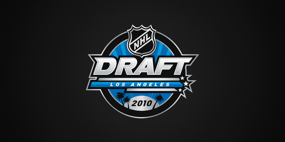
- 2010 · Los Angeles · New design standard implemented. Circle shield, blue accent, and palm trees. The Kings still used purple at this time, but the league chose a more neutral blue for the accent color.
- 2011 · Minnesota · Medieval-shaped shield with green accent, featuring a lake surrounded by trees to represent the Minnesota wilderness.
- 2012 · Pittsburgh · Shield capped with a bridge with gold accent, featuring the city skyline beneath.
- 2013 · New Jersey · Shield in the shape of the state of New Jersey and accented in red. Because the shield shape does double duty in this case, there is no other city-specific iconography.
- 2014 · Philadelphia · Shield shape evokes Liberty Bell, accented in orange, featuring Independence Hall silhouette.
- 2015 · Florida · Wavy shield contains sunrise to represent city and tropical location alongside palm trees. For the first time in the series, this logo breaks away from the standard black design, instead capturing the Panthers' three-color palette — navy blue, gold and red.
The 2016 NHL Draft has been awarded to the Buffalo Sabres, so it's likely we'll see another navy and gold draft logo next year.