
Maple Leafs officially unveil new sweaters
/We got a sneak peek yesterday, but now the new Toronto Maple Leafs home and road sweaters are official! And with the official unveiling comes an explanation for the design choices.
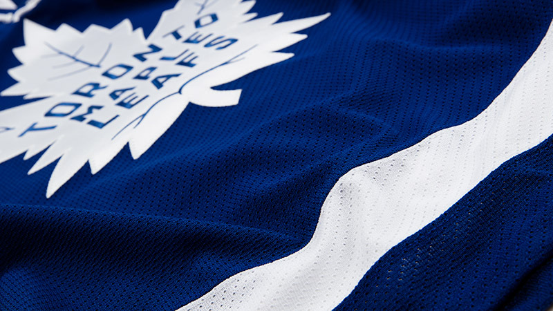
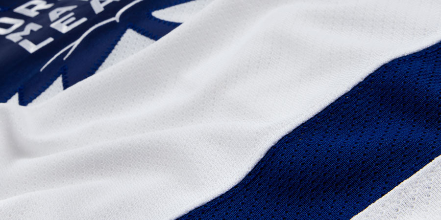
Everything about these uniforms is inspired by the club's 100 years of history, as you might imagine. There's a special page on the Maple Leafs' website that beautifully lays out the new logos and jersey designs. I highly recommend a visit, but I'll hit the highlights here.
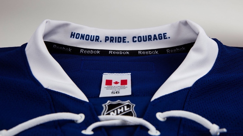
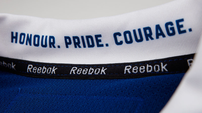
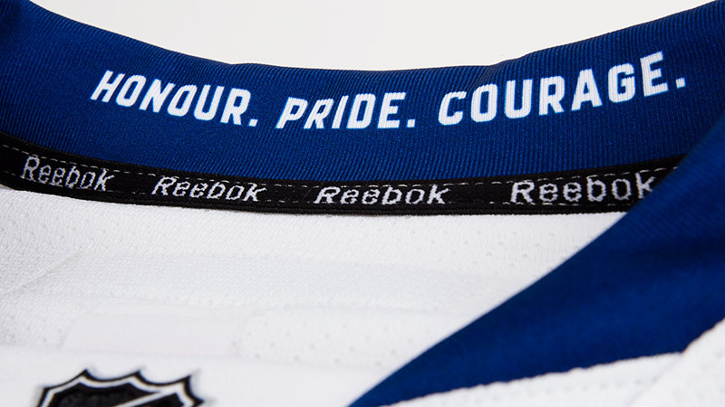
The tag line printed inside the collar, "Honour. Pride. Courage." comes from original Maple Leafs owner Conn Smythe.
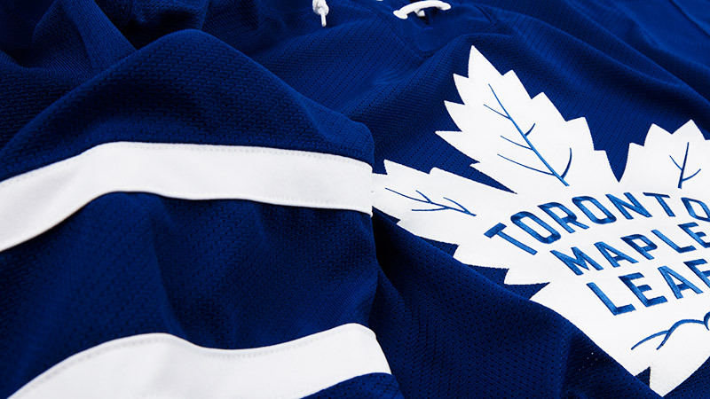
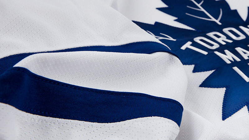
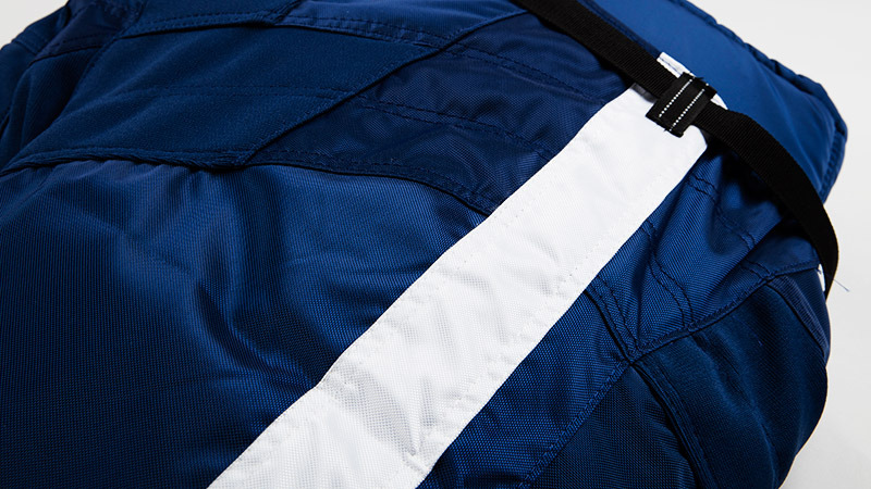
The single stripe around the waist is borrowed from the sweaters of the 1970s. The pants stripe, worn in recent years only with the third jersey, becomes a permanent fixture.
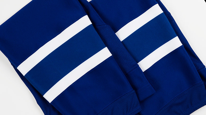
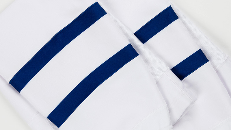
Perhaps the most iconic part of the uniform apart from the Leaf crest over the last 25 years has been the socks — three big stripes each bordered by two pinstripes. Those days are over. Now it's two small stripes to match the sleeves — just as they were from 1970 to 1992.
Another new feature of the sweaters is the custom number and letter design, seen here.
And that's that.
Yesterday I proclaimed disappointment that the Leafs failed to make more significant changes with these new sweaters. But having had time to think and now seeing the full uniform sets, they're hard not to like. And this is the Leafs we're talking about. They can't do anything crazy.
So while I still wish for a shoulder patch to liven things up, Toronto's choices make sense. I'd consider myself a fan. What do you think of the new look?