
Several teams celebrating 20th anniversaries
/The 2017-18 hockey season will be a big year for 20th anniversary celebrations. Teams in the NHL, AHL and ECHL are reaching double decades this fall. That brings new logos!
Nashville Predators
On July 13, the Predators revealed their 20th anniversary mark — a rather unique design. The "0" in 20 is formed from the eye of the saber-toothed tiger featured in the team's primary logo. Other symbolism includes the trio of stars seen in the guitar pick shoulder logo — an element borrowed from the Tennessee state flag.


As you can see, the yellow and white areas are reversed depending upon the color behind the logo. I haven't seen confirmation as to whether the logo will be used as a patch on the uniforms — but I expect it will.
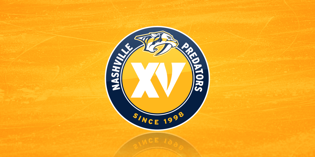
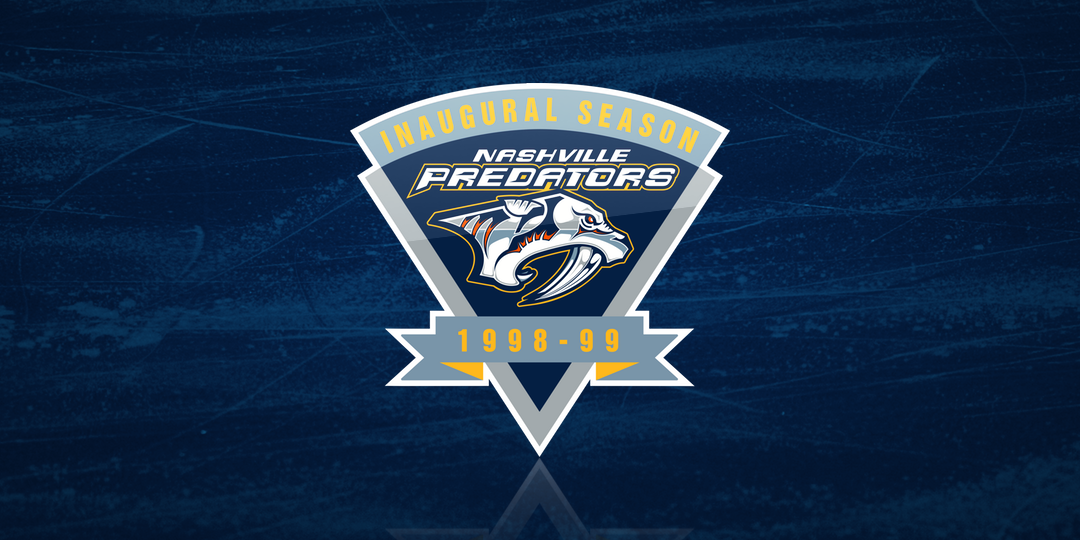
Let's take a look back at the Preds' past milestone marks before we move on. They most recently marked their 15th season in 2013-14. There are also 10th (2007-08) and 5th (2002-03) anniversary logos if you keep going back; there's even an inaugural season logo from 1998-99. Can't believe it's been that long!


Have a favorite Predators anniversary logo from that bunch?
Carolina Hurricanes
The other NHL club reaching 20 years is the Hurricanes. Their logo was revealed last month and I said everything I had to say about it then. But at the time, I didn't have the version used over a white background.

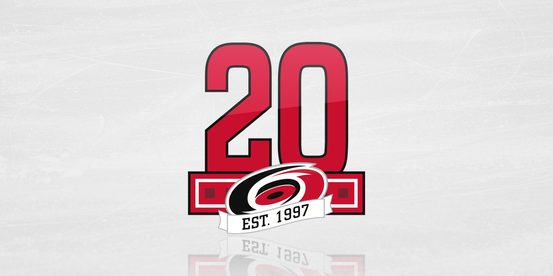
Given that the Canes' primary logo could've easily worked as the "0" in 20, I'm disappointed they weren't a little more creative with the design. I mean look at Nashville. Like it or hate it, it's off the beaten track a bit.
Bakersfield Condors
Taking a step down to the AHL, we find the Condors are marking 20 years despite having played in three different leagues now. The club was founded in the West Coast Hockey League in 1998 and joined the ECHL in the 2003 merger. Then when the AHL decided to create a Pacific division, they moved once more.
No question this is a disappointing logo design too — so much Arial font! But at least an attempt was made to be creative with the Oilers-inspired secondary mark standing in as the zero.
Florida Everblades
I still fondly remember going to Everblades games back when I lived in Fort Myers. What surprises me is that all the merch I have has the 10th anniversary logo. (Just how old am I?!) Anyway, the Blades are embarking on their 20th season in the ECHL with this logo.
To be honest, they probably should've saved all that silver for their 25th year in 2022-23. And while it's a clean, simple design, it is a bit generic. Cookie-cutter, even. But I'll take it over some of the other anniversary marks we've gotten this year. But my favorite Everblades logo is still that 10th anniversary design from 2007-08.


The 15th was a bit weak in 2012-13 but that "X" with the gator texture is just awesome. In fact, I liked it so much I bought the jersey that year. It's one of the few I actually have in my limited collection.
UPDATE (7/21): I missed one! Serge Godin pointed out in the comments another 20th anniversary logo that was just revealed yesterday.
Acadie-Bathurst Titan
The QMJHL's Titan revealed their 20-year mark only hours before this article was published. Here's a look.
That's pretty sharp. They ended up being the only team in the bunch to use the "XX" Roman numeral designation to represent their years in action.
And while I'm reading the comments, I see KrisKaniac was hoping to see the Carolina Hurricanes' 10th anniversary logo in this post to compare to the new 20th. Good idea!
Look at that. It's just a million times better than the new one, isn't it?