
Hurricanes tease new third jersey for 2018-19
/Update at the bottom of this article.
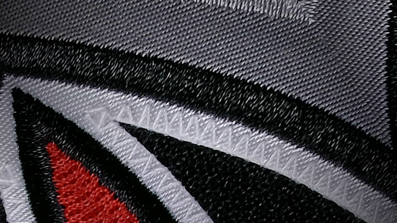
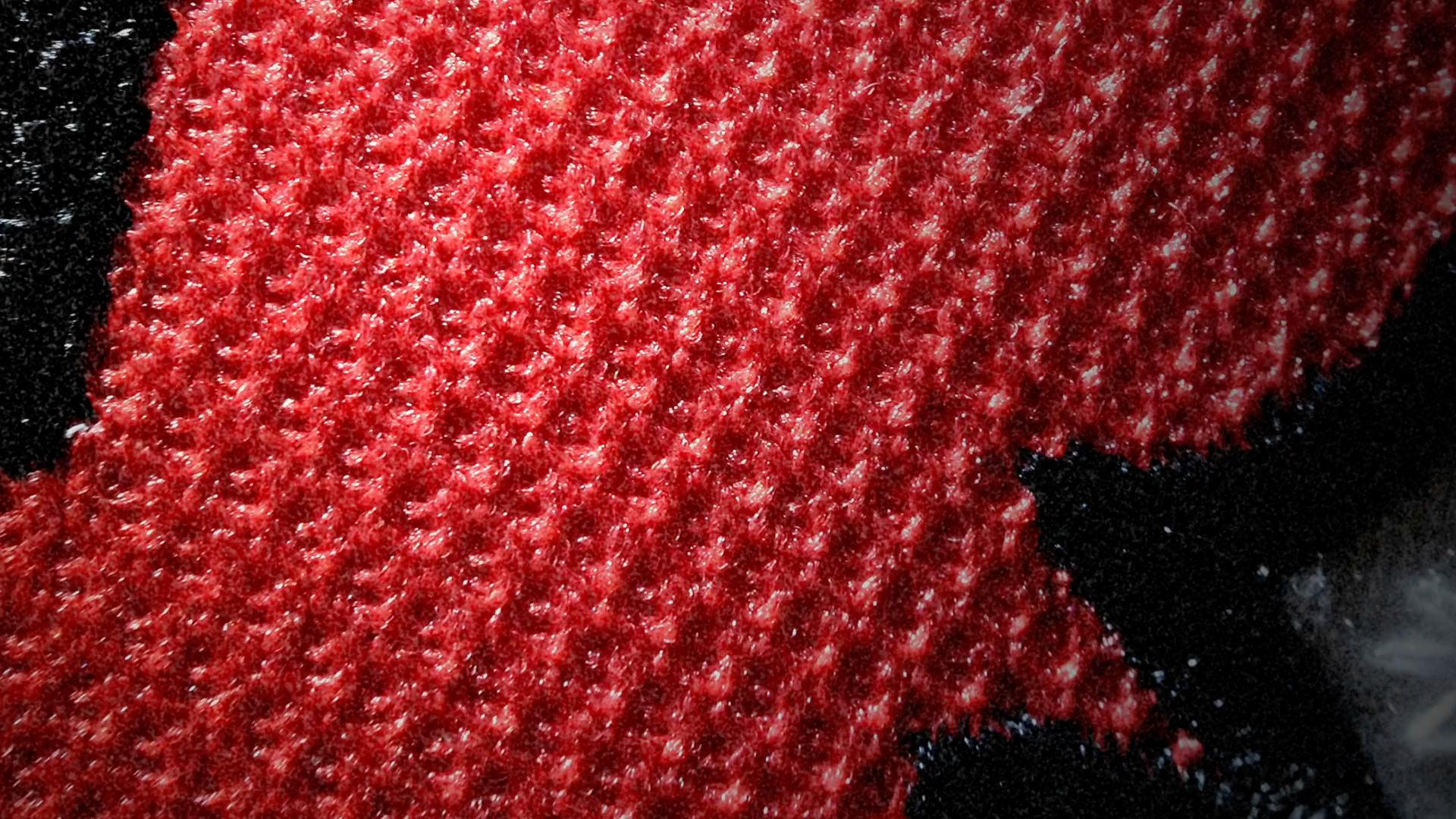
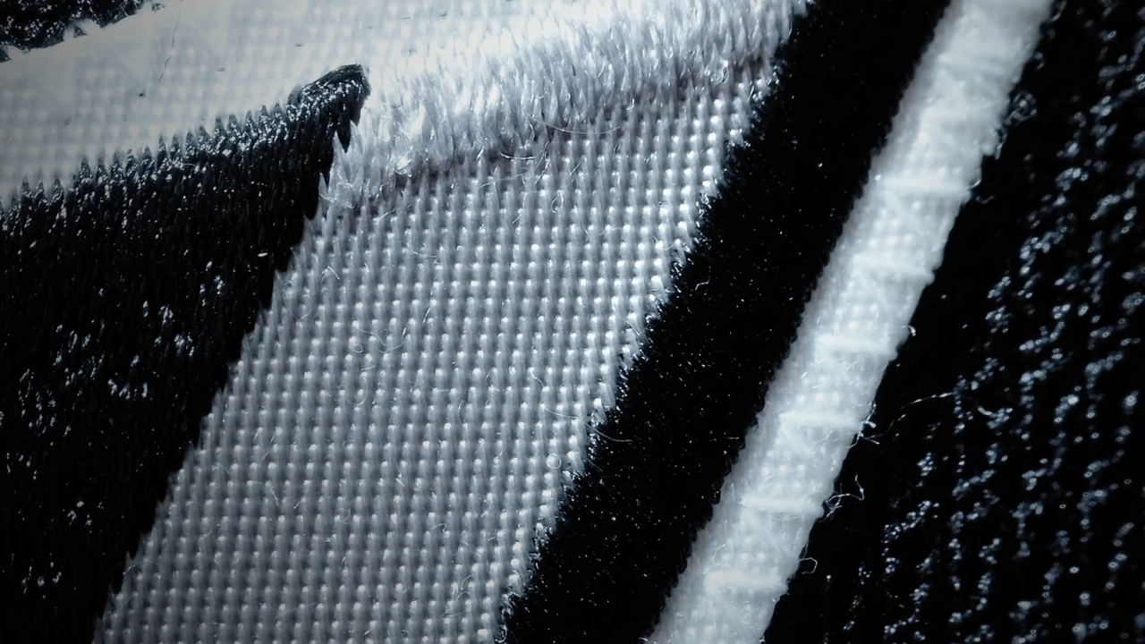
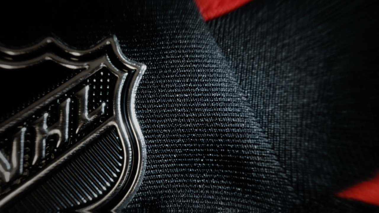
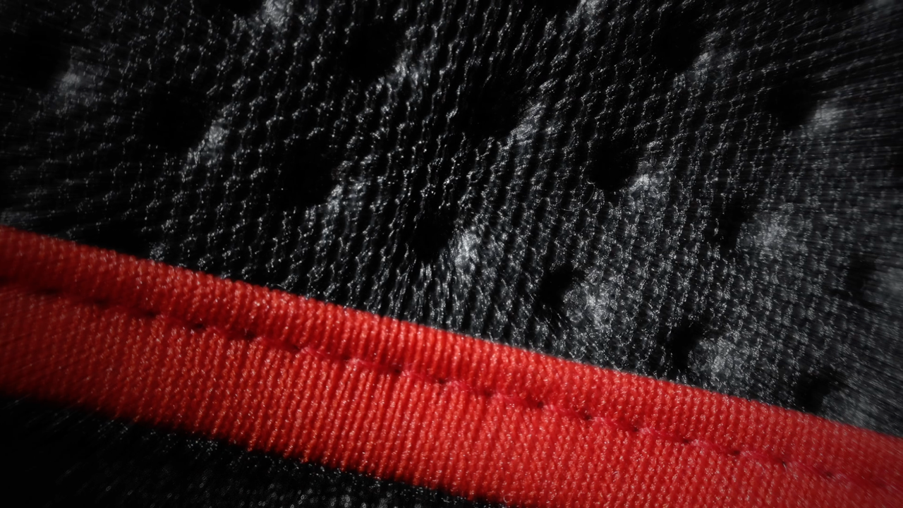
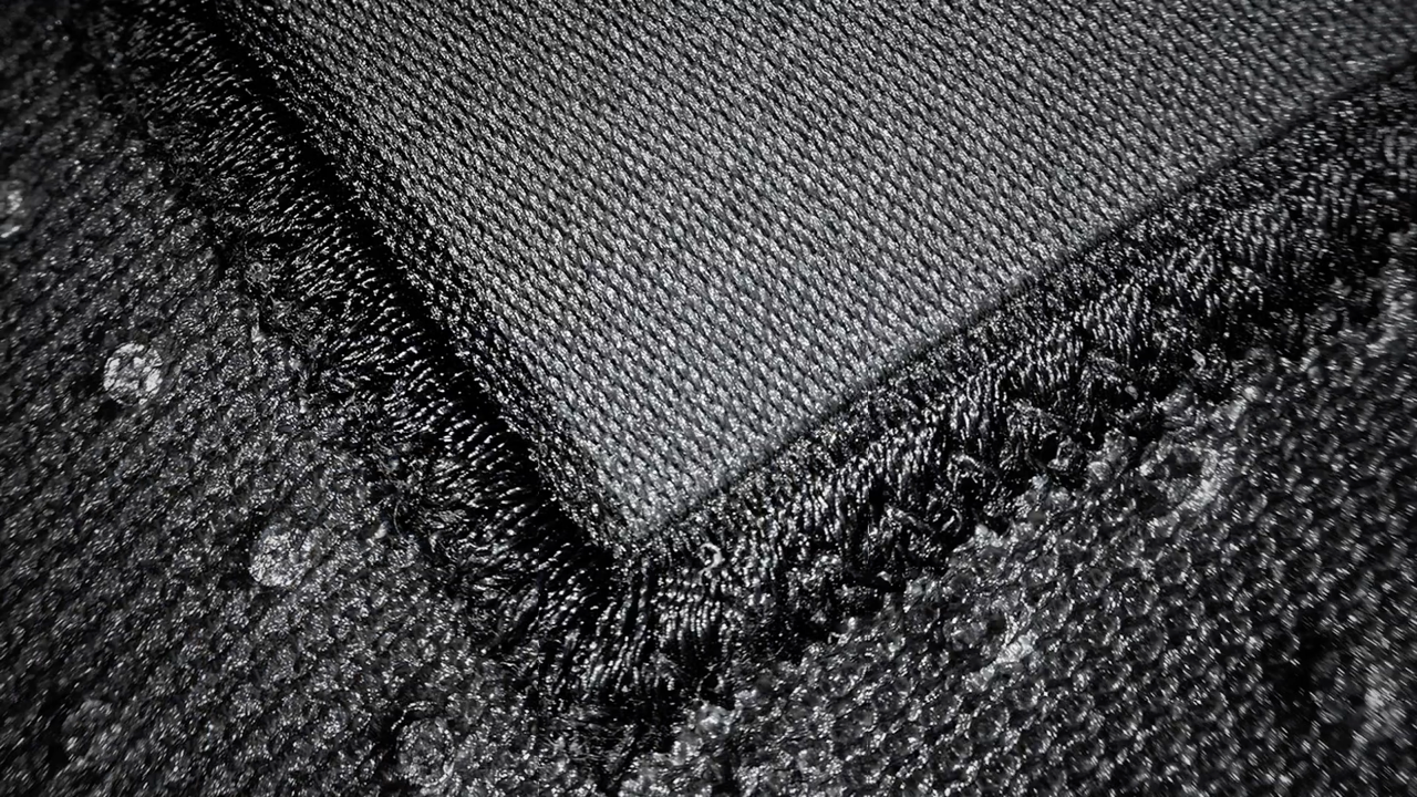
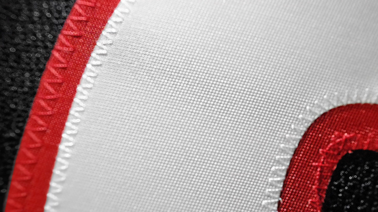
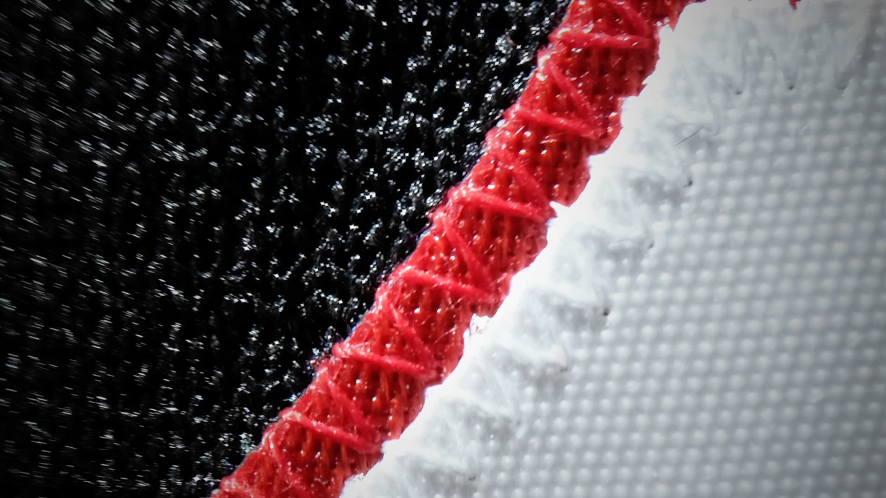
Still frames from video / Carolina Hurricanes
The Carolina Hurricanes will unveil their new third jersey at a draft party on June 22. But with nine days to wait, they gave us a sneak peek of some elements of the design today. The preview came in the form of a brief video, still frames from which I've assembled above.
There's a lot to unravel in those seven seconds. First and most obvious, the sweater is black. That's not surprising, though it has become a common third jersey trope with some preferring to mock it as lacking creativity. It even has its own acronym, BFBS — "black for black's sake."
In this case, however, it just makes sense. The Hurricanes' colors are red, black and white — and they already have red and white primary jerseys. Not to mention, Carolina had one of the longest-running third jerseys in NHL history, having used their previous black sweater for nine straight seasons. You can understand why they might not stray too far from that.
Carolina Hurricanes third jersey, 2008—2017
The next thing that stands out is the crest. Your brain expects it to be the storm flag whipping in the wind since that's what was on the old uniform. And it may well be — with some tweaks.
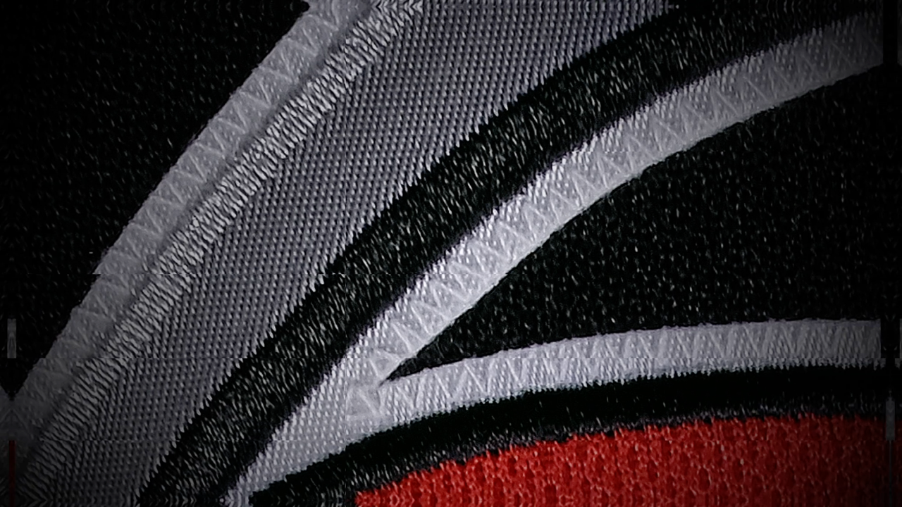

The crop is almost too tight to tell us what we're looking at. But a keen eye may notice a remarkable similarity to the section of the old logo just between the blade of the stick and the flag. But there's a difference. There appears to be a black border around the red flag.
Then in the video, that crest image rotates. You think you're seeing more of the logo. That's an illusion. Look closer and you'll see the edges are mirrored in a kaleidoscope effect. So that's a red herring throwing us off the scent. Another detail shot features some angular swatches of black, grey and white. My read on that is it's the top of the blade of the stick.
Lastly, we're treated to an extreme close-up of the storm flag's ragged edge. Again, it's bordered in black. But what little is visible does not align with the existing logo. My guess is the artists at Adidas did some much-needed clean-up work to this mark. Keep in mind it was originally designed in a rush as a shoulder patch for the newly relocated 'Canes back in 1997.
UPDATE: Hurricanes' Director of Marketing and Brand Strategy Mike Forman weighed in with a correction via Twitter. He points out that in the jersey design process, teams have the option of working with Adidas, a design agency, or their own in-house artists. In this case, it was the in-house team that worked on the new uniform design.
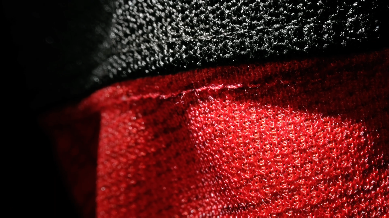
Moving on to the collar and shoulders. This is where we really diverge from the old jersey.
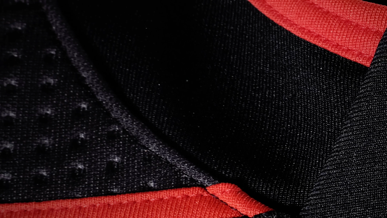

The collar here is black with red trim and red piping along the shoulder yoke. That certainly wasn't part of the original. It also appears the storm flag pattern will appear inside the collar as a "hanger effect." (For more on hanger effects, read this post.)
Another image that flashes by appears to show part of a shoulder patch. The perforations tell us it's on the shoulder. The embroidery suggests it's a patch. On the original jersey, the patch was a Hurricanes primary logo in black and very dark grey — visible only in the right light. The same effect seems to be at work here, only it's not the primary logo with that 90-degree corner. My thinking is it's another variation of the square tropical storm flag.
Continuing down the arm, there are flashes that appear to be parts of the sleeve and gloves.
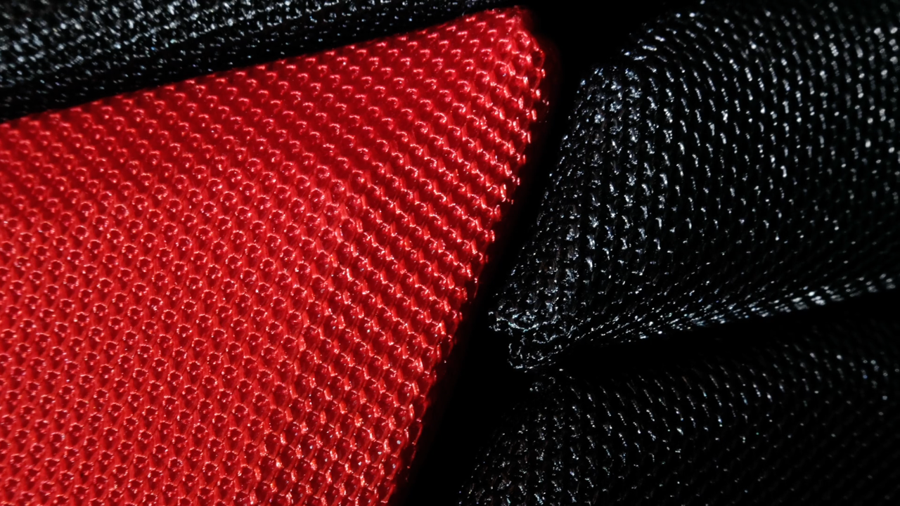
The sleeve seems to get a straight red stripe at the very least. The old jersey had angled stripes in red and grey. Another departure from that design? Maybe.
Around back, the numbers seem to be white with red trim, reversed from the old jersey.
It's tough to tell, but they seem to be the same type design as the primary sweaters.
To my eye, none of the images that flash by in the teaser video show the pants or socks, but there is one that looks to me like the helmet with a new wordmark.
For a second, that might look like a number, possibly 24. Actually, I think it's a new wordmark and I think we've seen it before — on a football, weirdly. If that's a "CA" rather than "24" and that splash of red on the left is what I think it is, well...
Those photos were tweeted in March. And according to Forman, the jersey design has been an 18-month process — so that logo has likely been around since long before March.

The new logo was used on a football signed by Tony Romo. (Yeah, I don't really get it either but we'll gloss over that part.) The key thing is the hurricane flags in the "C" of Canes. In some small way, it might be the team finally answering the critics who like to remind us that a single flag represents a tropical storm warning while a hurricane warning is signaled by two stacked flags.
Anyway, it looks to me like that's going to be the helmet decal on the new alternate uniform.
The last thing I wanted to point out is how this jersey reveal is being marketed. These days, you've gotta have a slogan and a hashtag. In this case, the Canes are going with "Take Warning."

Take Warning / Via Carolina Hurricanes
Initially it sounded like kind of a meaningless phrase. Take warning? Is that something you can take? But it actually comes from an old maritime rhyme you've probably heard.
“Red sky at night sailors delight; red sky in the morning sailors take warning.”
I'm guessing the Hurricanes are anticipating a red sky in the morning — the result of an oncoming storm from the east. This article in Scientific American can explain how that red sky business works better than I can.
One final thing.

I saw more than a few comments on Twitter and elsewhere today bemoaning the lack of any Whalers references in this new third teaser. I just wanted to point out again that this was an 18-month process that would've started in late 2016 or early 2017 — long before Tom Dundon started talking about the Canes wearing an old Hartford jersey sometime.
On top of that, a third jersey is part of a team's main branding. Any Whalers wear that should come about would likely be a one-off tribute since, you know, the team doesn't play in Hartford and hasn't for more than 20 years. Just want to make sure all that is being said.
Thinking about it now, maybe there's a bit of irony for you. The Canes are putting out a warning to sailors that they're in danger. Aren't whalers also sailors? Hmm.
That's that for now. The Hurricanes will officially unveil their new sweater next Friday.
UPDATE
TUE Jun 19 · 10:00 PM
After I originally published this article, a source reached out with some additional information related to the jersey's crest and shoulder patches. I added to the JerseyWatch page but it warrants some extra attention.
First, I mentioned that the dual storm flag design in the new wordmark may be the Hurricanes' attempt at correcting the perceived inaccuracy of the former secondary mark. It may go beyond the wordmark. My source says the crest has been redesigned to include two flags. I'm also told that the black triangle is not present in the new design, making the logo appear more narrow.
I also understand that square-cornered shoulder patch visible in one of the teaser images might not actually be a storm flag — but a different kind of flag altogether. Sounds like it's actually the state flag of North Carolina. It's been a design trend in recent years so that shouldn't surprise us.

Photo by Alisha Newton / Flickr
The Calgary Flames wear the flags of Canada and Alberta on their shoulders. The Florida Panthers heavily incorporated the Florida flag into their new 2016 rebrand. The Nashville Predators' shoulder logo has a subtle nod to the flag of Tennessee. And the St. Louis Blues use elements of their city flag in their collar.
The source also said the N.C. flag is only on one shoulder. On the other side is the Hurricanes' primary logo. Both are in the same black/dark grey color scheme as the shoulder patches on Carolina's old third jersey.
That was confirmed when I came across these smartphone wallpapers the Hurricanes released last week to promote the third jersey unveiling.
Wallpapers / via Carolina Hurricanes
The image on the left wasn't seen in the original teaser video but it is unmistakably the darkened primary logo as a shoulder patch. It looks just like the one on the old third. The image on the right seems like it could be from the new crest — part of one of the storm flags, perhaps?
All I know is our questions will be answered on Friday night. Check back here at 7:00pm ET.
UPDATE
One final update and I'll leave the Hurricanes alone until Friday. Icethetics concept contributor Tim Steele Allen sent in some artwork to help us visualize the rumors we've seen so far.
Carolina Hurricanes concept / Tim Steele Allen