Trio of New Jerseys at Q Draft
/The 2013 QMJHL Draft was held in Chicoutimi, Quebec on June 8. And those interested in junior hockey jerseys got treated to a few new ones at the event.

Islanders reveal black jersey at draft
Of course we have to begin with the recently rebranded Charlottetown Islanders, previously known as the PEI Rocket. Their new black sweater was on display at the draft and also given to their draftees. I haven't seen the white one so I'm not sure if it's the same style.
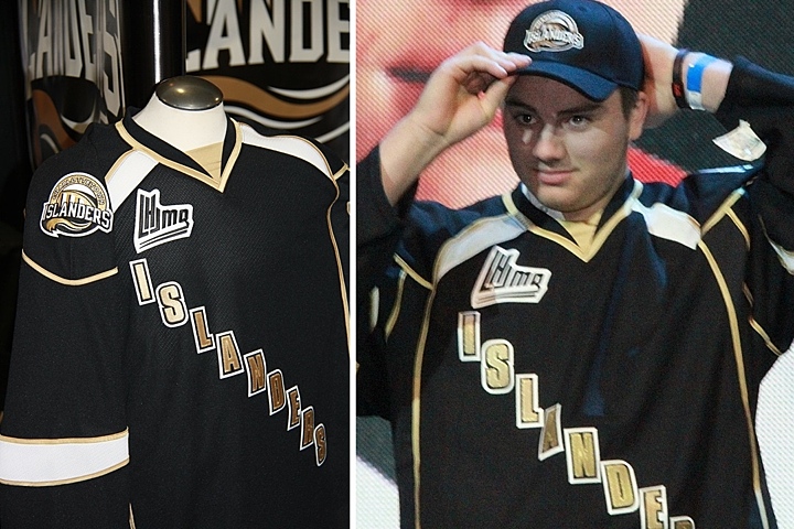
This is a bit disappointing. It's not like they knocked it out of the park on the logo, but why go even blander with a black text jersey? Charlottetown could've learned a thing or two from the mistakes of their NHL friends in Dallas. And what is with all the crazy piping?

Tigres switch from yellow to black
The Victoriaville Tigres have apparently dropped their yellow sweaters in favor of black. Seems like an odd move considering the trend in hockey jerseys these days, but these actually look pretty solid.
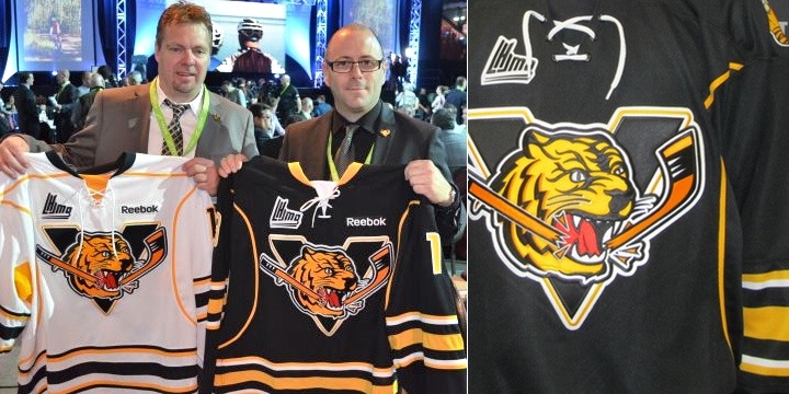 Photos from Victoriaville Tigres (via Facebook)
The Buffalo Sabres Edge template we're all quite familiar with, but it is an improvement on the Pens/Sens template they used to wear. And overall, it works.

Lastly, the Shawinigan Cataractes apparently have a new alternate jersey. I say "apparently" because they only seemed to give it to one player at the draft. And because almost everything written about all these teams is in French — a language I don't speak.
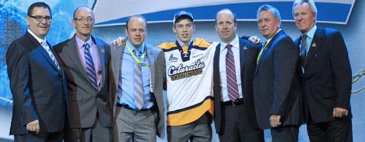 Photo from Shawinigan Cataractes (via Facebook)
Maybe some of my bilingual readers might have some more information to pass along. Keep an eye on the comments for updates from those in the know.
As for me, I'm taking a step back from the blog for a little while. Not to worry, if there's news to report, it'll be here. But I need some time to get the next IceHL yearbook together and that means making the time for daily blog posts will be difficult.
That said, I'm expecting jersey news from Buffalo, Minnesota, San Jose, Montreal and possibly Calgary over the next few months. So as soon as I know anything, I'll be sure to let you guys know.