As expected, I managed to overlook a handful of teams that plan to sport special St. Patrick's Day jerseys this weekend. We'll begin this update in Texas...
AHL: Houston Aeros

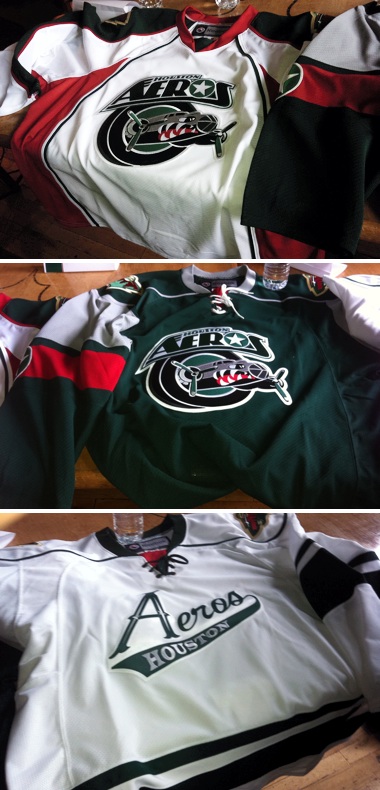
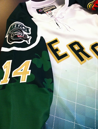 Aeros' St. Patrick's Day jerseyThe AHL's Houston Aeros are among the few teams that wear green on a regular basis. But on Saturday, they're doing it a little differently.
We got our first look at the team's special St. Patrick's Day jersey this morning by way of Aeros winger Jon DiSalvatore, who tweeted this picture (right). DiSalvatore's tweet was later confirmed by the team through Twitter.
Though the tweets don't specify exactly when the jersey will be worn, March 17 is a safe bet as the Aeros host the Abbotsford Heat. They're also at home against the Rockford IceHogs the night before, for what it's worth.
Interestingly, this jersey appears to feature an argyle pattern (in a gradient no less) which is somewhat unusual. I'm pretty sure argyle originated in Scotland.
Then again, so did plaid for that matter. Or tartan patterns, which are a type of plaid but commonly just referred to as "plaid." (See the Trenton Titans jersey above.)
I realize those last two paragraphs were pretty nerdy, but St. Patrick's Day is an Irish holiday that we're borrowing, right? And while the clovers are certainly relevant, I'm not sure the Scottish jersey designs are.
Anyway, I don't really care about that, it was just something I noticed and wanted to point out. My thanks to reader Chris Fraterrigo for letting me know about this today.
All right, so I'm attempted another neat segue here. This Aeros jersey was first shown to us by Jon DiSalvatore, who is originally from Maine — which happens to be where the Portland Pirates play...
AHL: Portland Pirates
 Another team doing the green thing this St. Patty's Day is the AHL's Portland Pirates. And for them, Green Night is not just a time for a new jersey color but altered logo colors as well.
For one night only, the Pirates will swap the red and silver in their logo for green and gold when they face the Bridgeport Sound Tigers at home this Saturday. They've even altered the the colors in their NHL affiliate shoulder patch. In fact, the patch used in this jersey is normally seen on the Phoenix Coyotes' third jersey. The Pirates wear the Yotes' primary logo on their regular home and road uniforms.
The design was posted for all to see on the Pirates' official Facebook page.
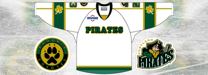
It looks like there's enough space underneath the wordmark on the front to fit a uniform number. But as this is a design sample, I can't say for sure. I'll keep an eye on it this weekend.
Got to squeeze in a shout-out for commenter Frank C. for keeping us in the loop.
AHL: Wilkes-Barre/Scranton Penguins

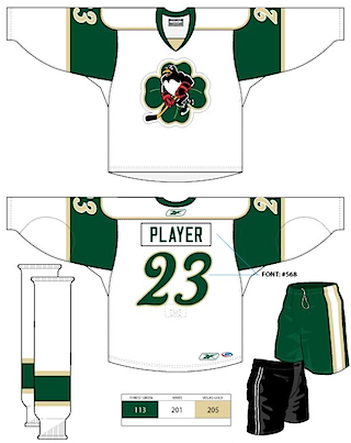 Baby Pens' St. Patrick's Day jerseyThe AHL's Wilkes-Barre/Scranton Penguins don't miss an opportunity for a specialty jersey. And March 17 is just an excuse for one more.
Right off the bat, I have to express my disappointment with the lack of creative originality with the crest design. (Visit Google Images and search "four leaf clover" and take note of what you find in the top 10.)
I realize it's just a simple clover for a one-off jersey design, but it isn't that difficult to draw a four-leaf clover. And if you're going to nab one from the web, does it have to be the first one that you spot in an online image search?
This is turning into the tartan/argyle rant all over again. It doesn't really bother me that much but it's still worth mentioning.
We have a pretty bare-bones jersey here, as you can see. It's based on the Minnesota Wild's red home sweater. There's not a lot to it, but of course it does have its share of green.
This preview (right) of the sweater design was posted last month on the Baby Pens' official Facebook page. My thanks to reader Eric Rodgers for letting me know about it.
We've got one more from a different league...
CHL: Wichita Thunder

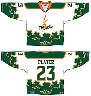 Wichita Thunder's St. Patrick's Day jerseyThe Wichita Thunder of the Central Hockey League will be among the many North American hockey teams donning green this Saturday.
The Thunder showed off the design via their official Facebook page back on Feb. 27. It features a recolored version of their old logo — similar to what they've been using on their uniforms this season to celebrate their 20th anniversary.
On Saturday, the Thunder host the Arizona Sundogs. (Damn. Just realized the Sundogs are affiliated with the Coyotes and Pirates. I think I could've finagled a decent transition before the Baby Pens if I was up for rewriting this post.)
Wichita's colors are normally black and blue but they're going with forest green and bright orange for St. Patrick's Day.
One final shout-out goes to commenter Jason S. who let us know about these jerseys in Wichita.
And this is where I leave you (again). If I've left out any of the teams that are celebrating the color green next weekend with special sweater designs, you know what to do.


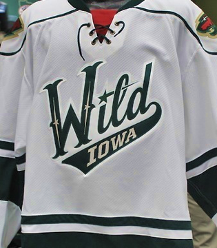 Iowa Wild jersey via TwitterThe new logo is not surprising. It's based on the script font found on both the Minnesota Wild and Houston Aeros third jerseys. It was shown off today on their new website.