
A Trio of CHL 3rd Jerseys
/A large chunk of Canadian Hockey League teams are adding alternate sweaters this season. It would be impossible for me to keep up with all of them on my own. So I thank all my awesome Canadian readers for their emails. Today, a trio of new third jerseys for your enjoyment.
WHL: Rebels go for retro feel

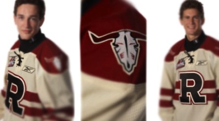 Rebels unveil third jerseyThe Red Deer Rebels unveiled their new third jersey on Wednesday morning.
I'm starting with this one because I'm a huge fan. It is by far one of my favorite junior league sweaters, with a great vintage look. And that's what they were going for.
Here's an excerpt from their news release:
The most noticeable change from the previous "R" uniform is the base color. The predominant burgundy has been replaced by a beige color that adds both a retro tone, along with a western feel.
The standalone "cow skull" shoulder patch, taken from the teams primary logo, reinfoces this western concept. The striping has been moved to the middle of the jersey, and a burgundy shoulder "yolk" [sic, I hate it when I get egg on my jersey] added to the top of the sweater.
The most predominant feature of the jersey, the popular "R" logo which the team has worn since 2001, has been made over. The black fill adds strength to the logo, and compliments the neck collar.
The team will wear black pants and black helmets to complete the look. Player socks will be beige with two burgundy stripes through the middle.
The jersey will make its debut on Oct. 2 when the Rebels face the Medicine Hat Tigers.
OHL: Frontenacs add impressive third

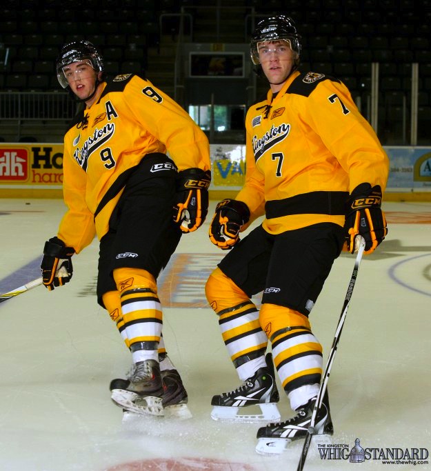 Frontenacs unveil third jerseyThe Kingston Frontenacs also unveiled an impressive new third jersey on Wednesday.
I'm really blown away by the uniform designs that come out of the CHL. Their designers really need to take a stab at the NHL because rarely do we find a bad one in the bunch. In fact, a Frontenacs official may have put it best:
“We went for a retro look and they turned out better than what we ever imagined,” said Jeff Stilwell, Director of Marketing and Communications.
Indeed, Jeff. You really don't need to say any more than that. Well done, Kingston!
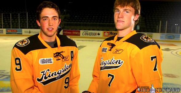
And here's another picture, because it's just that good.
OHL: Rangers rely on fan favorite

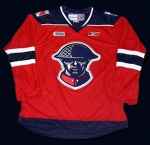 Kitchener unveils third jerseyLastly, the Kitchener Rangers unveiled their 2010-11 third jersey about three weeks ago.
I may be a little late to the party picking this one up but it's still very much worth a mention. This is a sharp sweater that is a big fan favorite. The team's press release has details:
This exciting new jersey was influenced by the Rangers 2008 Commemorative MasterCard Memorial Cup Jersey, and will feature the same highly popular soldier crest.
The crest on the front of the jersey was designed by the Kitchener Rangers Hockey Club in honour of the Canadian Forces. The design was derived from a recruiting poster that was used in England during WWI. This popular recruiting poster was inspired by "Lord Kitchener", the same individual that the City of Kitchener was subsequently named after.
The poster's popularity led the United States to use it as the basis for the creation of their "I Want You - US Army" poster in their recruiting efforts on this side of the Atlantic.
As I said, if only NHL teams were this thoughtful and inspired when it came to uniform designs. Time to stop marketing your slick, flashy jerseys to A.D.D.-addled children and think about what real hockey sweaters are meant to look like. Call the CHL. They can help.
Thanks to Andy for the email on this jersey and to everyone who wrote in about the Rebels' top-notch sweater. Remember, if you see something that hasn't been on the blog, drop me a line and I'll share it with everyone.