
Three AHL teams celebrating anniversaries in 2018-19
/The Syracuse Crunch, Texas Stars, and Wilkes-Barre/Scranton Penguins are each marking significant birthdays next season.
Read MoreThe Syracuse Crunch, Texas Stars, and Wilkes-Barre/Scranton Penguins are each marking significant birthdays next season.
Read More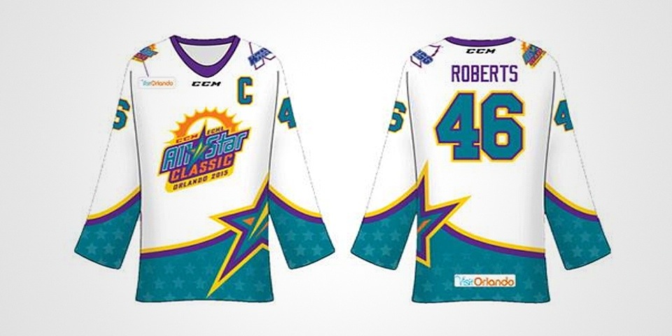
ECHL All-Star Team winning jersey design by Jordan Roberts
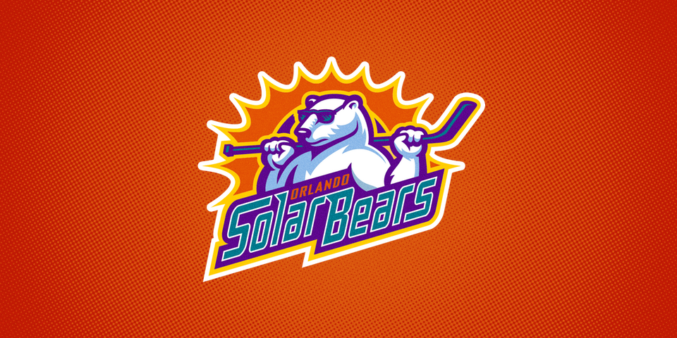
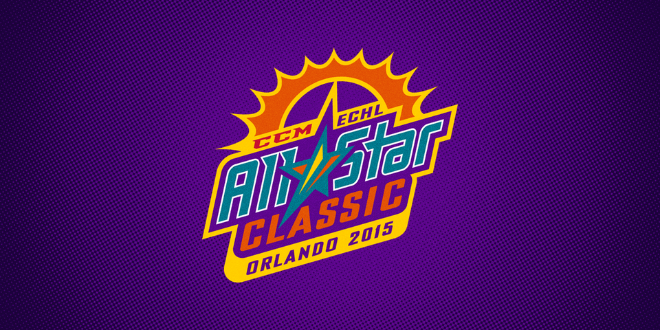
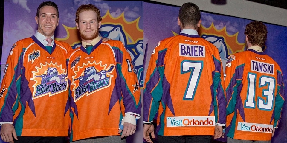
On Wednesday, the ECHL's Orlando Solar Bears unveiled the jersey they will wear when they host the 2015 ECHL All-Star Classic on Wed., Jan. 21. And they're very orange!
The jersey design is based on the team's existing primary uniforms with some colors swapped and some All-Star insignia added. The uniform is a little bright, but it's a nice homage to their home in Orange County.
The Solar Bears' opponent — the ECHL All-Star Team — will wear a white uniform that was first revealed last December following a fan jersey design contest, won by Jordan Roberts.
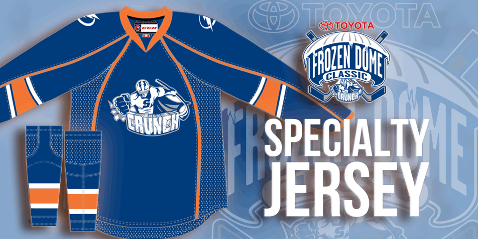
Image from Syracuse Crunch
Meanwhile in the AHL, the Syracuse Crunch will host a stadium game at the 49,000-seat Carrier Dome on Sat., Nov. 22. And this is the special jersey they plan to wear.
The sweater, revealed on Oct. 4, features orange trim in honor of Syracuse University, where the covered stadium is located — and basically the center of the universe for locals.
If you're thinking the jersey looks a lot like the monstrosity introduced in 2007 by the Edmonton Oilers — you're not wrong. It's the same template but with classic Oilers colors, essentially. And good lord, all that piping. You don't need me to tell you it's pretty weak.
The Comets will wear their standard white jerseys for the game.

It's been a busy summer with a lot of changes in the NHL. While I work on the next edition of NHL JerseyWatch, how about some new anniversary logos to hold you over? The AHL alone has at least four that I know of. Let's take a look at them here.
The Syracuse Crunch will mark their 20th season after arriving in upstate New York in 1994. (The franchise was actually founded as the Hamilton Canucks in 1992.) This logo was unveiled Aug. 14.

Also in 1994, the Springfield Falcons joined as an expansion franchise. So this season marks their 20th in the AHL as well. Although, I don't know what to say about this logo, which was released just last week. There's just too much going on and none of it good.

Fifteen years later, a couple more teams arrived on the AHL scene. The Abbotsford Heat are celebrating their fifth anniversary with this neat mark. It was unveiled almost two months ago, back on July 11. This is what most anniversary logos should be, actually. It cleverly incorporates an aspect of the team's primary logo with a unique type treatment for the number.

Here's what not to do. The Texas Stars are also marking five years, but in a much less interesting fashion. Hey, it's an anniversary logo. They can't all be winners. It was unveiled way back on June 28.

I'll wrap this up with a league anniversary. Can you believe the Southern Professional Hockey League has been around for almost a decade? But I think an intern made the logo. (Does the SPHL have interns?) Regardless, the execution is poor even if it's not a bad concept.
See any minor league anniversary logos I missed? Drop me a line and I'll update this post.
With no Tampa Bay Lightning hockey to follow at this point in the fall, I'm a little lost and turning to the minors for comfort. And it just so happens the Bolts' AHL and ECHL affiliates are sporting new uniforms this season. So let's have a look.
 Photos from Rochester Americans and Syracuse Crunch official websites
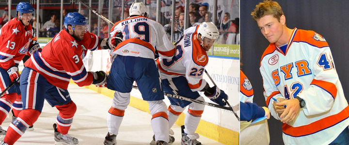
It happened with the Norfolk Admirals a few years ago and now it's happening to the Syracuse Crunch, who opened their season last night wearing not quite what you'd expect. For a team that just unveiled a very blue logo this summer, I'm surprised to still see so much orange in their uniforms.
But who knows what goes on behind the scenes with these teams? It could very well be that the rebrand happened too late in the game to get the uniforms completely overhauled. (Plus, they probably still have a lot of orange gear leftover that they need to sell, right?)
What's cool: The lightning bolt down the pants. Crunch players are actually wearing the same pants as their NHL affiliate. (You can even see the NHL shield on them in the photo above.) This is useful for two reasons. For one thing, it ties the branding of the two teams together. But more practically, players who are getting called up already have a key piece of their gear in tow.
What's not cool: The white Lightning logo over orange on the right shoulder. Someone at SME has to be shaking their head over that. I would've at least used the blue bolt if the shoulders had to be orange. Which brings me to my other point: Why not make the shoulders blue? These are obviously not recycled jerseys. They're new, with the blue piping added all over the place. Fix it.
That's all I have to say on Syracuse for now. Their home opener is tonight so I assume we'll get to see the other jerseys. I'll add photos as an update to this post later on.
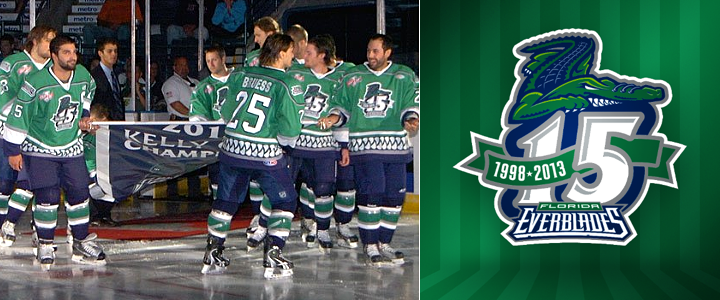 Photo from Florida Everblades (Facebook)
Also this season, the ECHL's Florida Everblades are celebrating their 15th anniversary along with their 2012 Kelly Cup championship. You can see both represented in the photo above as the team hit the ice in their new green anniversary sweaters and raised a special banner last night.
By the way, that Blades game was also the first time that expansion team Orlando Solar Bears hit the ice. You can see what their uniforms looked like in action for the first time on their Facebook page. The Orlando Sentinel also has a neat side-by-side shot of both teams' uniforms.
Interestingly, both of these games required extra time to decide. The Everblades won on a goal 26 seconds into overtime while the Crunch fell to the Rochester Americans in a shootout.
Turns out, the Crunch were just wearing an alternate jersey on Friday night. We know that because on Saturday night, they unveiled their actual home and road jerseys. They look like this.
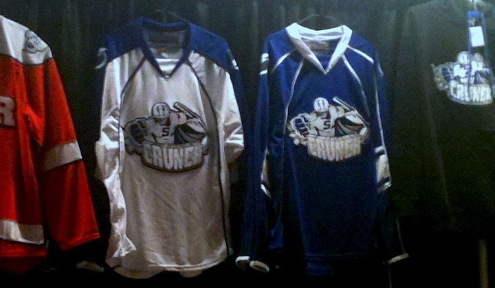 Photo by Jeremy Houghtaling (@JGHoughtaling on Twitter)
You'll note that the alternate jersey in this photo is the opposite of the white jersey the Crunch actually wore on Friday. That means they actually have four different uniforms in their arsenal this season. Seems a bit excessive. Is the attachment to orange all to do with the university?
I'll leave you with a look at the new white jersey in action.
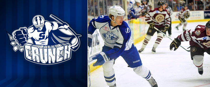 Photo by Scott Thomas Photography
Two sidebars. 1) Check out the 75th anniversary jersey the Hershey Bears are wearing! (That means four jerseys for them too, because they unveiled home, road and alternate sweaters with their rebrand over the summer.) And 2) Does anyone know what the standard is for AHL uniforms? Do they usually wear white at home or on the road? And does it switch midseason like it does in the ECHL?

The AHL's Syracuse Crunch unveiled their new logo today. And this is it.
 As rumored on Wednesday, it's a reboot of the club's original superhero mark from 1994 with the colors of its new NHL affiliate, the Tampa Bay Lightning. (Hey, by the way, are those lightning bolts on his helmet?)
For an upgrade, it's not bad. I would've liked to have seen the CRUNCH font get a bit of a modernization as well, but that might be too much to ask. Of course it is the thing that ties the team's various identities together. It hasn't changed since 1994.
New uniforms will be unveiled in October when the AHL season gets underway. And for those of us who didn't know, Syracuse's superhero dude is named Crunchman. He replaces Al, the (world's only) Ice Gorilla who has reigned as the team mascot since 1999.
Honestly, I don't have much more to say about it. It's underwhelming even if I can't say it's terrible. Though many readers tend to react to new logos in hyperbole so I'm sure we'll see that in the comments. Beyond that, what are your thoughts?