
Flames
/
Calgary FLAMES
Team Information
Team Colors / red, white, gold, black
Inaugural Season / 1980-81 (27 years)
Current Logo / 2003-04 (4 years)
Tournament History
 2007 Qualifying Tournament
13-1, 31 pts
Finished 3th in West; 5th overall
Team Information
Team Colors / red, white, gold, black
Inaugural Season / 1980-81 (27 years)
Current Logo / 2003-04 (4 years)
Tournament History
2007 Qualifying Tournament
Team Information
Team Colors / orange, gold, black, silver, white
Inaugural Season / 1993-94 (14 years)
Current Logo / 2006-07 (1 year)
Tournament History
 2007 Championship Tournament2007 Qualifying Tournament
The following entry contains material copied from an existing web page. It has been posted here for informational purposes should that page disappear in the future.
On September 16, 2006, the Buffalo Sabres officially unveiled a new logo and uniforms. The logo had been leaked online months earlier and was met with much criticism. The original article about the unveiling on the team's official website no longer exists. This article was written by cityhockeyfever at ArmchairGM.
 Sabres new logo at center iceThe Buffalo Sabres already had their fans excited about the prospects of going deep into the playoffs next spring, but they will do it in fashionable style on the ice during the upcoming 2006-2007 National Hockey League season.
Earlier today, the Sabres officially unveiled a new logo and uniforms to a large crowd that gathered inside HSBC Arena in Buffalo for the first open practice of training camp. As part of a "Game On" league-wide ticket drive, Sabres fans also had the opportunity to purchase season tickets and individual game tickets at the arena. WGRZ-TV provided a live webcast of the festivities, including the moment when the players stepped out onto the ice for the first time. The new logo with a team name wordmark was painted on the HSBC Arena ice surface earlier this week.
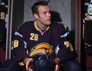 Paul Gaustad #28During this summer, hockey fans got an unexpected preview of the new logo as it leaked out onto the internet and then shown by various media outlets. Not all embraced the new logo and one Sabres fan even created the web site Fix The Logo to protest its use. Drew Celestino as the webmaster of the site has collected at least 29,000 signatures on his online petition.
As a result of much buzz around the city and the hockey community, the Sabres somewhat quieted fans in agreement with Celestino's protest of the new logo by announcing on July 27th the original road jersey would become the new alternate for 15 games this season. It is the blue base color jersey with the familiar blue circular logo in gold trim with a white bison and crossed swords.
Confirmation was made about the new primary logo at this point after all the talk had surfaced about whether it would officially be the new brand. Last seen in 1996 prior to the team moving into HSBC Arena (at the time of its opening, it was called Marine Midland Arena) and having the previous red, silver, white and black color scheme, the first game this season that the original blue jersey will worn is on October 14th against the New York Rangers. The retro jersey was also on display by a handful of players wearing it this morning during the open practice.
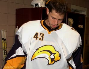 Martin Biron #43The third logo in team history resembles a modern-looking gold buffalo leaping from left to right, but without legs. Celestino and other non-supporters of the new logo describe it as a slug or hair toupee in resemblance. It is outlined in a deeper blue than the original blue color the Sabres wore from 1970 to 1996 and also in white and silver. A modified version of the secondary logo from the previous uniform was originally to be scrapped, but instead has been retained in the new navy blue and brighter gold colors with silver accenting.
The new home uniform has its base color in navy blue to make it more eye-appealing on television. Thin silver striping runs horizontally around the lower shoulders and also vertically below the armpits to the waist. The new road white uniform has the same silver striping, but the sleeves and within its boundaries along the sides of the jersey are in navy blue. But a unique first for NHL team jerseys is the implementation of a small player uniform number on the front. It is seen on the upper right chest in a different font that either of the previous two uniforms.
The Sabres and Reebok International jointly worked on the design of the new logo and uniforms. A limited amount of jerseys sporting the new look were made available this morning.
The following video was posted on YouTube by KayKay024 from the night of the logo and uniform unveiling in Buffalo.
Other coverage following the unveiling included hockey blogger James Mirtle posting his list of the worst hockey logos of all time and Paul Lukas at UniWatch writing about leaked sports logos.
The following entry contains material copied from a web page that no longer exists. It has been posted here for informational purposes only.
On June 23, 2006, the Anaheim Ducks officially unveiled their new name, logo and uniforms. Here is the press release posted on the team's official website.
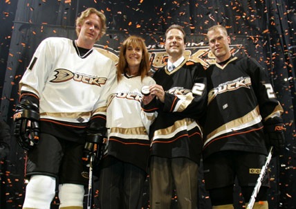 Ducks unveil new uniformsANAHEIM, Calif. – The Anaheim Ducks today unveiled the club’s new logo and jerseys at a press conference held at the Arrowhead Pond of Anaheim. At the same time, the club officially changed its name from the Mighty Ducks of Anaheim, to the Anaheim Ducks.
“We’re both proud and excited to bring hockey fans in Southern California a new look and new name,” said Anaheim Ducks owner Henry Samueli. “We think the new logo and jersey portray the same passion and energy our players and fans bring to the building every night.”
The new look and identity of the Ducks were a collaborative effort, mixing opinions of fans as well as Ducks players, ownership and management. After sports branding firm, Frederick & Froberg Design Office developed dozens of concepts in an exploratory design phase, all parties involved unanimously decided to go beyond simply altering the original concept of an aggressive duck character.
In shaping the new design, the focus was sharpened to create an overall image that expressed excitement, speed and a competitive edge. In addition, a classic color palette of black and metallic gold was developed, with an accent of orange as a metaphorical link to the teams’ Orange County home.
“As area residents, we felt it important the jerseys in some way represent our home,” added owner Susan Samueli. “And, we believe this new look serves as a fantastic way to update the franchise’s growing tradition.”
The result is a strong, typographic mark anchored by a stylized “D” that echoes the image of a duck’s foot or footprint. The custom typography has a powerful forward momentum and is made up of metallic gold letters with orange drop-shadows and a black holding shape. The new uniforms are an evolution of the earlier sweater design but with gold, white and orange sweeping stripes influenced by the curves of the “D” in the Ducks’ logo.
The overall look is a distinctive departure from the original design, introducing a more sophisticated, powerful and timeless identity.
“I really love the new look and thank the Samuelis for giving me a chance to have input on the design,” said Ducks winger Teemu Selanne. “I can’t wait to hit the ice with it this fall.”
ABOUT THE DUCKS
Since their inception in 1993, the Anaheim Ducks have earned four trips to the Stanley Cup Playoffs, including a trip to the Finals in 2003 and the Western Conference Finals this past season.
Just over a year ago, on June 20, 2005, the Ducks’ franchise was purchased by Orange County residents Henry and Susan Samueli. In the Samueli’s first year of ownership, the Ducks went on to break franchise records for overall wins (43) and standings points (98). Entering the 2006 Playoffs as the Western Conference’s sixth seed, the Ducks upset the third-seeded Calgary Flames in a thrilling seven-game series and went on to sweep the Colorado Avalanche before losing to the Edmonton Oilers in the Western Conference Finals.
Reference Posted 3/20/10
Original URL: http://www.anaheimducks.com/press/release/topstory.php?dir=200604&id=1364
The following entry contains material collected from various news services.
January 25, 1998
Nice touch, the new Minnesota franchise calling a news conference to unveil its new name — Wild — and logo and including Neal Broten in the ceremony. If anyone has done more for hockey in Minnesota than Broten, name him.
But on to the logo, described as iron range red, forest green, harvest gold and Minnesota wheat. Was Minnesota wheat in your box of Crayolas? The Wild, by the way, beat out the Polars, Voyageurs and Blue Ox in fan balloting.
Excerpt from article published in Deseret News
 Wild shows its new colors
John Millea
November 19, 1999When Minnesota's NHL expansion franchise announced in January 1998 that it would be called the Wild, the obvious question was, "What's a 'Wild?'" The team's response: "Whatever you want it to be."
The Wild's home sweater, unveiled Thursday at the Roseville Skating Center, is dominated by the head of a beast that might be a bear. Or maybe it's a mountain lion? A wolf? A very angry gopher? Who really knows?
And again, that's precisely the point.
"It's a wild picture," chief executive officer Jac Sperling explained. "People will see what they want to see. It's intended to be a wild animal."
Excerpt from article published in Star Tribune
November 19, 1999
It might be the head of a bear, or maybe a cougar. Whatever it is, the reaction to the Minnesota Wild's new icon is better than the last time they tried it.
The National Hockey League's newest expansion team introduced its home sweater just in time for the holiday shopping season. With a brass band blaring and Neal Broten, the North Stars' favorite star, skating at the Roseville Skating Center on Thursday, team officials showed off the...
Excerpt from article published in St. Paul Pioneer Press (page 1D)
Reference posted 3/21/10