HF&P, Part 21: Toronto Maple Leafs

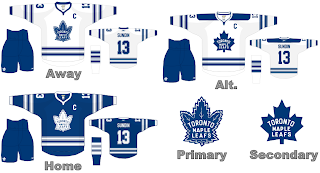
They're calling it blasphemous — the idea that the Toronto Maple Leafs may be changing their logo for the 2007-08 season. I say, why not? More power to them. Anyway, they're the 21st entry in the "Hockey Fans & Photoshop" series here on the NHL Tournament of Logos blog leading up the start of the competition in less than a week.

What do you think? As you can see, it's more work from Mr. Nostalgia as we dig into the time capsule and retrieve these old relics. The "primary" logo is of course currently used on the Leafs' third jerseys while they "secondary" logo hasn't been used in decades. But it's an interesting look. Any Toronto fans feel like weighing in?

That's really all I have to say on this matter. Check back tomorrow for more cool fan-made designs.

I also want to make sure that I mention every so often that these images I'm posting are stolen — borrowed, rather. I'm finding them at various places online and am trying to get them all posted in one place for the enjoyment and interest of fans everywhere. If you or someone you know has designed them, please feel free to drop me a line and let me know about it so I can credit you. I am by no means taking credit for anything here — unless I say so specifically.

There. Now onto other things.

Coming up next: the Detroit Red Wings.

HF&P, Part 20: Boston Bruins II

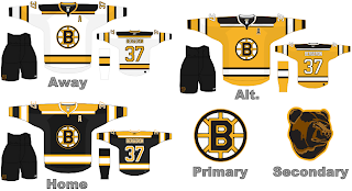
The "Hockey Fans & Photoshop" series trudges on with yet another new uniform design — this one, for the boys from Beantown — the Boston Bruins. We took a look at one design back in Part 8 but I've discovered another out there.

It's a nice one. But it's never going to happen. I haven't heard anything official yet but the Bruins are apparently redesigning the logo — something in the neighborhood of a scary looking bear a la the Hershey Bears of the AHL.

Regardless, I like this design. It's simple but it's different. I also like the yellow jersey even though no one else will and the league is probably opting away from third jerseys for a little bit while everyone adjusts to the sweeping uniform changes.

What do you think of them? Comment me.

Up next: the Toronto Maple Leafs.

HF&P, Part 19: Vancouver Canucks

Readers, you deserve better — the three of you out there. I promised posts every day and here yesterday came and went without a word from moi. I apologize and will try to keep that from happening in the future. On the other hand, it was my birthday yesterday so therefore I get a free pass.

Anyway, having said that, the illustrious "Hockey Fans & Photoshop" series continues today with the Vancouver Canucks.

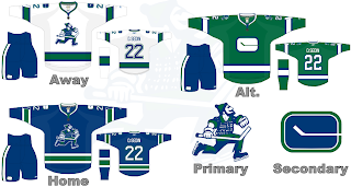
It's our favorite nostalgic artists taking a whack at Johnny Canuck, now. One thing we know for sure is that the Canucks won't be donning the blue and red next season. A logo/uniform change is coming August 1, according to retailers.

But this was a classic design. People seemed to like the green and blue scheme. Personally I'm not a fan but then I don't have to look at the uniforms every night. Anyway, it's a neat look, recapturing the Johnny Canuck logo of yesteryear and making due with the old '70s logo on the shoulder — which you currently find on Canuck uniforms.

Overall, I'd have to say I like it — not love it, but like it. How do you feel about it? Comment away!

Up next: you know you want it — the Boston Bruins.

HF&P, Part 18: Los Angeles Kings II

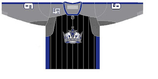
I know we already did the Kings once back early on in Part 4. But another image has since surfaced that I felt like posting as part of the "Hockey Fans & Photoshop" series.

There it is, friends. Artwork at its finest. But seriously, it's cool in that it's different. I've always been a fan of trying something new. The LA on the front of the shoulder is interesting. Not sure about the pinstripes. I'd have to see it on an actual jersey. But there you have it.

That's all for tonight. More later.

Up next: the Vancouver Canucks.

HF&P, Part 17: San Jose Sharks

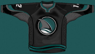
There's more in the "Hockey Fans & Photoshop" series today. Now we take a look at some interesting concepts for the San Jose Sharks.

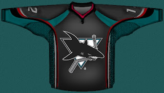
So that's one, simply replacing the shark-biting-hockey-stick logo with the shark fin logo, which I sort of like. What I think is really cool is this design.

The red trim adds an awesome "blood-in-the-water" feel. So I like it. However, I'm pretty sure the Sharks have plans to unveil a new logo this offseason so I wouldn't count on this one sticking around in any form.

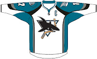
This is the last of the designs I wanted to post. It simply shows the current road jersey in the new Rbk EDGE style. It's rather basic and I kind of hope San Jose doesn't try anything similar to it.

There you have it. One more possibility for new uniforms come this fall.

Up next: the Los Angeles Kings — yes, for the second time. That will come tonight at some point.