Stars vs Blackhawks


vs
STARS
BLACKHAWKS
0-0
0-0

The Aesthetics
Albeit slightly boring, the Stars have a much sleaker look than the Blackhawks. I've always found the Indian head a little clunky and intricate, not to mention its lack of a defined color scheme.
Stars

The Nickname
Chief Black Hawk may have been a tough son of a bitch, but a Star is a giant all-consuming ball of fire.
Stars

The Analysis
The Blackhawks get their name from Chief Black Hawk who was a Sauk warlord in the area of what is now Rock Island, Illinois which is less than 200 miles from Chicago. Not bad. On the other hand, the Stars take their name from predecessor Minnesota North Stars. I think it works great, what with Texas being the Lone Star state. The only drawback is that the team name is spelled out in the logo and, by and large, I'm not a fan of that. Still, they squeak by with the point.
Stars


WINNER
3-0


Tourney Starts Up Tomorrow!

Can you feel the excitement yet? No? Am I building this up too much? I'm totally being sarcastic every time I tell you how awesome this tournament is going to be. It's going to be a three-month-long load of dung. You read that right.

Seriously though, I'll have fun writing it, but whether you'll have fun reading it is a completely different question altogether. What's cool is that it's finally starting tomorrow. I anticipate posting the first matches of the NHL Tournament of Logos tomorrow morning around 10 AM or so. (Don't hold me to that.)

For the time being, if you don't have a clue what this so-called "tournament" is about, may I suggest the Introduction. It's great reading and it will get you up to speed on this competition. Follow that up with a little bit of Rules & Regs and a side of FAQs. In fact, while you're getting your dose of the FAQs, feel free to ask some questions of your own. I swear I'll answer them on the double!

That's all from me for tonight. After the tournament gets started, I have some cool concept logos and jerseys to share. Look for that sometime tomorrow afternoon once the first matches have been posted.

HF&P, Part 30: Tampa Bay Lightning II

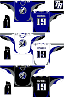
You know, the fact that this is the 30th segment in a series about the NHL — which has 30 teams — might lead you to believe I've covered all my bases. Unfortunately this is not the case. More about that in a moment. First, we're going to take another look at a design for the Tampa Bay Lightning. We last looked at them in Part 1 of the "Hockey Fans & Photoshop" series — the original.

So there it is. We've come full circle. Overall, I like it. The stripes are surely different. The designer has taken the secondary logo and made it the crest with some minor adjustments. I don't hate it, but if it were me, I'd come up with an entirely new logo for the team. But that's me.

The "TB" logo for the shoulder is nice if not a little overdone and generic. I say that, but generally speaking, this design is far better than what the team currently wears — or should I say, wore until the end of the 2006-07 season.

So as I was saying, due to the nature of this series, a number of deserving teams got missed in this series — which isn't to say it's over necessarily. If you have any designs — your own or something you found on the web — that I've overlooked, please feel free to send them along.

The teams I haven't seen any fan-made artwork for are the Buffalo Sabres, Atlanta Thrashers, Florida Panthers, Chicago Blackhawks, Colorado Avalanche, Phoenix Coyotes, Minnesota Wild and Nashville Predators.

Anyway, if you know of or have a graphic I haven't posted here, drop me a line in the comments and tell me all about it. I might even post it as part of the series.

HF&P, Part 29: Montreal Canadiens II

Can you believe the tournament begins in only two days? I can't. It's going to be a lot of work — but also a lot of fun. Be sure to check in on Tuesday to be part of that fun.

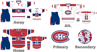
In the meantime, the "Hockey Fans & Photoshop" series continues as we look at uniform designs for the Montreal Canadiens once again. We previously saw fan artwork for them in Part 5 of this series.

This design indicates how striping can work as that seems to be the primary complaint of ultra-traditionalists with regard to the new RbK EDGE uniform system. Seems like it will be just fine. I like the jersey designs here. They're classic and regal. Hard to complain. I don't get the secondary logo but maybe someone can explain that to me.

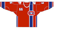
But wait, there's more. Yesterday we got a look at what might happen if the logo was moved to the side of the jersey and the number shown on the front by way of an Edmonton Oilers design. Well that same artist has taken a shot at the Canadiens — complete with the vertical stripe and off-center crest.

Like I said yesterday, it's different and that makes it cool in my eyes. I'm not sure how I'd feel about a team actually wearing it, but as a concept it's a good one. I've always like the giant crest in the middle of the front of the sweater. Strangely, it's not that common in professional sports.

And that does it for today. Tomorrow will be the last day before the tournament begins so I've saved up something special — it's another fan-made design for the Tampa Bay Lightning. They're my team so they have to get special treatment. You're sure to enjoy it.

Along with that, I've also come across some rather interesting concept logos if various clubs were to change theirs. Not only that but I have a few bonus fan-designed jerseys to share before this blog becomes almost completely about the tournament.

HF&P, Part 28: Ottawa Senators II

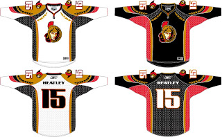
Today we're revisiting a couple of Canadian teams as part of the "Hockey Fans & Photoshop" series. We last saw the Ottawa Senators back early on in Part 6. Well we've got more where that came from. Right now.

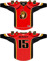
The Sens may not have won the Stanley Cup but I think they would be coolest jerseys in all of hockey if they nailed these suckers down. Tell me that sweater doesn't frighten you. One of my favorite parts of this design is the use of the logo's helmet element along the shoulders and arms. These would be seriously classy jerseys. Unfortunately, this design is the work of a fan and therefore it's not likely we'll ever see it on NHL ice.


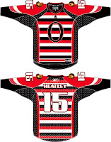
The graphics you see here to the left come from the same designer, obviously. With the red, we see what can be done in the alternative of a black home jersey — though I rather like the black in this case. And below is the horror from the '20s or something. I am not amused. Seriously, I hate that design. A lot. I'm all for throwbacks but horizontal stripes going the length of the jersey don't do it for me. I'm sorry.

In any case, that's what we've got for Ottawa today. I honestly hope you enjoyed it. Or if you didn't, whatever. Feel free to comment with your thoughts on these designs. Disclaimer: Again, I am NOT the designer. All I've done is scour the web for these images so as to bring them all to one place for fans like you and me.

Later today: the Montreal Canadiens — again.