HF&P, Part 27: New Jersey Devils

This "Hockey Fans & Photoshop" series seems to be winding down, but I assure you there's still so much more if you're a fan of hockey jersey designs. Let's move along with the New Jersey Devils.

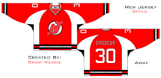
So that's an interesting design coming from Randy Wilkins, apparently. It's cool and I like the idea of the horns at the shoulders, but unfortunately this is not an Rbk EDGE uniform design so the chances of ever seeing it on the ice are rather nil. That and the fact that it was designed by a fan and not a professional hired by the club or the league.

Still, I wanted to share it because it's something different. And that's what I'm all about. Not sure about the bars at the wrists and bottom of the jersey. A little close to the Hurricanes.

Anyway, I know, short posts today. Not much to say, really. If you have anything to add, please feel free to comment. I'd love to hear from you or anyone else.

Coming tomorrow: We're going to revisit both the Ottawa Senators and Montreal Canadiens and you won't want to miss this.

HF&P, Part 26: Edmonton Oilers

If this was a deck of cards, we'd be halfway through it. But this is the "Hockey Fans & Photoshop" series here at the NHL Tournament of Logos. Just three more days until the tourney begins! How exciting is that?

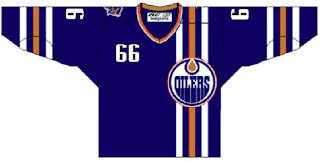
As you can see we're taking a gander at the Edmonton Oilers today. While this may not be a specimen of quality per se, I do like that is unique. It takes a page out of the Buffalo Sabres' book by placing the jersey number on the front shoulder but it also completely reworks the front. We have vertical stripes going down the left side instead of the usual horizontal stripes across the bottom. The design also gets rid of the centered crest and places it on the left over the stripes.

Very interesting. We'll never see it on the ice, but it's sure something to look at here.

Speaking of which, if you or anyone you know is a graphically-inclined hockey fan and has designed the jerseys posted here or anywhere else, feel free to shoot me an email or leave a comment. We'd love to hear from you.

Up next: the New Jersey Devils.

A Caps Contest

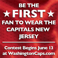
I don't really know what this is supposed to be about, but one way or another, I suppose we'll find out on Wednesday. Seems like the Washington Capitals will be holding a contest among fans to be the first to get to try on the brand new Caps unis. I guess that means free tickets to the big party where it will be unveiled. Too bad I'm not a Caps fan.

HF&P, Part 25: Dallas Stars II

What? I realize we already covered the Dallas Stars once in this series — back in Part 11. But I've found more artwork in my web searches. Check it.

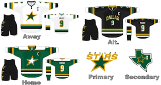
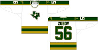
This masterpiece again comes to us by way of our favorite nostalgic designer. Not only do we see a rather severe case of Minnesota North Stars tomfoolery, but we're treated to Rangers numbering on the back. Also, gotta say, I'm just nuts about the alternate design. The city written across the chest may make this hockey uniform feel more like a basketball jersey, but it's different and we all know how I like things that are different.

I also like the idea of dumping the DALLAS STRS out of the Stars logo but I have a feeling we should expect some rather sweeping changes to it entirely. I don't know why I have that feeling, though.


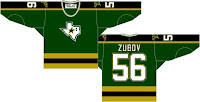
These designs don't really have any relevance beyond the fact that they're — yes, I'm going to say it — different. These are designed in the current style and makes use of the Stars' '90s uni layout and switches the primary and secondary logos. It's interesting but I don't like the state-of-Texas logo on the front of the jersey. It's not — balanced enough.

Anyway, that does it for the "Hockey Fans & Photoshop" series for tonight. Check back again tomorrow for a couple more designs, including — the Edmonton Oilers.

HF&P, Part 24: Anaheim Ducks

I'm going to keep them coming. More fan-designed jerseys for you to look at today as part of the "Hockey Fans & Photoshop" series of posts. Now featuring the 2007 Stanley Cup Champion Anaheim Ducks.

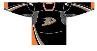
I know, I know, it's the wrong jersey format. You want to know what happened to the Rbk EDGE. Well I didn't promise these would all necessarily be new uniform designs for the 2007-08 season. Today we have what I imagine are graphics designed last summer when the new Ducks logo was unveiled following the announcement that the team would be dropping "Mighty" from their name. The uniforms were announced at the same time, but it seems certain folks weren't impressed and wanted to take a shot at it themselves.

So I guess somebody thought this is how they'd look. Yeah, not so much. On the other hand, it also appears another designer would have preferred to see a dark green instead of black. Someone apparently called "Fonz." Thing is, I actually like the color. The design is pitiful. Horribly pitiful. But I think the colors work — not that I dislike the black. I just dislike the logo in general.

Attention NHL teams: STOP SPELLING OUT YOUR TEAM NAME IN THE FUCKING LOGO! Perhaps my message came across that time.

No, but seriously I understand why they did that this season. They're trying to re-brand the club and get people to stop saying Mighty Ducks. It's cool but I really hope they switch things up with the new Rbk EDGE jerseys next fall.

More coming today: the Dallas Stars.