Bruins Unveil New Logo!

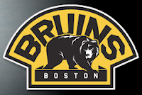
All right, here we go. We have the first of the official new logo unveilings as the Boston Bruins unveiled this:

My first instinct was a dislike of the black outlining of the "B" in the center, but after having stared at it for about 10 minutes, it's growing on me. Anyway, the logo barely changed as you can see. It's a minor update but it was what's required at this juncture. Anything drastic would have sent Beantown fans overboard. We'd have the equivalent of another Boston Tea Party on our hands, to be sure. (Oh come on, you know I had to do that joke. It was just too obvious not to.)


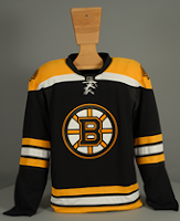
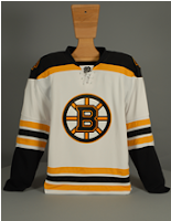
And then there's these gems. For your viewing pleasure we have the home and road Rbk EDGE uniforms for the 2007-08 Boston Bruins.

Proving once and for all to all those frightened ultra-traditionalists out there that these new uniforms can in fact deal with horizontal striping. Not that losing it would really hurt anyone.

But I'm grown up enough to move on.
I also felt like it was worth posting this. It's the secondary logo — or as their calling it, the "vintage crest" — which will be worn on the shoulder. It's pretty cool. I'd even like it as a primary but we can't have everything, can we?

For those of you following along in the tournament, the Bruins have had one match already, against the Flyers in which we used what is now the old logo. Their next match is June 25 and will feature the new one. In case you were wondering.

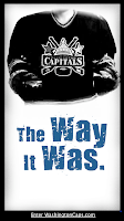
The Way It Was?

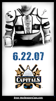
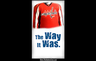
At this point I am awfully tempted to believe that the image we saw yesterday of the new Washington Capitals uniform is the real deal. The images you see here to the left are what you find on the Caps' official web site as of today. The graphics very closely match as you can see. Having said that, still anything is possible. Once again, we get the official word from the team tomorrow evening.

For now, I leave you with this...

Flyers vs Rangers


vs
FLYERS
RANGERS
2-1
1-2

The Aesthetics
Both logos symbolize storied franchises but as I've said many times before, words can kill the aesthetics of any logo. That and I love subtle letters such as the "P" in the Flyers logo.
Flyers

The Nickname
As with any bird, it's the job of a Ranger to protect the Flyer, who therefore has the upper hand.
Rangers

The Analysis
Quite honestly, red, white and blue have never been such important colors to New York City than in the aftermath of the attacks of 9/11. That makes the Rangers colors very significant. Meanwhile, the Flyers logo doesn't go a very long way to symbolize its home city of Philadelphia.
Rangers


WINNER
2-1


Sharks vs Ducks


vs
SHARKS
DUCKS
2-0
0-2

The Aesthetics
The Ducks' unfortunate choice to make a wordmark their primary logo may very well be their downfall in this competition. On the other hand, the Sharks logo is good enough to beat out just about anyone. Talk about fierce!
Sharks

The Nickname
A Shark could totally eat a Duck. The Duck wouldn't stand a chance.
Sharks

The Analysis
Ultimately the Sharks logo is nearly perfect for its location of San Jose, and with any California team you would expect non-traditional colors. I think it's great that the Ducks opted to go with the orange and gold after the name change, but a logo with an actual Duck or even just the footprint would be exponentially better.
Sharks


WINNER
3-0


Islanders vs Thrashers


vs
ISLANDERS
THRASHERS
0-0
0-2

The Aesthetics
I've never been the biggest fan of words or hockey sticks especially in hockey logos. It's a little too on-the-nose if you ask me. The Islanders have both and for that reason they should lose the point. But then this logo is supposed to be traditional right? They've used it for a few decades now (minus those couple of years with the Gordon's fisherman). Still, the Thrashers logo is visually interesting and makes great use of color.
Thrashers

The Nickname
If a Thrasher was flying over an Islander, the bird would surely poop on his head. I know, effort.
Thrashers

The Analysis
It stood the test of time even when a mid-'90s mistake couldn't. The Islanders logo may only be 35 years old, but to many hockey fans, it's been around forever. But that doesn't automatically win you a point in this competition. You need to really show something. In this case, the Islanders logo shows a sense of where it's from with the map of Long Island featured. The Atlanta Thrasher? Maybe. But I'm not getting a feel for the city.
Islanders


WINNER
2-1