Wild vs Kings


vs
WILD
KINGS
2-0
1-2

The Aesthetics
Don't let their record fool you, the Kings have a very strong logo. Unfortunately, it could use more color and a little less minute detail. So by a slight margin, the point here goes to the Wild.
Wild

The Nickname
The King may rule the land, but out in the Wild, he has no say. Bears would eat him.
Wild

The Analysis
If we look at the history of the Kings' logos, I'd say the best was the one just prior to this one. But this competition is about the current logo and ultimately it says "king" more than anything possibly could. It's a crown. The Wild by no means misses the mark in this category, though by the slightest of margins, they lose the point.
Kings


WINNER
2-1


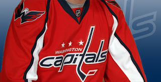
It's Official: Caps Unveil New Logo!

There it is, posted right on their official web site this morning. The official announcement and ceremony doesn't come until tonight. It's true. The Washington Capitals will actually be wearing that this fall. I'm not even sure about the shoulder logo there — except to say that its a million times better than what's on the front of the jersey.

I feel bad for Caps fans. Hey, unless they like it. And then I'm just a jerk.

Wild vs Blues


vs
WILD
BLUES
1-0
3-0

The Aesthetics
These are two very aesthetically strong logos going up against each other here. I could go on all day about their strengths so I'll skip that and get to the point. It goes to the Wild for its color, detail and complexity (not the bad things you thought they were).
Wild

The Nickname
If a jazz man was singing the Blues out in the Wild, he would almost surely attract unwanted attention and, you know, get eaten by a bear.
Wild

The Analysis
This is a hard call to make with such strong logos facing each other. Both have unique colors that set them apart. But do I really need to say it. Just look at that Wild logo? Can anything beat it?
Wild


WINNER
3-0


Flyers vs Penguins


vs
FLYERS
PENGUINS
2-2
0-1

The Aesthetics
Both teams call the same state home and both logos make use of a single color outside of black and white. The orange and gold are quite unique but there is almost too much detail in the Penguins logo. However, that seems to add to it in this case.
Penguins

The Nickname
A Penguin is one of the rare birds that is unable to Fly. Too bad.
Flyers

The Analysis
This point is incredibly difficult to award in this case. Neither logo makes a very good representation of its locale but hit the nickname right on the money. The angry penguin veers away from cartoonish yet can be bogged down in minute detail. Meanwhile the generic winged "P" fits well with the generic nickname. It comes down to this: When looking at them side by side, the stronger logo is the Flyers by a hair.
Flyers


WINNER
2-1


Oilers vs Flames


vs
OILERS
FLAMES
1-3
1-0

The Aesthetics
Both logos have very nice eye-catching colors, but the Oilers logo has lost several points for its use of the name. This time won't be any different. The flaming "C" doesn't help them very much either.
Flames

The Nickname
Fire and oil do not mix. An Oiler would be lit up by Flames and that would be the end of the story.
Flames

The Analysis
As mentioned the flaming "C" of the Flames logo works extremely well and is one of hockey's classic logos. The Oilers logo could be better as I've discussed before and as the Flames proves, sometimes simplicity is what's required for a great team icon.
Flames


WINNER
3-0