Lightning vs Hurricanes


vs
LIGHTNING
HURRICANES
1-0
1-0

The Aesthetics
We have a Southeast Division battle on our hands. Mad props to the Hurricanes for not spelling out the team name as well as what I would consider to be the subtle use of a puck in the eye of the storm. Now I may be hypocritical about many things but here's the thing: subtlety in logos rocks! You have to look at it over and over again so if you discover something new each time, you've got yourself a winner.
Hurricanes

The Nickname
You know, you would think these two go hand-in-hand right. Well as any gulf coast resident can tell you, there is no Lightning in a Hurricane. Just wind to blow everything away.
Hurricanes

The Analysis
As a Lightning fan, I find myself rather despressed at the prospect of my team being shut out in a tournament I designed. Sadly, however, this is the case. Our logo is just not good. But don't let that take away from how good the Hurricanes logo is. I've always thought it was among the best. My only complaint would be that its aspect ratio is a little off. Can we have it a little more circular please?
Hurricanes


WINNER
3-0


Capitals vs Maple Leafs


vs
CAPITALS
MAPLE LEAFS
2-1
0-4

The Aesthetics
The new Capitals logo was just unveiled last week. It's sharp but it breaks one of my cardinal rules. And you know they're gospel, buddy. If we look we see both teams make the mistake of spelling out the full name in the logo. But someone has to get the point. The Capitals logo gets it for the good colors.
Capitals

The Nickname
If lawmakers in the Capital can pass legislation to, say, protect maple trees, they then have the upper hand on a Maple Leaf. Crazy thought.
Capitals

The Analysis
Both logos spell out the full team name so nobody's getting any default points here. The saving grace then has to come in how the logo depicts the name. Again, I was always a fan of the capitol building but three stars does not a point get. I've said before that a silhouette is too easy, but let me eat my words now. This one is very practical in comparison.
Maple Leafs


WINNER
2-1


Flames vs Sharks


vs
FLAMES
SHARKS
2-0
3-0

The Aesthetics
A couple of strong, undefeated logos here. For its simplicity and the Sharks logo's overuse of detail and underuse of color, the Flames will win this point.
Flames

The Nickname
Thanks to good ol' water and the depth of the oceans, a Shark never has to worry about being engulfed in Flames.
Sharks

The Analysis
Here we have two logos that are very good at symbolizing their team names. What I have to take issue with is the Sharks logo's lack of color. The teal and grey are used only in a thin outline of the triangle surrounding the shark. The Flames' "C" logo is a classic and the fire coming out of its back is scary.
Flames


WINNER
2-1


Possible New Kings Jerseys

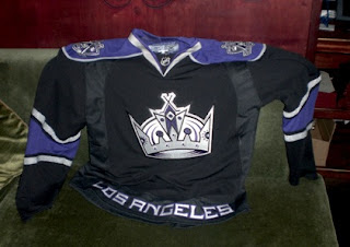
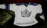
As you know, I'm always more than happy to share new uniform designs I come across while scouring the web. Today we get a look at a photo of what is likely the Los Angeles Kings jerseys. Word is they were on hand at the team draft party. The team hasn't made any official unveiling or announcement as far as I know, but I wouldn't expect much fanfare anyway. There doesn't appear to be much difference between the Rbk EDGE design and the current one.

So I have nothing bad to say about them but as usual, take it all with a grain of salt. I obviously don't know for certain if this is the real deal, but I can't see any reason why it wouldn't be.

By the way, I hope you're enjoying the tournament, the few of you that seem to be following it. Feel free to leave comments as we go along about your feelings on how these logos stack up against each other. Should readership of this blog expand, I'd like to do a tournament that's voted on by the fans. Would probably be more realistic, anyway.

Thanks for stopping by.

Islanders vs Sabres


vs
ISLANDERS
SABRES
0-2
2-1

The Aesthetics
As much as Sabres fans in general have made well known their distaste for the new logo, it's actually a very strong sports team logo. Simple design, great colors. The Islanders, however, make use of an unnecessary hockey stick and puck. We already know it's a hockey team.
Sabres

The Nickname
Could an Islander really defend himself against a Sabre-wielding swordsman? I think not.
Sabres

The Analysis
Here is where the Islanders avoid getting swept. The map of Long Island in the background of the logo is great and the classic design is very recognizable. Unfortunately in a logo for the Sabres, there isn't a sword in sight. Why, I wonder. Why must every team from Buffalo use the animal in the primary logo? Stop it, already.
Islanders


WINNER
2-1