Flyers vs Thrashers


vs
FLYERS
THRASHERS
4-7
3-3

The Aesthetics
You can tell these two logos come from very different eras. Both of are strong hockey logos but when it comes to the look and use of color, the Thrashers beat out the Flyers in that area despite the blatant use of a hockey stick.
Thrashers

The Nickname
You could say a Thrasher is a Flyer. But the Thrasher sounds much fiercer.
Thrashers

The Analysis
This is where the Thrashers logo gets in trouble for its hockey stick. At the same time, its where I give credit to the Flyers logo for the "P" that does Philly proud. I also like the simplicity in the Flyers logo but the sharp, tapered points in the Thrashers logo work in its favor. Still the Flyers have one of those classic sports logos that will be around forever, I'm sure.
Flyers


WINNER
2-1


Stars vs Red Wings


vs
STARS
RED WINGS
3-2
2-6

The Aesthetics
The Stars logo is mostly made up of the team name with the "A" in Stars making the tip of the star. In comparison, the Red Wings logo may be more detailed but is cleaner and better-looking as logos go.
Red Wings

The Nickname
As usual, giant ball of fire versus anything yields a predictable result. The Star burns up the Red Wing.
Stars

The Analysis
This one is actually a bit more difficult to decide than it may seem. While both logos obviously portray the name well, its the way they symbolize where they're from that grabs my attention. The wheel attached to the wing references Motor City but at the same time, the big "lone star" in the Stars logo makes me thing Texas. It's kind of a toss-up but ultimately those 11 letters in the Stars logo will be the detrimental factor for it.
Red Wings


WINNER
2-1


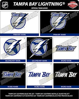
Possible New Lightning Logo?


If you thought the San Jose Sharks logo I just posted was bad, you ain't seen nothing yet. This gem was posted on the same web site and I just saw it on Boltsmag and needed to post it here.

It's not the best I've ever seen. The city is still there. See that one there labeled "secondary mark" underneath? Love that one! Put it on the front of the jersey! Anyway, there's no official word from the team yet so this may or may not be the real deal. I suppose we'll find out for sure sometime this summer.

Leave your comments below and let us all know what you think.

UPDATE (6:44 PM): According to Tampa Trib Lightning beat writer Erik Erlendsson, the Lightning will unveil their new logo and uniforms at a "fan festival" on August 25. This is the first I'm hearing of an actual date. Incidentally, Erik wrote that he knows of the leaked logos I posted earlier and seems to believe they are in fact the real deal. When asked, the Lightning would neither confirm nor deny their veracity. Regardless, we should know for sure 43 days from now.

Possible New Sharks Logo?


A reader pointed me to this image of a potential new design for the San Jose Sharks logo. As I reported the other day, the Sharks will be unveiling a new logo on July 24.

Now if you want my opinion, take it with a grain of salt. It's a cool update on the current logo, but I think its just an artistically-inclined fan having a little fun on the internet. The way I understand it, the team is going with a complete redesign. It's rumored the new logo will feature an entire shark as opposed to just the front end. Now having said that, anything is possible and we won't know for certain for another 11 days, so check back here then.

In the meantime, feel free to leave your comments. What do you think it will look like? What do you think it should look like? What do you think of this design?

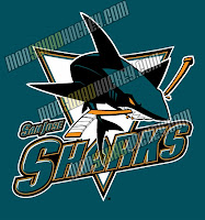
UPDATE (4:55 PM): Just came across this version of the Sharks logo. It actually shows the entire shark as I mentioned earlier. But its a wordmark, so it probably wouldn't be the crest.

What do you think of it? Great? Not great? Personally, I'm a little indifferent. It's an improvement on their current logo but I think they can do better.

Blue Jackets vs Blues


vs
BLUE JACKETS
BLUES
4-1
4-4

The Aesthetics
Sometimes you can feel action in a still logo and I feel it in the Blue Jackets logo — in a good way. It's a very smart logo with appropriate attention to detail. I like the two-tone blue in the Blues logo but its not quite enough to steal this point away.
Blue Jackets

The Nickname
A Blue Jacket carries a bayonet. A Blues man carries a sax. Do the math.
Blue Jackets

The Analysis
The Blue Jackets name leaves little room to screw up the logo, although you wouldn't know it based on previous logos. This one just makes sense. The Ohio flag more than references the home state of the team while the Blues logo is really little more than a musical note with a wing. I don't really get the wing, but that's not why they're getting swept. The new Blue Jackets logo is just that good.
Blue Jackets


WINNER
3-0