Blues vs Stars


vs
BLUES
STARS
4-5
3-4

The Aesthetics
Both logos are simple and strong if you can look past the wordmarks in the Stars logo. Unfortunately, for this point, I can't.
Blues

The Nickname
The all-consuming ball of fire we call a Star would have its way with anything on this planet. Even the Blues and those who sing them.
Stars

The Analysis
The Blues logo is a blue musical note. Very fitting. I did like the shoulder logo they wore in the '90s with the blue trumpets but I think most St. Louis fans would revolt over that one. As for the Stars, if you can go beyond the wordmarks, which I can for this point, you can't help but notice the the giant star is by itself — like the Lone Star State of Texas. The Blues logo really makes no references to the Gateway City.
Stars


WINNER
2-1


Capitals vs Sabres


vs
CAPITALS
SABRES
4-4
4-3

The Aesthetics
The Capitals logo, as discussed is a wordmark with a hockey stick and a puck and that is the opposite of what's required to take this point. On top of that, the Sabres actually have a rather aesthetically strong logo.
Sabres

The Nickname
I can't really think of how to compare Capitals and Sabres, but let's say an army of Sabre-wielding anarchists stormed the Capital. They would probably overwhelm the lawmakers.
Sabres

The Analysis
Sabres fans everywhere have bemoaned the "Buffaslug" all year, begging for a change. I agree in that the team could do better, perhaps in merely placing an actual sabre in the logo would be an improvement. It's the reason why the team hasn't earned this point all tournament. That won't change today. Despite the Capitals logo being a glorified wordmark, the three stars representing Maryland, Virginia and the District will win me over in this match.
Capitals


WINNER
2-1


Predators vs Blue Jackets


vs
PREDATORS
BLUE JACKETS
7-3
6-1

The Aesthetics
The top two logos in the Central Division are going head-to-head this afternoon. Both logos are rather detailed and have great colors, albeit the Predators' colors are aren't as common. For originality, this point goes the way of the Preds.
Predators

The Nickname
The Blue Jackets would be armed with bayonets so no Predator would have a chance unless it was impervious bullets and knives.
Blue Jackets

The Analysis
With the Ohio flag strewn across a silver star, there's no way the Blue Jackets logo can lose this point. I like the Predators logo and the reason behind it, but just looking at it, you wouldn't necessarily know the team was from Nashville. In fact, they could be from Hamilton and we wouldn't know the difference. All right, that's enough digs from me.
Blue Jackets


WINNER
2-1


Thrashers vs Maple Leafs


vs
THRASHERS
MAPLE LEAFS
4-6
1-9

The Aesthetics
The Thrashers logo is so much better looking than the Maple Leafs. And I say that despite the hockey stick the bird is holding. What's worse is the team name completely spelled out in the Leafs logo. I've said before how the Maple Leafs can improve without scaring lifelong fans away. It is possible, believe it or not.
Thrashers

The Nickname
I've never heard of a Maple Leaf hurting a Thrasher. The Thrasher, on the other hand, has some nasty claws.
Thrashers

The Analysis
Neither logo is really strong in this category. Here's the thing, though. When you look at the two, which is easier to guess the home city of, if you didn't already know it? If we're ignoring the fact that Toronto is spelled out in the Maple Leafs logo, the maple leaf itself is a dead giveaway for Canada. It would be pretty impossible to guess where the Thrashers come from.
Maple Leafs


WINNER
2-1


Kings' New Uniforms Official

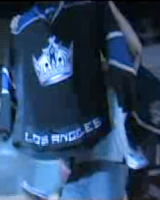
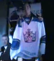
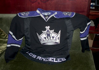
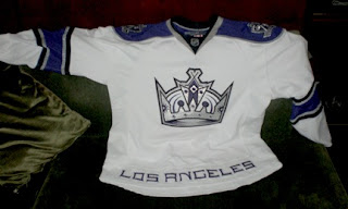
It's been brought to my attention that there is in fact another team that has unveiled their new Rbk EDGE jerseys. The Monday after draft day, I posted photos I came across of what appeared to be said uniforms. Turns out, the Kings actually did unveil them officially at the team's draft day party.


I know the image quality sucks, but you're looking at screengrabs from a video shot at the Kings draft party. They show Jack Johnson holding up the home jersey and Michael Cammalleri with the road sweater. For a better look at both jerseys, the photos I first posted were accurate.


Thanks to those of you who pointed this out to me. We now have five teams with OFFICIALLY unveiled jerseys for 2007-08. If you want to keep up with who's done what, there's now a tracker in the sidebar.