Senators vs Devils


vs
SENATORS
DEVILS
4-3
10-1

The Aesthetics
The Devils logo is simpler but the additional color in the Senators logo gives it extra layers. This is not meant to take away from the clever design of the Devils logo but rather to highlight how using more than two colors can be effective.
Senators

The Nickname
The Devil is one evil son of a bitch. A Senator doesn't have anything on him.
Devils

The Analysis
It's the subtle "NJ" making up the devil that will help give the Devils this point. As far as the Senators logo, it's nice but it could be better. I do like the third jersey version better and rumor has it that an updated version of that will be donning the crest of the Sens new unis this season. Until we find out for sure, this point is not for them.
Devils


WINNER
2-1


Sharks vs Oilers


vs
SHARKS
OILERS
4-6
1-9

The Aesthetics
The Sharks logo goes heavy on the detail and light on the color which is not a good combination. It has a hockey stick in it and if you notice, the tape doesn't go around the entire blade. It needs work. Good thing is, in just two days, it's getting the help it needs when the Sharks unveil a new logo. The team name being written out in the Oilers logo still isn't making me happy, but its a better-looking logo when compared with the Sharks. If you ask me.
Oilers

The Nickname
Suppose an Oiler is out working on an ocean rig. Were he to fall off with hungry Sharks lying in wait, he would no doubt be lunch.
Sharks

The Analysis
All we really have to look at in this match is whether the logo is a good symbol for the club's name. Here, the Sharks logo works well while the Oilers logo leaves a lot to be desired. I'm a fan of the shoulder logo they currently wear despite its heavy-handed detail. The third jersey logo would work as well but what do I know? I see a shark.
Sharks


WINNER
2-1


Red Out For Panthers?

Posting speculation isn't something I love but often the source can change my mind. Miami Herald writer George Richards wrote in his Florida Panthers blog a brief description of what the team's new uniforms may look like. Apparently, team executive Michael Yormark said some interesting things around the time of the all-star game in Dallas.
The Panthers will also have a new look next season, the first real update since the team’s inception in 1993. Like each team in the league, Florida will only have two jerseys next year because of the Reebok redesign. The Panthers will get rid of their original red jersey at least for the time being.

“We’ve made changes,’’ Yormark said. “It’s a much more contemporary look. The look is going to be different from what we have now. We’re pretty excited about it.’’

The away jersey will still be white, but red will be the predominant secondary color; the home jersey remains blue, with yellow as the main accent. Yormark says horizontal stripes are out and vertical stripes are in. The leaping Panther logo on the chest will be larger and more dynamic.

Now I don't know what he means by "more dynamic," but the Panthers haven't publicly said anything about altering their logo in any way. So stay tuned with regard to that.

For a look at the full post and other writings by Richards, go here.

The Panthers have since announced the date for the unveiling as July 28 — this Saturday.

A Sharks Logo ... Not San Jose!

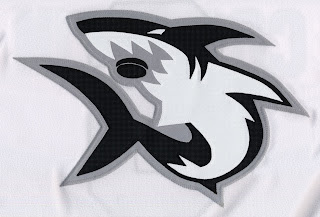
Okay, before I say anything else, I need to mention that I was weary about posting this image. It's a photo of a shark logo that has been floating around the net as a potential new logo for the San Jose Sharks. First, look at it then read what I've written below.

Now from what I've read, most people aren't loving this logo and would rather not see the Sharks wearing it — ever. My belief is that there never was nor will be a chance of the Sharks wearing this anyway. But I am not omniscient or all-knowing believe it or not, and while anything is possible I'm saying I don't think it'll happen.

Why?

Because the logo belongs to this team. They're the Boston Ice Sharks, an amateur women's hockey team. That makes the odds of this being a San Jose concept very slim.

But having said that, don't chuck it out the window so fast. Word is that the new Sharks logo is supposed to feature a shark from head to tail, as opposed to just the front end sticking out of a triangle. Still, it's important to note that nothing official has been announced yet and it won't kill us all to wait three more days when the teams makes their announcement.

Also I want to point out that I'm not trying to shoot down possibilities, but rather put forth explanations for certain... rumors. I like the logo but I don't see the Sharks ever wearing it — on their chests. Could something similar find its way onto the shoulder patch? What do you think?

Flyers Jersey Concept Designs

Hope you're enjoying the tournament. In the last few days, the traffic here on this blog has skyrocketed, due in part, I believe, to links being posted on various message boards. I thank you all for dropping in and I hope the information regarding new jersey and logo designs for this fall that I've been providing is helpful.

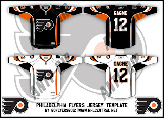
Today we get a look at a fan-made concept for the new Philadelphia Flyers uniforms. These designs have the Rbk EDGE cut but use the same layout scheme as the all-star uniforms, which is why I know its fan art and nothing official from the team. I'm under the impression the Flyers will be going with black for their home jerseys this season. Take a gander.

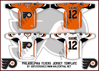
If you were wondering what the home uniforms might look like in orange, check out the design below.

Once again, these were of course designed by a fan and despite the fact that the Flyers are taking pre-orders for the 2007-08 jerseys, we have yet to see what one will actually look like. As usual, keep it here for info on that as it becomes available.