Try not to filet me, Canucks fans, but I may have stumbled upon your team's new logo.

I can't speak to the veracity of this image. It may well be the work of a fan toying with rumors learned of on various web sites and message boards. Still, it's something to consider.
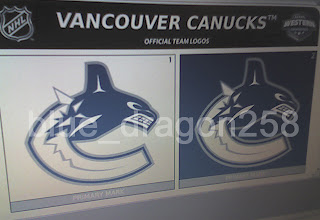
This image appears to be a cell phone photo of a computer screen showing the logos on official NHL stationery. But don't be so quick to take it as fact. From what I've seen of these design sheets, the fonts don't quite match and that makes me question whether this is someone just trying to have a go at the hockey world. However, there's no reason why the league couldn't change the font on the stationery. So it at least seems to be a possibility for us all to consider.
Now my feeble analysis: I feel it's more a downgrade than an upgrade on a logo I thought was great as it was. To lose the maroon and light blue only serves to hurt the symbol which now no longer has the feel of the Pacific Northwest that it once did. I might eat my words if the maroon or light blue was simply replaced with the classic Canucks green. But it remains to be seen whether this is the real deal or not.
According to various sports retailers, the Canucks have apparently told them that there will be changes to the logo and uniforms for the new season. They've evidently also been told to expect an announcement regarding such changes on August 1. That is a controversial date to Canucks fans who would prefer to hear it from the horse's mouth. But team executives have their lips sealed tighter than a cow's ass in fly season (which is to say they aren't talking).
What do you guys think of all this? Speculate below in the comments.


