Panthers vs Hurricanes


vs
PANTHERS
HURRICANES
9-1
9-0

The Aesthetics
These two logos lead the Southeast Division and sit among the top 5 in the league at this late point in the tournament. The Hurricanes logo has managed to fare perfect so far in this category. But that ends today. There's little doubt that the 'Canes have a strong logo, but the Panthers logo almost literally jumps out at you. It's got a great color combination and a fiercec look.
Panthers

The Nickname
A Hurricane is Mother Nature's way of taking out her aggression. To her, a Panther is just another cat with nowhere to hide.
Hurricanes

The Analysis
It all comes down to the analysis. Despite the detail when you get up close to it, nothing about the Panthers logo is lost when you have to view it with less detail. The Hurricanes logo is simple and even works in a subtle puck as the storm's eye — something I really like. Then there's the fact that both teams are so appropriately named that there's no need to reference the home city specifically in the logo. It all comes down to the shape, now. I would like the Hurricanes logo even more if it were more circular. The oval shape makes the puck fit well, but there's no reason you couldn't be looking at the puck from above rather than at an angle. This logo is finally dealt a hit as it loses its first match.
Panthers


WINNER
2-1


Wild vs Predators


vs
WILD
PREDATORS
9-0
7-4

The Aesthetics
These are two teams still working on their first decade in the NHL — though if certain billionaires have their way, the Preds won't make it beyond ten years. The most noticeable thing about these two logos is their similarities in shape. There are very distinct triangles make up the heads of some rather vicious animals. I think they are two of the league's best and that shows in the standings. Still, I think the Predators logo could use a little less minutia and final a real focus for the color scheme. The Wild logo already has all of that.
Wild

The Nickname
You might say a Predator is the king of the Wild, catching prey and dispatching of it.
Predators

The Analysis
By now, you already know the story of how the Predators got their name. Unfortunately, there's no sign of the city of Nashville in the logo, so it will be very easily transferred to Hamilton, er Kansas City, er... screw it. Anyway, I've also already talked in length about the greatness of the Wild logo in its ability to work in so much in such a small space.
Wild


WINNER
2-1


Sabres vs Lightning


vs
SABRES
LIGHTNING
5-3
4-5

The Aesthetics
I don't think this requires a whole lot of scrutiny. The Sabres logo obviously is a much better-looking logo than the Lightning's. If you need an explanation, try and see past all the words in the Lightning logo. Bet you can't.
Sabres

The Nickname
You know, metal is a good conductor of electricity. Still, a bolt of Lightning would fry even the toughest of Sabres.
Lightning

The Analysis
All this time I've been saying that the logo for a team called the "Sabres" conspicuously lacks, you know, a sabre. Turns out, I've been wrong all this time. A reader here recently pointed out to me that there is in fact a very subtle sword across the side of the buffalo. The white horn is the handle and the blue stripe protruding from it is the blade. I think that's really cool. However! It's the name of the team. It shouldn't be subtle. It should be right out there in the open. Make the buffalo subtle. At least there's a lightning bolt in the Lightning logo.
Lightning


WINNER
2-1


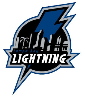
New Lightning Logo Concept Design

I just came across this fan-created concept logo for the Tampa Bay Lightning while surfing the web.

It makes use of the skyline and a palm tree, which I like, only the Bolts can't do it because stinkin' Panther fans would cry foul and say it was stolen. (Though if you guys recall, you did steal the broken stick thing from the Sharks. Don't know if you remember that bit.)

Anyway, kudos for the sharp work by the artist, but it's not my favorite because of the wordmark in it, but I could see it as a shoulder patch or on a hat or something. What do you think?

No Islanders Jerseys Until September

Today we've got news on the New York Islanders and when we can expect to see a new uniform for them. You might remember about a month ago I posted what appeared to be a cell phone photo of the new Isles unis. Only time will tell whether those are legitimate designs. One would hope they aren't though. They were quite awful to look at.

Newsday's Isles beat writer Greg Logan posted some news regarding the team's new Reebok duds.

Many of you keep asking about the unveiling of the Islanders’ new jerseys. Three teams were permitted to display theirs at the recent NHL draft, but the rest of the league will put them on for the first time in September. Reebok won’t be able to deliver a full complement of uniforms until then. The exact date is uncertain, but the Islanders anticipate unveiling their jersey either just before they leave for training camp on Sept. 13 or just after they return on Sept. 22.


You can read his full post here.

I'm trying to keep my bases covered league-wide so if you guys notice I'm blatantly leaving any teams out, let me know. Though I'm trying to post as much information as I can as I find it. That said, if you've seen any uniform or logo news worth posting, please tell me about it. I'd be happy to spread the word.